


For years now, I have followed baseball writers—fantasy and *real*—taking in their input and applying it to my own knowledge and hopefully learning something new about a player, or perhaps an entire way to assess players. This all started for me back around the year 2010. I was a Fangraphs addict following their every word and slowly building up a huge background in baseball information and research. The timeline went something like this:
- BABIP became a thing. Everyone who was too far out of line in one direction or another, and was a regression candidate for both pitchers and hitters (mainly hitters though).
- ERA – FIP to see who was the furthest from what was expected in a more controlled environment.
- Batted ball data to see who was fitting into one bucket or another.
If you’ve been reading this stuff for the past 10 years this all sounds very familiar. Eventually, I stumbled upon Bret Sayer who had the brilliant idea of a “Holy Trinity” of pitching stats: finding pitchers who were in the highest third of K/9, bottom third of BB/9, and the highest third of ground ball percentage. It was a point system, and players who had all three were unicorns. This was how I initially realized Kyle Hendricks may be a lot better than I think he is, and it turns out: he was. The combination of skills led to him being worth more than the sum of his parts.
But for hitters, it has been a lot of the same for a while now. BABIP and batted ball data have slowly fallen out of style for Baseball Savant metrics which largely measure the same thing. You have read that hitters who have a high hard hit rate, or an exceptional max exit velocity need to raise their launch angle, or make more consistent barreled contact. These things are largely true, but the reason that pitching analysis seems to consistently be on the cutting edge, and hitting lags behind is because pitching is an input, and hitting is an output.
A pitcher decides what they are going to throw, where they are going to throw it, and how they are going to throw it. The hitter reacts to all of this before they have any chance to determine what they want to actually happen to that pitch they are swinging at. To make a long story short, a bunch of things are happening before that bat hits the ball, and action happens. This article is going to attempt to help you decide who makes those swing decisions best and worst.
This year, I was supposed to work for the Angels in AA as their video manager. That obviously did not go according to plan, so I was gifted a lot of time to teach myself how to take the data I had been looking at for years, and do something actionable with. I have always been pretty good at Excel, but this year I dove deep into SQL and more recently R. With the three combined I came up with the idea to assess swing decisions using multiple regression to create an estimated walk rate and estimated strikeout rate for hitters.
Metrics on the per-pitch level are more accurate than something that describes an outcome, so if you saw that a hitter saw 43% of his pitches faced in the zone, you have a very good idea of what I am talking about. If I say a hitter struck out 22.3% of the time, that likely means less to you because there is more than one way to imagine how those strikeouts happened. Did the hitter watch three straight perfect strikes, did they whiff horribly three consecutive times, did they get jobbed by an umpire after a 10 pitch battle? Each of these is a possibility, and totally unknown based on a 22.3% strikeout rate.
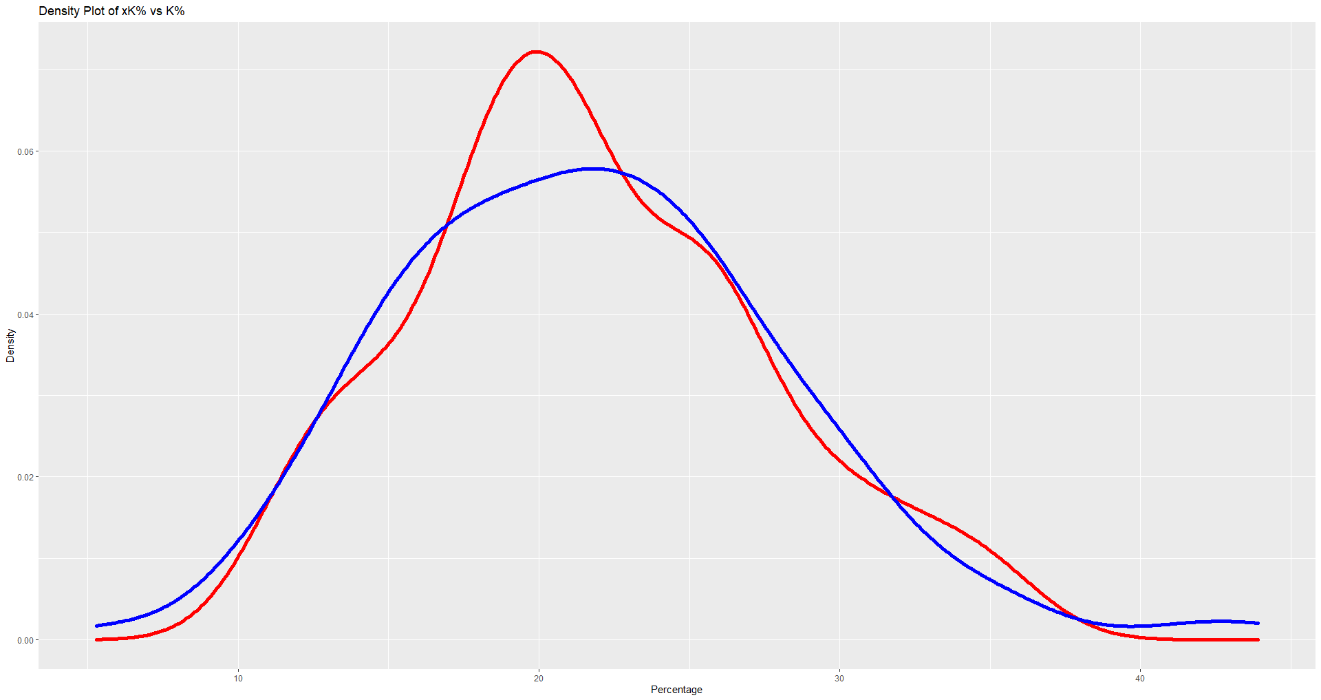
So, 600 words in, what I did was take all qualified hitters plate discipline from Fangraphs, as well as all of their strikeout and walk rates. I made a multiple regression equation to estimate walk and strikeout rates for every qualified hitter, took the coefficients from the ANOVA report, and applied them to each hitter’s plate discipline attributes to get expected walk and strikeout rates. After doing that, I found that my 2020 xBB had an r2 of .725 and my xK was at .812. I backtested to 2015 and found all of those longer seasons to be even more accurate. For people less interested in math: in a normal season, this plan could account for between 72 – 87% of why a player struck out or walked. The graphical representation of that means the expected and real versions are going to be incredibly similar. Here is a density plot comparing K% and xK%, with the blue line being xK%.
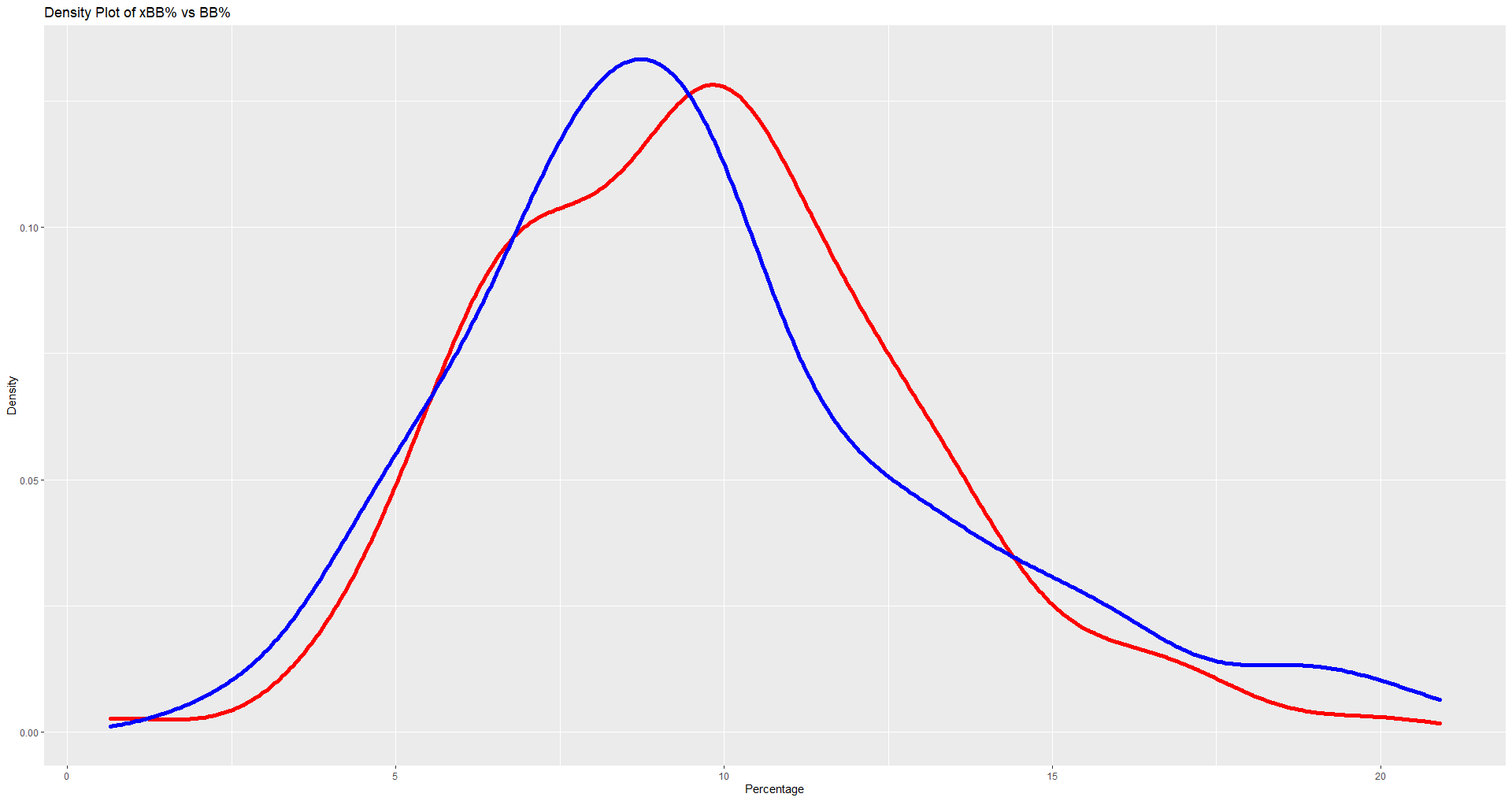
Here is the same visualization as above, except with BB% and xBB%. Again, the blue line is the expected rate.
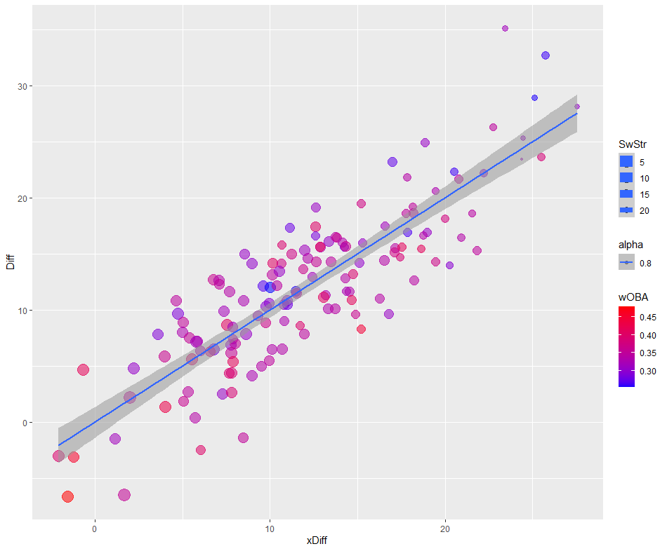
So for example last season, Anthony Rendon walked in 16.4% of his plate appearances, and struck out in 13.4% of his plate appearances, if you take his strikeout rate and subtract his walk rate you have a difference of -3%, or the 4th lowest difference in baseball behind Juan Soto (-6.6%), Tommy La Stella (-6.5%), and Freddie Freeman (-3.1%). However, Rendon’s xBB% was 13.84% and his xK% was 11.75%, leaving him with a difference of -2.09%. While this is lower than what happened, with the smoothing nature of modeling it was, in fact, the best expected difference in baseball in 2020. For the vast majority of hitters, their K-BB (Diff), and their xK-xBB (xDiff) are largely in line with each other. One look at a chart with Diff compared to xDiff shows you how well the expected version mimicked reality for most hitters, as most of them earned their strikeout and walk rates.
But you, much like myself, do not care about how this is accurate and trustworthy, you want those sweet, sweet outliers to take advantage of the naivete of others, and if you have stuck with me this long, here you are. The qualified hitters I expect to make the largest improvements in plate discipline in 2021. (the further left, the better)
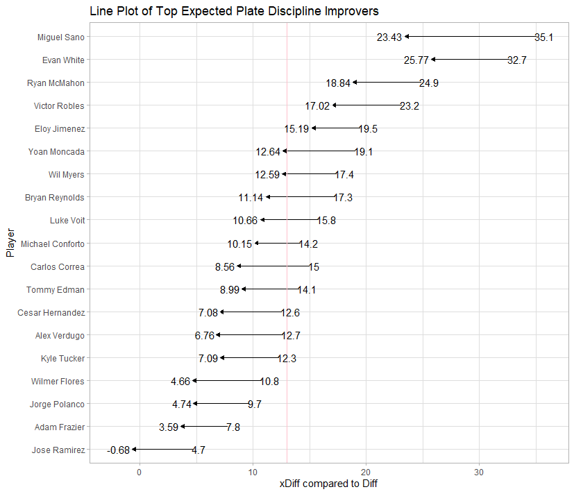
The pink line was thrown in there to distinguish who was above and below the league average. I plotted the number at 13 since the MLB average Diff was 14, but the average Diff for qualified hitters was 12.04. For those less interested in visualizations and curious about the actual differences, here is the spreadsheet view.
| Name | BB% | K% | Diff | xBB% | xK% | xDiff | DiffTotal |
|---|---|---|---|---|---|---|---|
| Miguel Sanó | 8.80% | 43.90% | 35.10% | 11.78% | 35.22% | 23.43% | 11.67% |
| Evan White | 8.90% | 41.60% | 32.70% | 9.37% | 35.14% | 25.77% | 6.93% |
| Yoan Moncada | 12.10% | 31.20% | 19.10% | 12.43% | 25.07% | 12.64% | 6.46% |
| Carlos Correa | 7.20% | 22.20% | 15.00% | 9.85% | 18.40% | 8.56% | 6.44% |
| Victor Robles | 4.80% | 28.00% | 23.20% | 7.66% | 24.69% | 17.02% | 6.18% |
| Bryan Reynolds | 10.10% | 27.40% | 17.30% | 10.43% | 21.57% | 11.14% | 6.16% |
| Wilmer Flores | 6.10% | 16.90% | 10.80% | 8.88% | 13.54% | 4.66% | 6.14% |
| Ryan McMahon | 9.30% | 34.20% | 24.90% | 9.57% | 28.41% | 18.84% | 6.06% |
| Alex Verdugo | 7.70% | 20.40% | 12.70% | 9.37% | 16.13% | 6.76% | 5.94% |
| César Hernández | 9.20% | 21.80% | 12.60% | 10.56% | 17.64% | 7.08% | 5.52% |
| José Ramírez | 12.20% | 16.90% | 4.70% | 13.37% | 12.69% | -0.68% | 5.38% |
| Kyle Tucker | 7.90% | 20.20% | 12.30% | 9.38% | 16.46% | 7.09% | 5.21% |
| Luke Voit | 7.30% | 23.10% | 15.80% | 9.62% | 20.27% | 10.66% | 5.14% |
| Tommy Edman | 7.00% | 21.10% | 14.10% | 9.55% | 18.54% | 8.99% | 5.11% |
| Jorge Polanco | 5.80% | 15.50% | 9.70% | 9.92% | 14.66% | 4.74% | 4.96% |
| Wil Myers | 8.30% | 25.70% | 17.40% | 12.37% | 24.95% | 12.59% | 4.81% |
| Eloy Jiménez | 5.30% | 24.80% | 19.50% | 7.02% | 22.21% | 15.19% | 4.31% |
| Adam Frazier | 7.40% | 15.20% | 7.80% | 9.91% | 13.50% | 3.59% | 4.21% |
| Michael Conforto | 10.30% | 24.50% | 14.20% | 11.68% | 21.83% | 10.15% | 4.05% |
While I will not dig into these players individually in this article, these are the guys I anticipate having their plate discipline undervalued. For example, Miguel Sanó was an unmitigated disaster in 2020—striking out over 40% of the time is laughable—but his approach seems to have left him short changed by umpires and random chance. His swing decisions were not good, but the results made him look like the worst in baseball by far. What happened on the per-pitch level appears to make him look like he should have been towards the bottom of the leaderboard instead of rock bottom. His approach is very bad, but not the worst. If I am only half right on Sanó I would anticipate a few more walks, fewer strikeouts, and many more balls in play for arguably the best player in baseball on balls in play. For all of these players the opportunity to trade strikeouts for walks would obviously be advantageous; even subjecting them all to the random nature of the BABIP gods would be an improvement over the strikeouts they did not deserve to accumulate the way they did.
Good always comes with bad, so on the other end of the spectrum, here are the players I believe overachieved their approach in 2020.
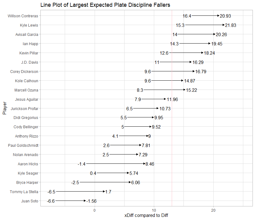
And for those who prefer to view the data as a table:
| Name | BB% | K% | Diff | xBB% | xK% | xDiff | DiffTotal |
|---|---|---|---|---|---|---|---|
| Aaron Hicks | 19.40% | 18.00% | -1.40% | 16.35% | 24.82% | 8.46% | -9.86% |
| Bryce Harper | 20.10% | 17.60% | -2.50% | 15.38% | 21.44% | 6.06% | -8.56% |
| Tommy La Stella | 11.80% | 5.30% | -6.50% | 10.02% | 11.72% | 1.70% | -8.20% |
| Corey Dickerson | 7.10% | 16.70% | 9.60% | 4.54% | 21.33% | 16.79% | -7.19% |
| Marcell Ozuna | 14.20% | 22.50% | 8.30% | 10.69% | 25.91% | 15.22% | -6.92% |
| Kyle Lewis | 14.00% | 29.30% | 15.30% | 11.54% | 33.38% | 21.83% | -6.53% |
| Avisaíl García | 9.70% | 23.70% | 14.00% | 6.36% | 26.61% | 20.26% | -6.26% |
| Kevin Pillar | 5.80% | 18.40% | 12.60% | 3.80% | 22.04% | 18.24% | -5.64% |
| Kyle Seager | 12.90% | 13.30% | 0.40% | 13.17% | 18.91% | 5.74% | -5.34% |
| J.D. Davis | 13.50% | 24.50% | 11.00% | 10.52% | 26.81% | 16.29% | -5.29% |
| Kole Calhoun | 12.30% | 21.90% | 9.60% | 12.13% | 27.00% | 14.87% | -5.27% |
| Paul Goldschmidt | 16.00% | 18.60% | 2.60% | 12.45% | 20.26% | 7.81% | -5.21% |
| Ian Happ | 13.00% | 27.30% | 14.30% | 11.77% | 31.22% | 19.45% | -5.15% |
| Juan Soto | 20.90% | 14.30% | -6.60% | 17.69% | 16.13% | -1.56% | -5.04% |
| Anthony Rizzo | 11.50% | 15.60% | 4.10% | 8.97% | 17.98% | 9.00% | -4.90% |
| Nolan Arenado | 7.50% | 10.00% | 2.50% | 7.10% | 14.40% | 7.29% | -4.79% |
| Willson Contreras | 8.90% | 25.30% | 16.40% | 8.66% | 29.59% | 20.93% | -4.53% |
| Cody Bellinger | 12.30% | 17.30% | 5.00% | 9.36% | 18.88% | 9.52% | -4.52% |
| Didi Gregorius | 6.30% | 11.80% | 5.50% | 5.40% | 15.35% | 9.95% | -4.45% |
| Jurickson Profar | 7.40% | 13.90% | 6.50% | 7.82% | 18.55% | 10.73% | -4.23% |
| Jesús Aguilar | 10.60% | 18.50% | 7.90% | 6.75% | 18.71% | 11.96% | -4.06% |
Unsurprisingly, a lot of these guys were studs or experienced large gains in offense in 2020. As I said before, models smooth some things out, so La Stella and Soto showing up is not terribly surprising, but I wouldn’t expect them to keep up the pace they had in 2020 over a full season in 2021. Aaron Hicks dropping from 7th best to 44th out of 142 is not good, and Kyle Lewis going from 98th to 134th, or from being like Ramón Laureano who has poor plate discipline, to near what Miguel Sanó’s expected difference is, is never good unless he plans on hitting the ball a lot more like Miguel Sanó.
In the end, this is uncharted territory. The decision to swing always has and always will be more important and come before actually hitting the ball. For the most part, plate discipline has been viewed as “it is what it is” for most big leaguers. The good ones have it and their careers seem to be prolonged by it, the bad ones rely on athleticism and quality of contact to carry them above their poor decisions until that well runs dry. With Hawkeye measuring more than we have ever had access to, and blast sensors in practice as well as minor league games, one day this will likely be viewed as archaic. As of today, I do not know of many others who have tried to measure this, so I’d love to hear what you guys think of my attempt to quantify swing decisions, and if you have any advice on how I could have made these visualizations better, I’m new to R but I’d love to hear your input.
Huge shoutout to Colin Charles and Colin Hong for the R help that got me this far.
Photo by George Walker/Icon Sportswire | Adapted by Doug Carlin (@Bdougals on Twitter)
Really cool article! Thanks
Great article and very thought-provoking. Out of curiosity, have you back-tested this yet to see if the rates bounce back?
Fascinating stuff. Thanks! Can’t wait to digest it and use it in drafting!
I particularly liked your analysis of why batting data is noisier than pitching data. That was clarifying.
Love analysis like this. Good stuff.
I have Donnie, and you will be getting that in article 2, where I review guys I anticipate dropping off. As far as overall predictiveness, it is basically the same if not slightly below K-BB%. HOWEVER, when I just look at the outliers above and below 4% expected improvement of decline, my system Is incredibly good at finding guys who will move one way or another. Which will be the subject of article 2.
This is outstanding work. I love the explanations, the charts, and the backstory of how you reached this point. And I love what (or who) the data points toward. It just so happens that a lot of my targets are in the first chart, and a lot of my “fades” are in the Naughty Chart. Love this, excited to read more of your work.
Question with a guy like Soto who has been know for know the k zone so well.. do you think they will always or as a career get the benefit of a call by the umps? Even like votto would be interested to see if he “got” the call for the 4th ball when a more free swinger would have been punched out by the ump?
Love the work and love when guys take a different direction and find awesome ways to look into stats that others haven’t been
Kyle, I think what you are asking falls into the percentage of someone’s K and BB rates that I cannot explain, not only because of the legacy of Soto being something to account for, but also the errors umpires make like how the zone expands and contracts in various counts, even though it shouldn’t.
Great stuff.