


Here we are well into October. It’s time for meaningful baseball, playoffs are well underway, and sandwiched right in the middle is First Pitch Arizona (FPAZ), a fantasy baseball conference that brings together writers, players, fans, and everything in between. Attendees will get a chance to listen in on fantasy baseball presentations, live podcasts, breakout groups, ballgames, and whatever other debauchery people can come up with. The Pitcher List Discord has been full of FPAZ talk and while I won’t be attending, I’ll be sure to follow the highlights and live vicariously through those that were able to make it.
As part of the lead up to FPAZ, a few of us here at Pitcher List have decided to try something new and release a data camp style of article that will explore some baseball analysis and also include the code so that if anyone wants to try their hand at learning to program, it’ll be easy to replicate and practice their skills. For this article we will be exploring batted ball data and developing a model using the INLA package in R. If you aren’t familiar with R but want to learn, there are tons of useful links and materials out there for you to learn. I’m not going to go into any details on how to get started in R as there are resources out there that will do a much better job than I can. But what I will do is drop a few links here for some resources that I’ve found very useful over the years:
- Tom Tango’s blog
- Analyzing baseball data with R blog
- baseballr package – for learning how to analyze/acquire data using R
At the very least, those three links will get you thinking and should teach you a thing or two about baseball.
Before we dig in, I want to say a few things about INLA. First off, it is a pain in the butt to learn. Not the best way to start a how-to article but best to let you all know. There are tons of nuances in the package, and even though I’ve been using it on and off for a few years I still feel like a novice. That being said, it is incredibly useful, and once you get the hang of it it’s pretty awesome. Next, the code and data for this article will be available on GitHub. I will also include the code throughout the article so you can see how things are done step by step, but to save you some copy/paste effort, you will be able to access the script (link will be at the end of the article).
Step 1: Import The Libraries And Data
# I always start a script with this line, just to make sure the workspace is empty
rm(list = ls())

# If you don't have INLA you can install it with this
# install.packages("INLA",repos=c(getOption("repos"),
# INLA="https://inla.r-inla-download.org/R/stable"), dep=TRUE)

# load in the packages
require(tidyverse)
require(INLA)

# load in the data - make sure you point R to the correct folder
df <- readr::read_csv("Model_1_data_xwOBAcon.csv") %>%
  dplyr::filter(!is.na(launch_angle))
The data we are going to be using is Statcast data from 2019-2021, randomly sampled so that the data should capture 2000 batted balls from each of the home stadiums (60k total rows). We are going to assume that all batted ball data was collected in the home team’s stadium, and not as part of delayed doubleheaders played in other stadiums, promotional games, etc. The data provided is stripped down so that there are only four columns to load in; launch speed, launch angle, home team, and wOBA value. The wOBA values are the experimental units provided by Statcast and not the actual values that can vary year to year (e.g. home runs have a value of 2, but in 2020 the value was 1.979, and in 2021 it was 2.07).
There is one issue with Statcast data that was documented by Andrew Perpetua a few years ago. He wrote a great article title ‘Accounting for the “No Nulls” Solution‘. In essence, there are groups of batted balls that aren’t tracked well by the system and there is a subset of data that get a launch speed and launch angle assigned to them. We can calculate how many combinations of launch angle and launch speed that are in the data using the following code:
df %>%
  dplyr::filter(!is.na(launch_speed) | !is.na(launch_angle)) %>%
  group_by(launch_speed, launch_angle) %>%
  tally %>%
  arrange(desc(n))
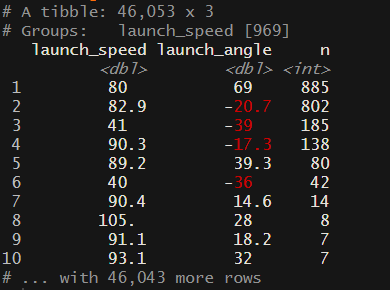
From this screenshot, we seem to have about five groups (you could argue that there are more) groups of launch speed and launch angle that have way more combinations than might be expected. There are better ways to clean this up, but for this exercise, I am going to reduce the number of data points to 35 (randomly selected) points for the combinations with 80 or more data points. The reason for doing this is when we create our mesh in the next step, if we have large clusters of data it becomes difficult to create an even mesh.
# randomly sample 35 points from each of these combinations of launch_speed and launch_angle
temp <- df %>%
  dplyr::filter(launch_speed == 80 & launch_angle == 69 |
  launch_speed == 82.9 & launch_angle == -20.7 |
  launch_speed == 41 & launch_angle == -39 |
  launch_speed == 90.3 & launch_angle == -17.3 |
  launch_speed == 89.2 & launch_angle == 39.3) %>%
  group_by(launch_speed, launch_angle) %>%
  sample_n(35)

# remove all combinations where the values are likely more than expected
df <- df %>%
  dplyr::filter(!(launch_speed == 80 & launch_angle == 69 |
  launch_speed == 82.9 & launch_angle == -20.7 |
  launch_speed == 41 & launch_angle == -39 |
  launch_speed == 90.3 & launch_angle == -17.3 |
  launch_speed == 89.2 & launch_angle == 39.3))

df <- bind_rows(df, temp)

# now those 5 grouping that had a lot of observations are all dropped to 35 points in each bin
df %>%
  dplyr::filter(!is.na(launch_speed) | !is.na(launch_angle)) %>%
  group_by(launch_speed, launch_angle) %>%
  tally %>%
  arrange(desc(n))
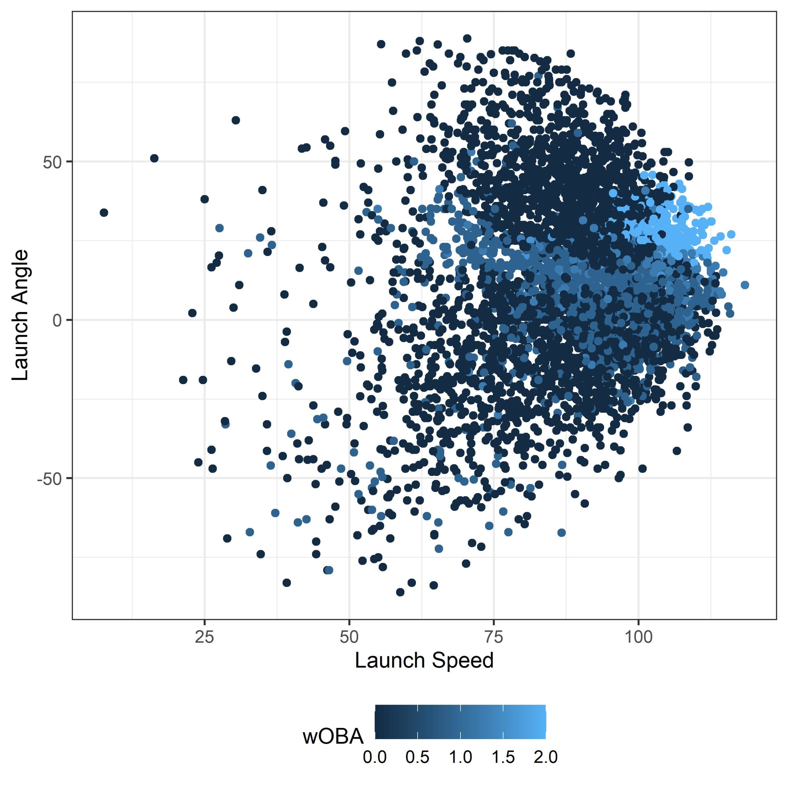
Step 2: Visualize The Data
Now we need to get a sense of what we’re working with. If you run the following code, your output graph should look something like what I’ve got below. Since we are randomly choosing 5000 data points (for the sole reason of plotting speed) whatever you are looking at might be slightly different, but should have the same general pattern.
# Let’s do a quick visualization of the data
df %>%
  sample_n(5000) %>%
  ggplot(., aes(launch_speed, launch_angle, col = woba_value)) + geom_point() +
  scale_colour_gradient() + xlab("Launch Speed") + ylab("Launch Angle") +
  labs(colour = wOBA) + theme_bw() + theme(legend.position = "bottom")
Step 3: Creating The Model
INLA is a really powerful technique that approximates Bayesian inference much faster than algorithms such as Markov chain Monte Carlo. It allows for fitting geostatistical models via stochastic partial differential equation (SPDE), two really good online resources are these two gitbooks: spde-gitbook and inla-gitbook.
Fitting a spatial model in INLA requires a set of particular steps:
- Create a mesh to approximate the spatial effect
- Create a projection matrix to link the observations to the mesh
- Define the stochastic partial differential equation (SPDE)
- Define the spatial field
- Create and combine the stacks
- Fit the model
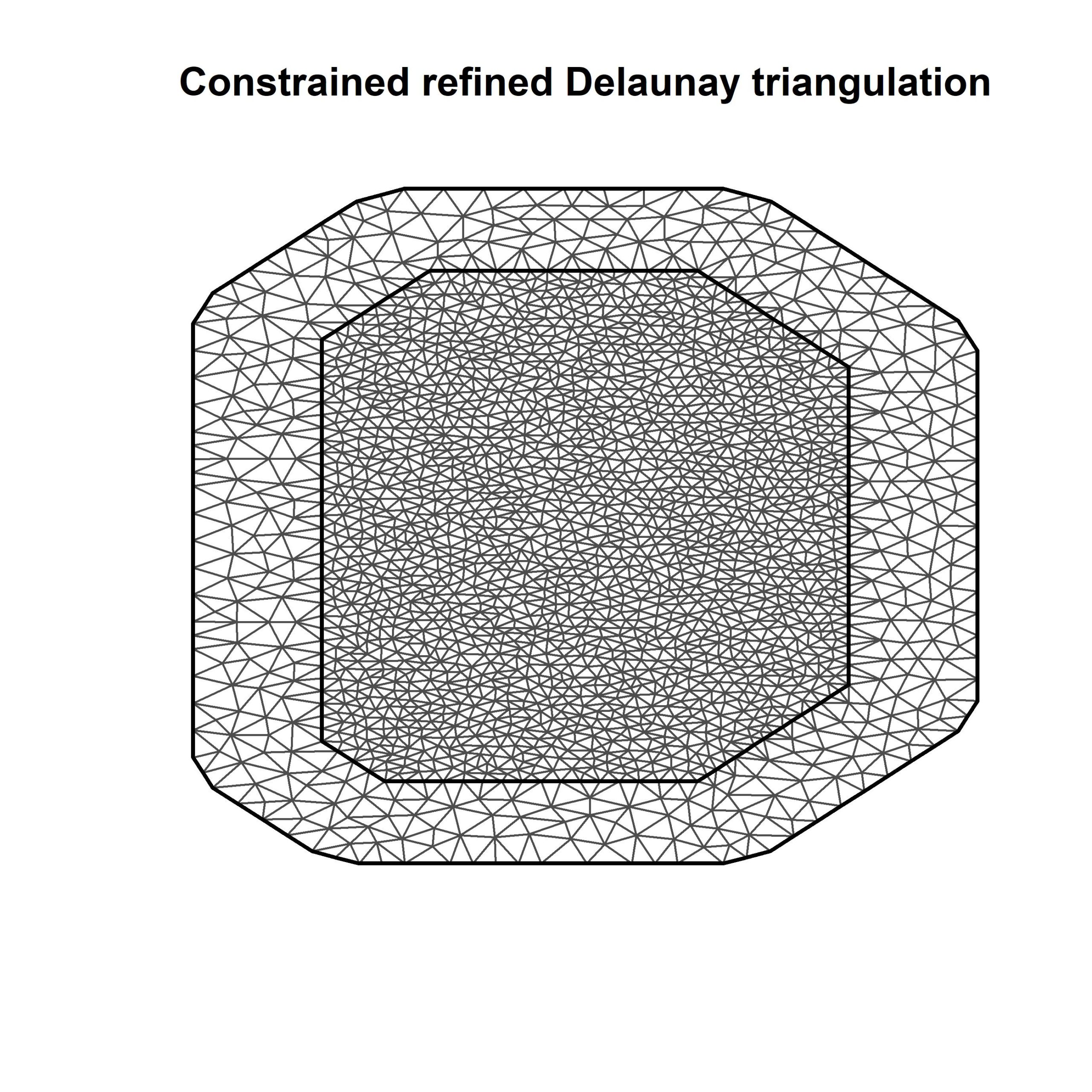
This first step is probably the most important. The mesh that we are going to develop is the heart and soul of this model. To keep it simple, INLA uses the mesh (and a lot of background calculations) to analyze point referenced data (in our case launch speed on the X and launch angle on the Y). While the model is running all of the calculations, one thing it is doing is estimating the practical range of the spatial process. What does that mean? Well, basically, points that are closer together in space will be more similar than points that are further apart. Think of it this way, if we have 3 batted balls which 2 do you think would be more similar? (1) EV of 110 mph, LA of 35 degrees, (2) EV of 80 mph, LA of 10 degrees, (3) EV of 105 mph, LA of 35 degrees. 1 & 3 right? INLA will use points that are closer together to inform the final result.
Enough of that, let’s get back to the code.
Part 1: Create the mesh
# Step 1. Create the mesh
max.edge <- 3
locs <- cbind(df$launch_speed, df$launch_angle)

mesh <- inla.mesh.2d(loc = locs, max.edge = c(4, 12), cutoff = 3)

# let’s see how many nodes our mesh has
mesh$n
# the one I've created here has ~1900. For model testing purposes you should aim for 800-900

# So what is a mesh? Let’s plot it out and see
plot(mesh)

# if you'd like you can also add points to the mesh that show the launch speed and launch angle to show what the mesh is actually doing
#points(df$launch_speed, df$launch_angle, pch = 19, col = 2)
Part 2: Define the projector matrix
# Step 2. Define the weighting factors a_ik (also called the projector matrix).
A <- inla.spde.make.A(mesh = mesh, loc = locs)
Part 3: Define the SPDE
For this part, we are just trying to give the model some prior information. Above we created a mesh for the model and we used launch speed for the “x” and launch angle for the “y” dimension. For simplicity, we are going to use uninformed priors, where the code below will be telling the model that there is a 50% chance that the range of the data (i.e., the vector of launch speed and launch angle) is less than 50 (so there is also a 50% chance that the range is greater than 50). If you dig start digging into the literature there is a lot of information on this topic.
# Step 3: Define the SPDE
spde <- inla.spde2.pcmatern(mesh,
                            alpha = 2, ### give it some flexibility # https://groups.google.com/g/r-inla-discussion-group/c/ZhZVu8YPI8I/m/pUUWL1UZBAAJ
                            prior.range = c(50, 0.5), ### P(practical.range < 50) = 0.5
                            prior.sigma = c(1, 0.1), ### P(sigma > 1) = 0.1
                            constr = FALSE)
Part 4: Define the spatial field
# Step 4. Define the spatial field
s.index <- inla.spde.make.index(name = ’spatial.field', n.spde = spde$n.spde)
Part 5: Create the stacks
To make our prediction stack more simple, we are going to use the coordinates from our mesh (the points where the points of the triangles meet up) for our xwOBAcon output
# First: Stack for model inputs
stk.fit <- inla.stack(
                      tag = 'fit',
                      data = list(Y = df$woba_value, link = 1),
                      A = list(1, 1, 1, 1, A),
                      effects = list(intercept = rep(1, nrow(df)),
                      team = df$home_team,
                      s.index))

# Second: Stack for predictions
stk.pred <- inla.stack(
                       tag = 'pred',
                       data = list(Y = matrix(NA, nrow = ncol(A)), link = 1),
                       A = list(1, 1),
                       effects = list(intercept = mesh_locs$intercept,
                       s.index))

# combine the stacks
stk.all <- inla.stack(stk.fit, stk.pred)
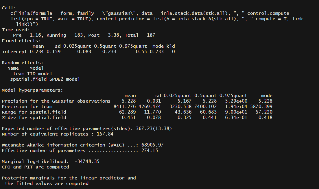
Part 6: Fit the model
Now we finally get to the part where we can fit the model, and I sure hope you’re still with me. A really neat thing about INLA is that it is pretty simple to include random effects in the models. What the heck do I mean about a random effect? Well in this case we can include the home team as a random effect, as in we can see how or if home park affects wOBAcon.
form <- Y ~ -1 + intercept + f(team, model = "iid") + f(x, model = spde)

mod <- inla(form, family = "gaussian",
            data = inla.stack.data(stk.all),
            control.predictor = list(A = inla.stack.A(stk.all), compute = T, link = link),
            control.compute = list(cpo = TRUE, waic = TRUE))
We’ve finally run our model! You can see a summary of the model using summary(mod). You can start digging into the literature to get a sense of what everything means, as I won’t go into that here. But remember in step 3 when we defined the SPDE and used uninformed priors ...prior.range = c(50,0.5)... The range in my output has a mean of 62.3 and a standard deviation of 11.8. If you wanted to test the strength of your priors you could update the code in part 3 to something like ...prior.range = c(50,0.05)...(setting is so that you think there is only a 5% chance that the range is less than 50) and this would tell the model that you have a strong belief that the range is greater than 50.
Let’s take a look at the model summary:
summary(mod)
Step 4: Plotting the Model Results
One middle step here is to ignore the points that aren’t in the range of observed launch speed and launch angles from the data. First, we will create a convex hull around the data points, and then using the convex hull we remove all predictions outside of that polygon. NOTE: You could ignore this step. It just makes for a nicer final plot with the xwOBAcon predictions.
i.x <- inla.stack.index(stk.all, tag = "pred")$data
prop <- matrix(mod$summary.fitted.values$`0.5quant`[i.x], spde$n.spde)
proj <- inla.mesh.projector(mesh, dims = c(300, 300))
field.proj <- inla.mesh.project(proj, prop)
loc <- expand.grid(proj$x, proj$y)
colnames(loc) <- c("x","y")
loc$z <- as.vector(field.proj)
hpts <- chull(df$launch_speed, df$launch_angle)
hpts <- c(hpts, hpts[1])
poly <- df[hpts,1:2] %>%
dplyr::rename(x = launch_speed, y = launch_angle)
mesh_locs <- data.frame(X = mesh$loc[,1], Y = mesh$loc[,2])
xx <- GEOmap::inpoly(loc$x, loc$y, POK = list(x = poly$x, y = poly$y))
loc <- loc[xx == 1,]
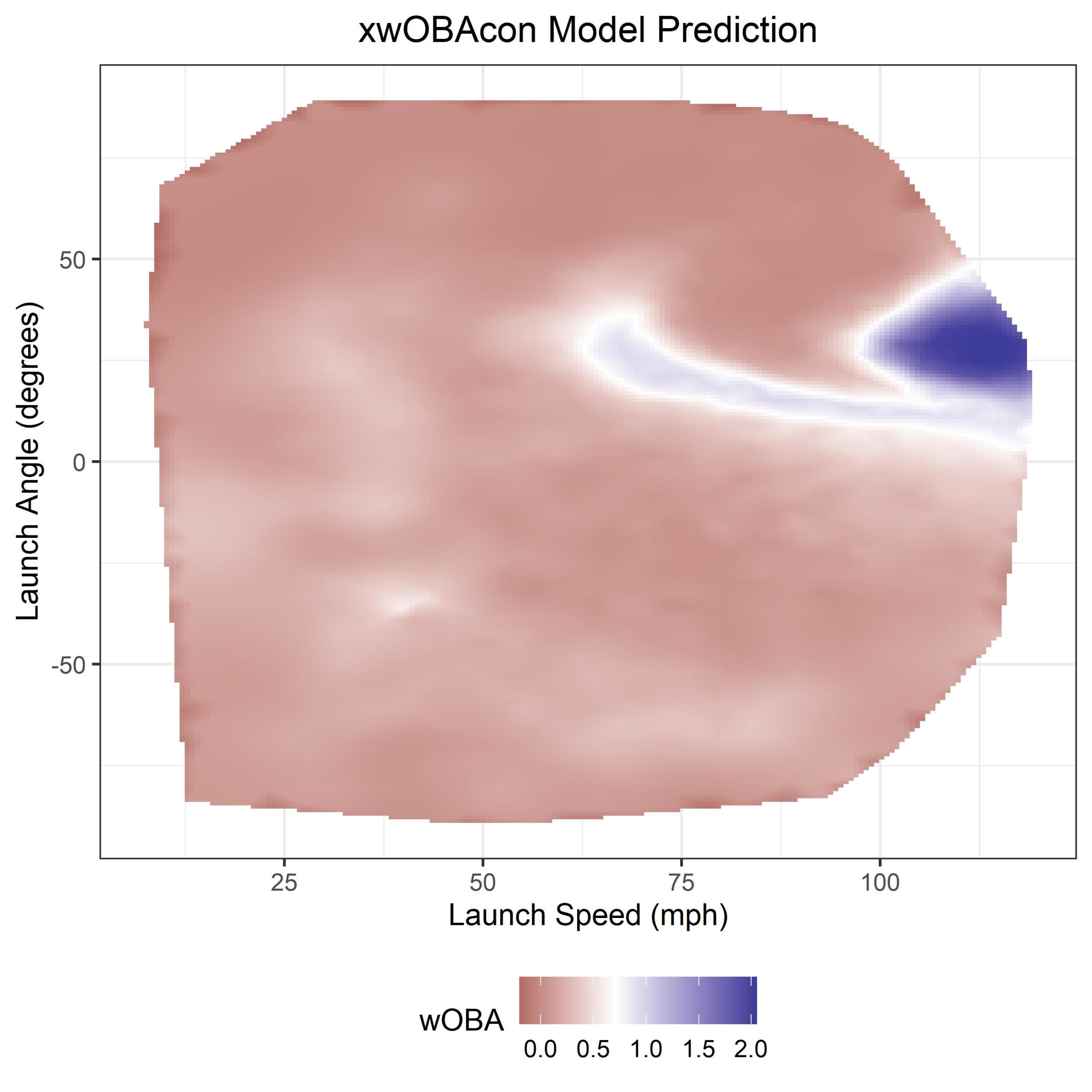
ggplot() +
geom_tile(data = loc, aes(x = x, y = y, fill = z)) +
xlab("Launch Speed (mph)") + ylab("Launch Angle (degrees)") +
scale_fill_gradient2(midpoint = 0.7) + theme_bw() +
ggtitle("xwOBAcon Model Prediction") +
labs(fill = wOBA) + theme(legend.position = "bottom",
plot.title = element_text(hjust = 0.5))
And voila! we finally have our xwOBAcon predictions. If you take a look at this fantastic blog post on the MLB website you’ll see that this output looks very similar to theirs.
Now we get to the final section of this exercise, we’ll explore the output of our random effect (park effect) from the model. By running the following code, you should get roughly the same output as below.
# park factors
# now we can look at how home team (ie the park) affects xwOBA
mod$summary.random$team %>%
  arrange(`0.5quant`) %>%
  mutate(ID = factor(ID, levels = ID)) %>%
  ggplot(., aes(`0.5quant`, ID)) + geom_point() +
  geom_errorbarh(aes(xmin = `0.025quant`, xmax = `0.975quant`)) +
  ylab("Home Team Park") + xlab("Relative Park Effect") + theme_bw()
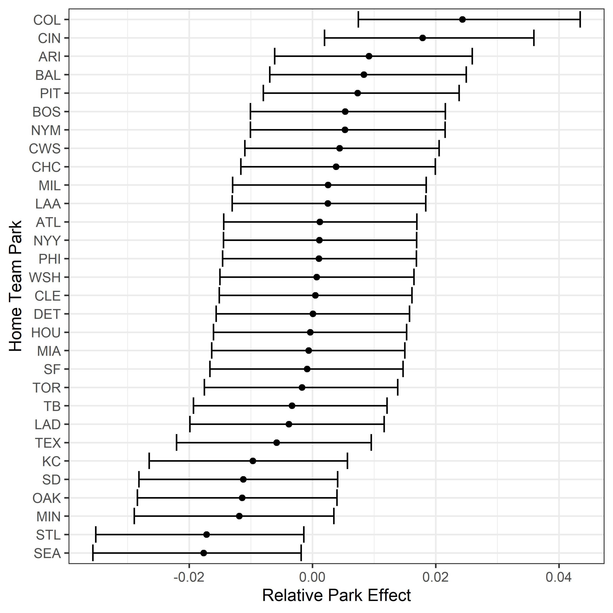
There are lots of other random effects that you could explore with this method too. Instead of using the home team (park), you could try looking at years to model changes in the baseball. We know that the ball has been tinkered with over the years, and by including year as a random effect you could quantify the effect and compare differences between years. You could also look within a single year and run a model by month to see if there is any seasonal effect (I’m looking at you Dodger stadium) on batted ball outcomes.
