


The aesthetic look for Pitcher List that you’ve come to know was a bit of an accident. Truth be told, I had only been designing for two years when I was hired as a graphic designer for Pitcher List. My graphic design hobby had started as a way to keep me occupied during my daily three-hour commute in and out of New York City. In fact, I had just purchased Photoshop the month that Nick Pollack hired me to work here. Imagine, a graphic designer that didn’t even know how to use Photoshop. Who says you can’t accomplish anything in America?
Jumping in, there was not really a set agenda for how I would contribute nor any direction at what the featured images should look like. We had a few stock headers for recurring articles like the Injury Report, but that was it. As a newcomer to graphic design, my goal was to push myself to make interesting images that looked cool and showcased our Going Deep writers. I never imagined that these featured images would become a draw for readers and a differentiating component for the site. So much so that the 5.0 site redesign was done in part to show off these featured images. We now aim for all (or at least most) of our articles to have a custom graphic.
Since that initial lift-off, the Graphics Team has expanded to eleven bonafide designers, not including some other incredible design talents that have passed through. All of these designers came equipped with way more experience and talent than I could ever imagine. Over the past two and a half years, this team has collectively contributed over 2,300 images to adorn your favorite articles. The best part is that the initial creative spirit has continued, as the designers have free reign to experiment and try new things aesthetically.
With that said, we thought it was time to provide a space for each of the designers to highlight their favorite image produced in the previous month. You can expect this to be a monthly contribution going forward.
Here are the designer’s favorite images for the month of May 2021:
JR Caines
Photos by Juan DeLeon/Icon Sportswire, Marianne O’Leary/Flickr, Rick Briggs/Flickr | Design by J.R. Caines (@JRCainesDesign on Twitter and @caines_design on Instagram)
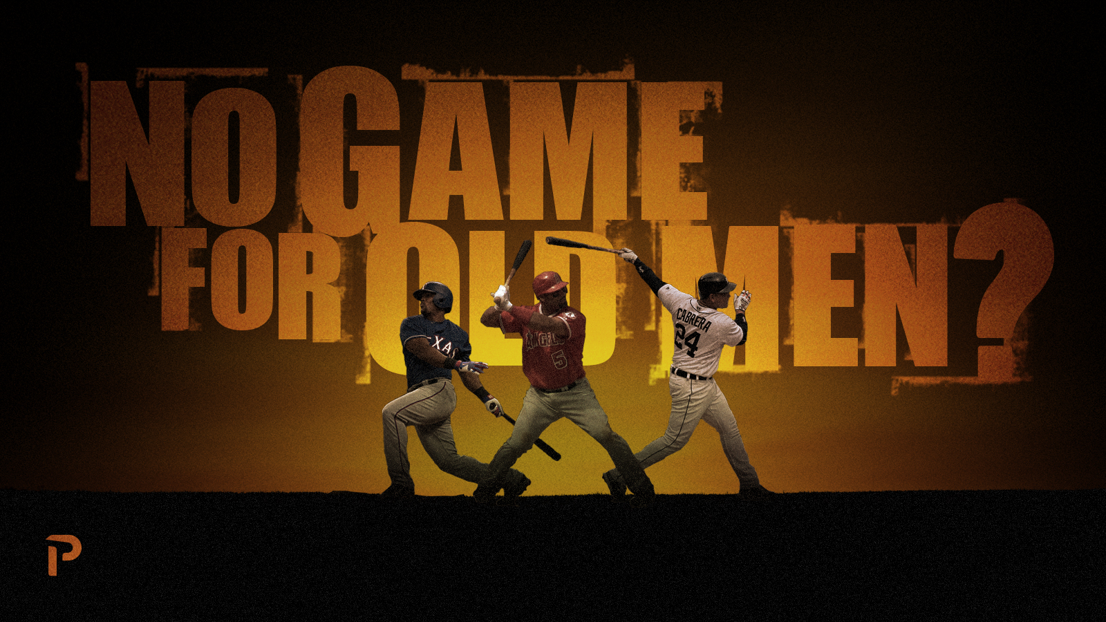
From: No Game for Old Men? by Carlos Marcano
Background from JR: It is obviously a spoof of No Country for Old Men. The first version had an image of Albert Pujols in the background similar to the eerie face of Anton Chigurh in the movie poster. But, I decided there was just too much going on and simplified it down to what you see here.
Doug Carlin
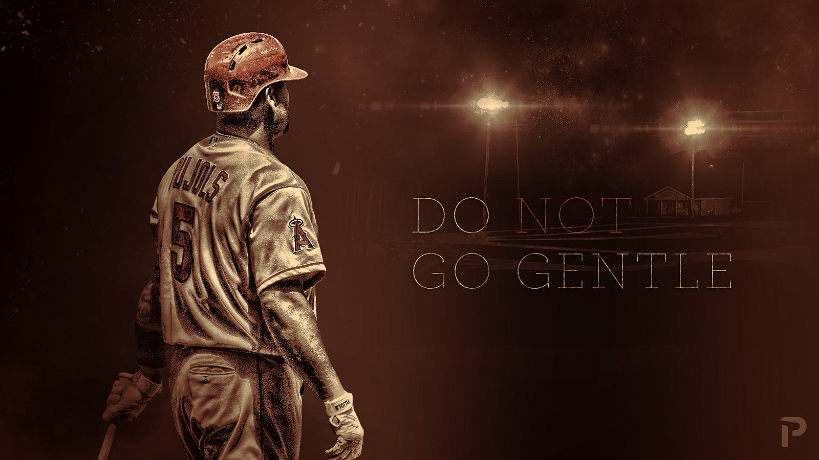
Photo by Erik Drost Flickr/Wikimedia Commons | Adapted by Doug Carlin (@Bdougals on Twitter)
From: Do Not Go Gentle by Daniel MacDonald
Background from Doug: This is my favorite for May. Daniel MacDonald had asked for a graphic for his article about aging gracefully in baseball. Daniel looked at a few high-profile players over the last few decades who have either aged out of baseball gracefully and those who haven’t. Albert Pujols had just been released, so he was the obvious choice to be featured. This image shows Albert, raging against the dying of his career, looking out on an uncertain and semi-apocalyptic landscape. Inside info: he’s looking at the Field of Dreams.
Quincey Dong
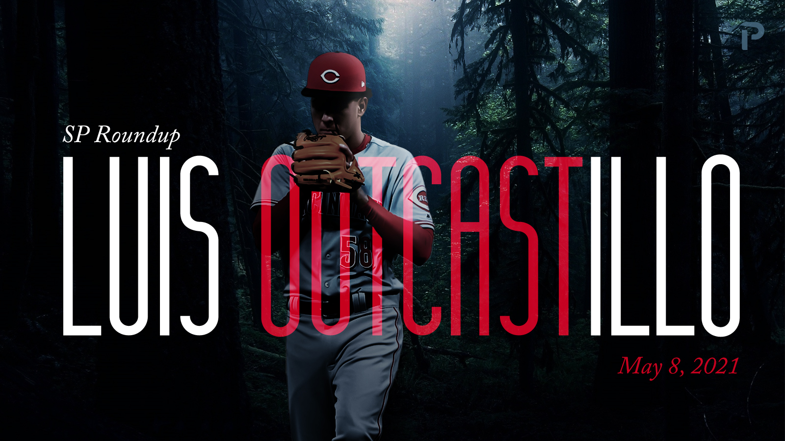
Photo from Nick Wosika/Icon Sportswire | Design by Quincey Dong (@threerundong on Twitter)
From: SP Roundup: Luis OutCastillo by Nick Pollack
Background from Quincey: When I think of an outcast, I think of someone who is ostracized from society. I thought “alone in the forest” represented this well. I also thought that this scene symbolizes how Castillo must feel on the mound these days, lost and alone. I like this choice of font, as it gives the graphic an added sense of tension.
Ethan Kaplan
Photos by Dustin Bradford/Icon Sportswire, NeonBrand/Unsplash, Chris Chow/Unsplash | Adapted by Ethan Kaplan (@DJFreddie10 on Twitter and @EthanMKaplanImages on Instagram)
From: Translating Prospect Tool Grades into Big League Results-Pitching by Andrew Krutz
Background from Ethan: When I went into the design process, I didn’t have much of an idea of what I wanted to do, but I’d been looking for an excuse to try out the player outline around an image effect. I’ve seen it on movie posters and always thought it was really cool. I wanted to hit the “tools” element hard, and then found a great overhead shot of a stadium for the background. From there, it was finding great fonts, and voila, there you go.
Nick Kollauf
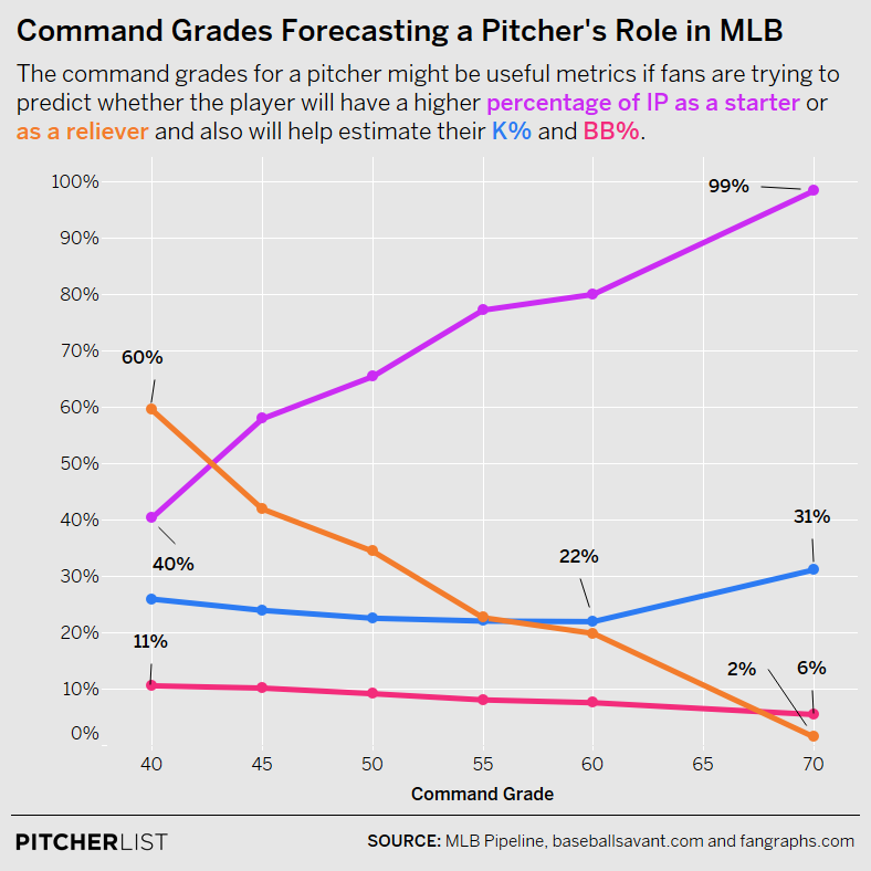
Data Visualization by @Kollauf on Twitter
From: Translating Prospect Tool Grades into Big League Results-Pitching by Andrew Krutz
Commentary from Justin: Nick was not available to choose his favorite of the month, so I have the pleasure of doing it for him. In case you did not know, Nick provides valuable data visualizations that sit inside our articles. They add a heap of professionalism to the article and help the writers demonstrate their points visually. This chart very clearly displays how important the command grade is in projecting MLB starters versus relievers. It completely will change the way that I consider prospect command grades from now on. That is the hallmark of an effective graphic.
Michael Packard
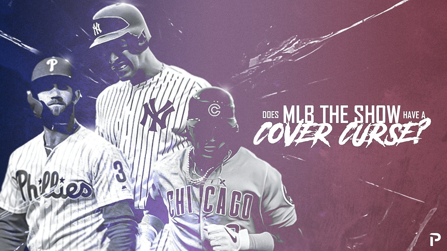
(Photos by Kyle Ross & Mark Alberti/Icon Sportswire | Design by Michael Packard (@designsbypack on Twitter @ IG)
From: Does MLB the Show Have a Cover Curse by Samuel In
Background from Michael: Any time I get to use an image of an upset Yankee star, I get excited. This graphic was created using elements from the MLB The Show covers and putting a ‘bad luck’ twist on it. The typography and color scheme are my two favorite things from this piece.
Justin Paradis
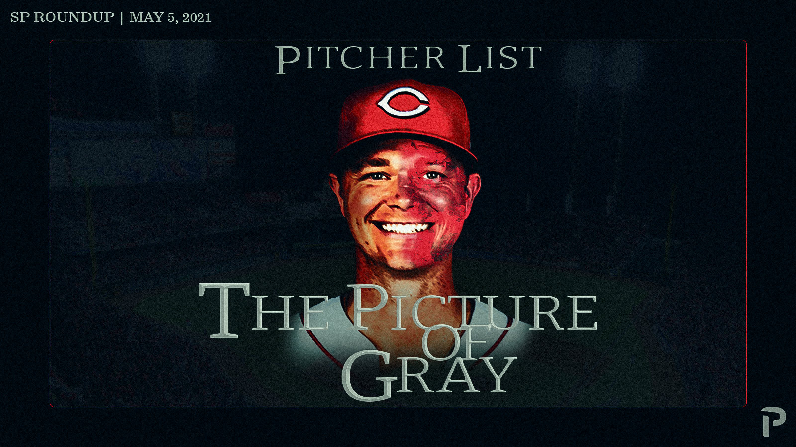
Featured image by Justin Paradis (@JustParaDesigns on Twitter)
From: SP Roundup: The Picture of Gray by Nick Pollack
Background from Justin: The SP Roundup is a wildcard every night. Just as Nick writes up each start late at night, the designer comes up with a new concept based upon the (predominately) clever puns showcasing one of the top or bottom pitchers of the day. On May 5th, Nick came to me with the title, “The Picture of Gray,” based on the Oscar Wilde book The Picture of Dorian Gray. For the uninformed (and as a cultured man, I in no way had to look up the plot), the book is about how a man sells his soul for eternal youth all the while his portrait painting ages and records his sinful deeds. This premise made for an interesting design.
I guess that is what happens to your portrait when you have a line like this: 7.0 IP, 0 ER, 2 Hits, 2 BBs, 8 Ks. Are we sure Sonny didn’t sell his soul after leaving the Yankees?
James Peterson
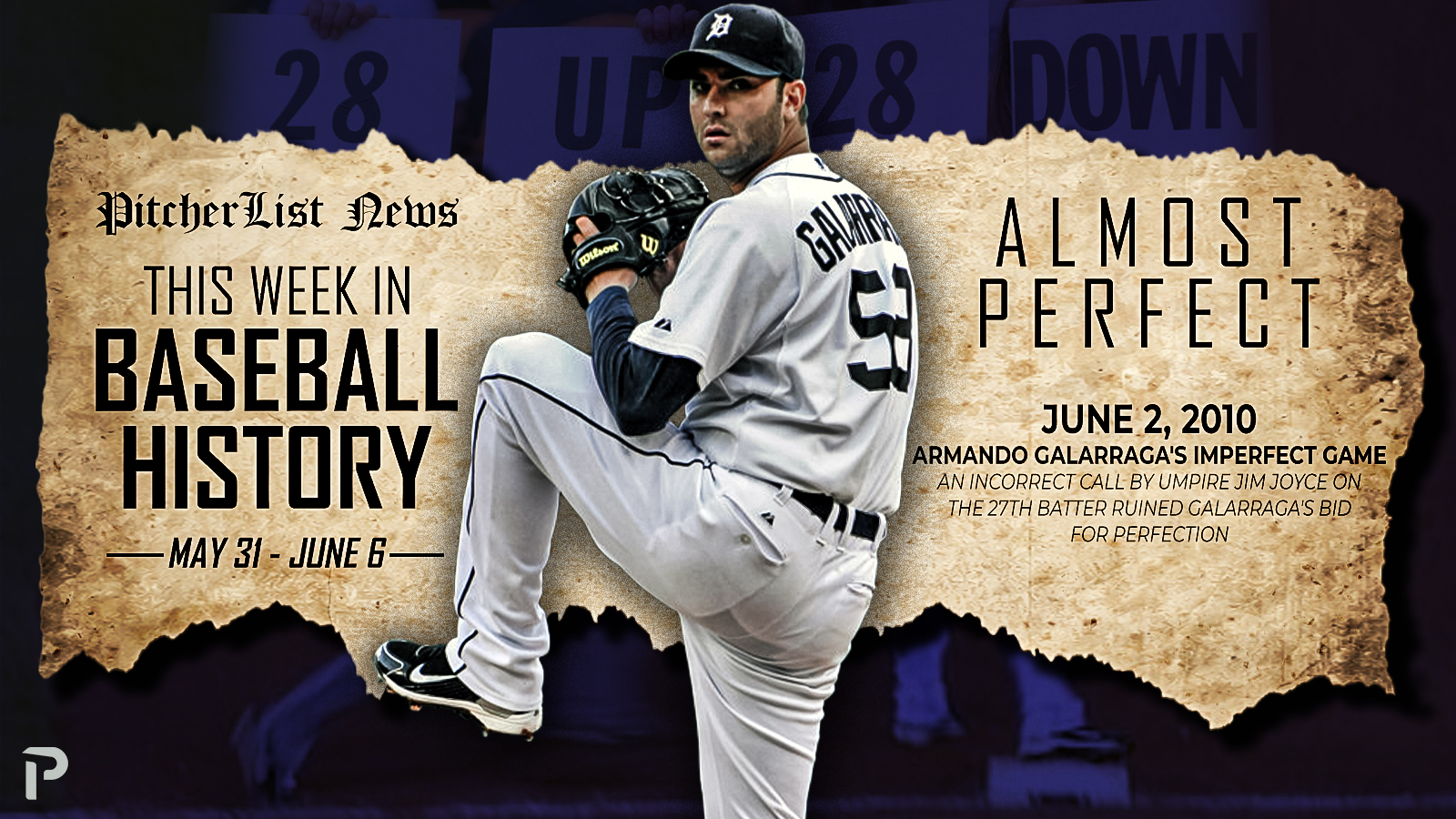
Photo by Icon Sportswire | Feature Graphic Designed by James Peterson (Follow @jhp_design714 on Instagram & Twitter)
From: This Week in Baseball History by Alex Kleinman
Background from James: Every week Alex Kleinman requests a graphic for his “This Week in Baseball History” article and for this particular week I went with Armando Galarraga. There were a few other notable events that occurred, but this one stood out to me the most because I remember watching this live on TV and the class Galarraga showed after the game and the next day was very impressive. I included the 28up/28down sign that was very prominent over the next few days at the stadium and also included the actual first base shot at the bottom of the graphic.
Aaron Polcare
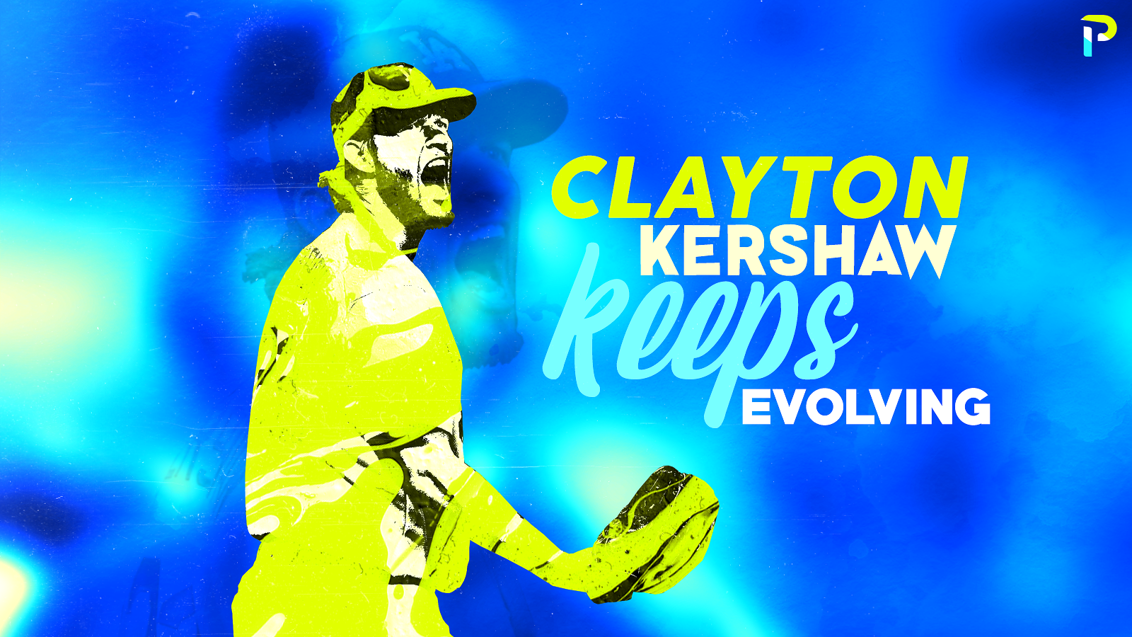
Photo by Jon Durr/Getty Images | Adapted by Aaron Polcare
From: Clayton Kershaw Keeps Evolving by Zach Hayes
Background from Aaron: I volunteered to design this graphic for Zach mainly because Kershaw is the ace of my staff in my dynasty league. I have a running joke with Pitcher List Writer Vinny Ginardi that anyone I do a graphic of gets a little bump for a few games (Fun fact: Kershaw pitched 7.2 innings of 1 run ball the day after the article was released).
I liked this graphic the most out of my May graphics because my style is usually messy or grungy. But, with this one, I kept it fairly clean. Pair that with the text styling that I absolutely love and you get a 7.2 inning, 6 strikeout quality start type of graphic.
Justin Redler
https://gfycat.com/smugillegalgrouse
Image by Justin Redler (@reldernitsuj on Twitter)
From: Pitcher List Twitch Stream
Background from Justin: It has been awesome to work with Nick to try to create motion graphics that make his Twitch streams stand out. One small detail on this GIF, the base path animation is synced up to the countdown to complete a revolution every 15 seconds. There is more to come with this project, which is going to be a lot of fun to make.
Jake Roy
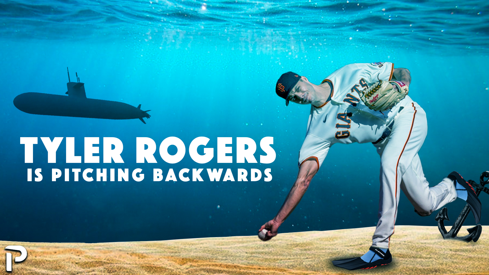
Photo by Bob Kupbens/Icon Sportswire | Adapted by Jacob Roy (@jmrgraphics3 on IG)
From: Tyler Rogers is Pitching Backwards by Michael Ajeto
Background from Jake: I think my best graphic of the month is my Tyler Rogers graphic for Michael Ajeto’s article. My first thought was to have him pitching in a mirror of some sort to play off the “Backwards” part of the article, but when I saw the photo of his delivery, I knew I had to put him underwater.
That wraps up May 2021. Did we miss your favorite image from the month? Let us know in the comments.
Photos by Icon Sportswire | Main Featured image design by Michael Packard (@designsbypack on Twitter @ IG)
The custom images on Pitcher List are hands down, unequivocally S Tier.
Framber time! Just glad you found hammer pants that fit the pitch delivery
…or did someone have to model for that?
There were no images that matched Framber’s delivery. But oh, we have our ways. Glad you enjoyed it!
Framber Time was my favorite, matched the pants to the stride, just absolutely glorious!
The design team is top notch – people-getting-poached-by-other-places good