


While there are hundreds of combinations of ways to analyze hitters, there are good ways, and there are less-good ways. Some methods of analysis are more predictive and reliable than others. To avoid beating a dead horse, I refer you to Colin Charles and Scott Chu’s advanced statistics article, but we will go over several of the statistics that they’ve outlined. For brevity, we will give quick and easy reasons for using some statistics as opposed to others, but if you want a more fleshed-out explanation for them, feel free to check out their article or leave a comment.
Starting Point
Often, the first things to look at are how good the player is on the surface. For starters, that should require a quick glance at FanGraphs and Baseball Savant. For the former, you can start with very surface-level information: What is the player’s walk percentage, strikeout percentage, ISO, wRC+, and BABIP? That addresses some information very quickly—very grossly, what is their level of plate discipline? How much raw power are they displaying? How do they compare when adjusted for park factors and to the league? Is there anything wonky in the luck department (i.e., is it sustainable?).
On Baseball Savant, the idea is similar, but there are more options. We’ll look at the Statcast sliders that pop up right away on player pages. Let’s take a look at the sliders for Mike Trout, which are always obscene:
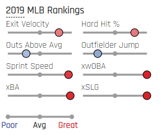
Here, we can see that Trout grades out extremely well as a hitter and baserunner. If you hover over the sliders, you will find that he ranks in the 100th percentile in xwOBA and xSLG, and 95th and 98th, respectively, in sprint speed and xBA. As for exit velocity and hard-hit percentage, there are less gaudy at the 80th and 81st percentiles, but these tell you right away that Trout is as good as they come.
But not everyone is Trout. Let’s take a look at a breakout player in Marcus Semien:
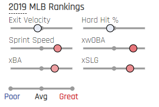
As you can see, Semien’s exit velocity and hard-hit numbers are a touch below 50th percentile (i.e., average), but his expected statistics are well above average nonetheless. His wOBA (.373) and xwOBA (.362) are relatively congruent, and so if we’re talking broad strokes—remember, we’re trying to get a surface-level look at players thus far—we feel OK about Semien as a legitimate breakout candidate.
Using Statcast Wisely
There are good ways to use Statcast, and there are misled ways of using Statcast. First, it is important to know that Statcast metrics are more descriptive (or reflective, as our own Dan Richards puts it) than they are predictive. In other words, many expected statistics are good at describing what happened, but they’re not as good as predicting what will happen. However, it is important to note that xwOBA is significantly more descriptive and predictive for hitters than pitchers—even in smaller samples. This is somewhat intuitive, as it is easier for hitters to consistently create hard-hit balls than it is for pitchers to suppress hard contact. In any case, since xwOBA is based on launch angle and exit velocity, it makes sense that it is descriptive (i.e., looking at what happened) as opposed to predictive (i.e., looking at what will happen).
And so, some statistics are better than others. For example, barrel percentage is good—however, it is important to note that Brls/BBE% appears to be ever so slightly stickier year-to-year than Brls/PA% at predicting power. Perhaps underutilized, xwOBAcon (expected weighted on-base average on contact) predicts wOBA better for hitters year-to-year than both wOBA and xwOBA. This is because xwOBA takes strikeouts and walks into account (which aren’t always stable year-to-year), while xwOBAcon only takes batted balls into account.
Stay away from averages! In terms of average exit velocity, if I have one hitter who hits a ball 110 mph and 70 mph, and another who hits 90 mph and 90 mph, give me the first player. As opposed to average exit velocity, average exit velocity on fly balls and line drives (FB/LD exit velocity) can actually be very useful. This can be found on the Baseball Savant leaderboards, which is very east to find. However, these can’t be sorted directionally (e.g., pulled FB/LD exit velocity). Thankfully, this can be done with Baseball Savant’s search tool, which is a more versatile tool. Although I can’t find a more current graphic, FB/LD exit velocity correlates well with power, as it filters out ground balls and pop-ups (which reduces noisiness) and looks to see if hitters are making hard contact with the ball when they’re lifting it in the air.
Maximum exit velocity can also be useful too, namely for young players or prospects with limited sample sizes. It’s not as predictive of same-season HR/FB, ISO, or hard-hit percentage as average exit velocity, but it’s a nice, cheap way of looking at a player’s potential in terms of hard contact. This is a good tool to use for players who are only up for a short cup of coffee before the end of the year. For examples from this season, think Kyle Lewis, Gavin Lux, or Kyle Tucker. You may notice, though, that FB/LD exit velocity is superior in all three categories to average exit velocity, so if you think you’ve got a sufficient sample (perhaps 100 batted-ball events will do the trick), use that!
Staying with the theme of avoiding averages, average launch angle is even less helpful, in my opinion, than average exit velocity. Similar to average exit velocity, think of it like this: Player A hits two balls at 50 degrees and -10 degrees, while Player B hits two balls at 30 degrees and 10 degrees—both have the same average launch angle. Of course, most players are not as extreme as Player A, but with or without taking exit velocity into account, give me Player B every time.
Instead, there are a few options. First, looking at the mix between ground-ball rate and fly-ball rate. There is no one mix that we want all players to have, but too many fly balls (i.e., >50%) and too many ground balls (i.e., >45%) is a bad thing. (Also, are they hitting a lot of pop-ups?). Second, looking at the launch angle distribution visually can be helpful. This also gets at the point I just brought up—essentially, what we are looking for is: Are players hitting a lot of pop-ups or ground balls, or are they consolidating their batted balls into less-polar launch angles?
To this point, here is a GIF of Corey Seager, Teoscar Hernandez, and Christian Yelich’s launch angle distributions at the same point this past season:
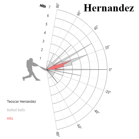
While there are similarities, I used this graphic as a way to show that they are three very different players, and even though their average launch angle was the same, their distributions showed differences that their averages cannot. You can find these charts in Baseball Savant’s search tool, or by going to a specific player page, clicking the Statcast tab, and clicking on any yearly launch angle.
Another example:
| Launch Angle | ISO | GB/FB | PU% | wOBA | xwOBA | |
|---|---|---|---|---|---|---|
| Peter Alonso | 14.8 | 0.323 | 0.98 | 5.52% | 0.384 | 0.374 |
| Ramon Laureano | 14.8 | 0.233 | 0.91 | 3.14% | 0.356 | 0.342 |
| Daniel Murphy | 14.8 | 0.174 | 1.1 | 3.25% | 0.328 | 0.290 |
As you can see, by launch angle, these players were exactly the same, but other than that, they weren’t very similar players. We’ve got a 50-home run player, a speed guy with sneaky power, and an aging slugger whose best days are far behind him. You’ll notice that their GB/FB mixes all differ by about 10 points, ISO shows that they vary significantly in raw power, and by wOBA and xwOBA they all differ in overall production. If there’s one thing you take away from this section, it’s that average launch angle and average exit velocity—while they have their uses—are very crude. It’s not an apples-to-apples comparison, but imagine if we used average pitch velocity to analyze pitchers. We wouldn’t!
Substantive Changes
After viewing these metrics, we want to ask ourselves a very simple question: Is this player changing? Are their skills substantively different from before, or is it a mirage?
One thing we can do is look at FanGraphs’ rolling graphs. There are several accounts on Twitter that are constantly doing this, and it’s a nice way to see visually how a player is trending in different areas over time. Baseball Savant has its own version too, but it is much more limited (i.e., it cannot use multiple statistics at once), although it offers several statistics that FanGraphs does not. One thing to note here is that we can fall into the trap of believing changes are real, even when the period of change has been short. Keep in mind that regression and reversion are always feasible—cautious optimism, my friends!
Looking at Dan Vogelbach, we can quickly observe a few changes, via Baseball Savant. First, the opposition’s pitch mix:
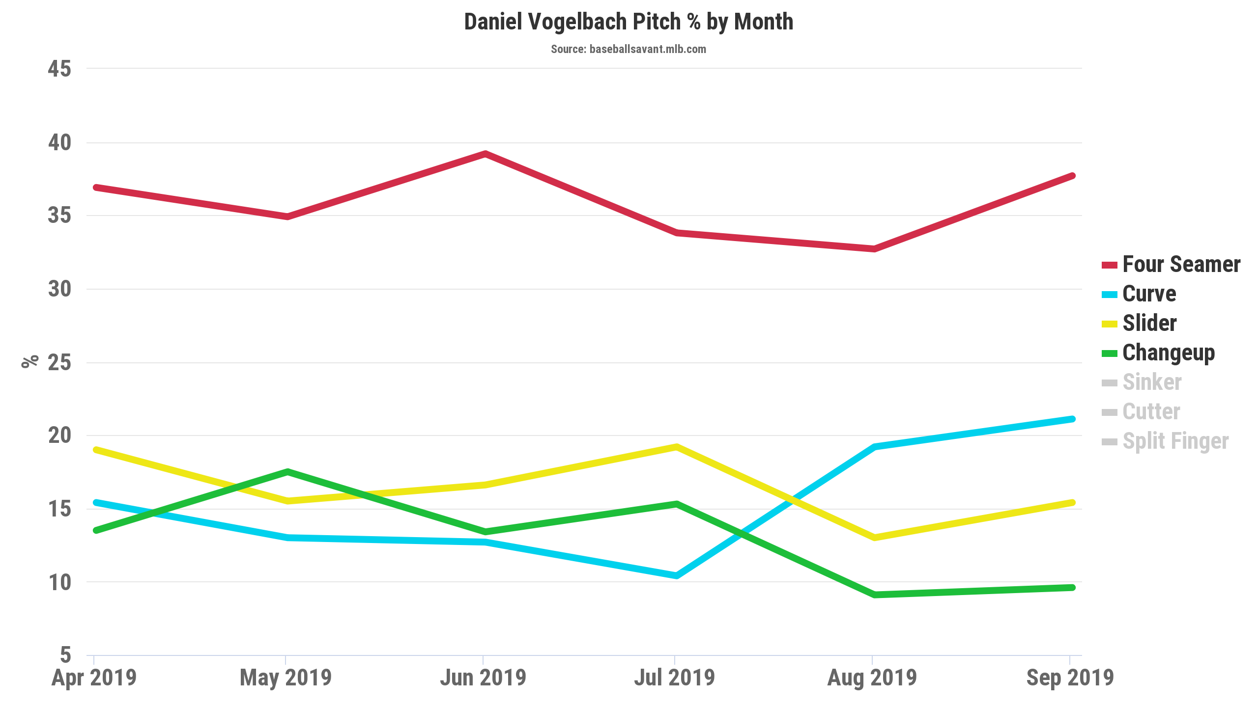
We can see that pitchers started to throw Vogelbach more curveballs, while slightly tampering slider and changeup usage. During this same time frame, he also started to struggle mightily against fastballs for the first time all year:
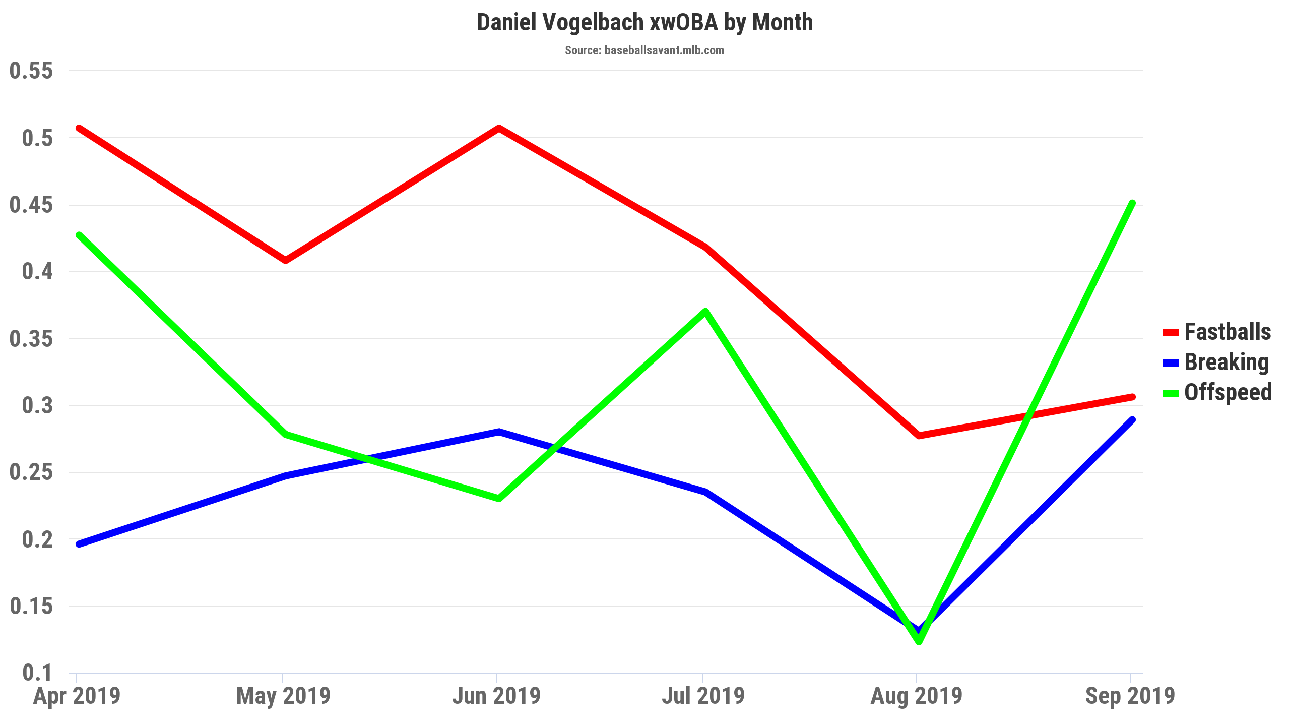
Another way of looking at changes over time is by using FanGraphs’ game logs (or Baseball Savant’s search tool!). Comparing between March through July and August through September, we see Vogelbach’s swing percentages remain stable, his contact percentages plummet, and his swinging-strike percentage rise. Comparing his batted balls in the same time frames here and here, we see more vast changes. Ground balls way up, line drives and fly balls down, and pull percentage way down—all of which are very bad.
Opposing Approach
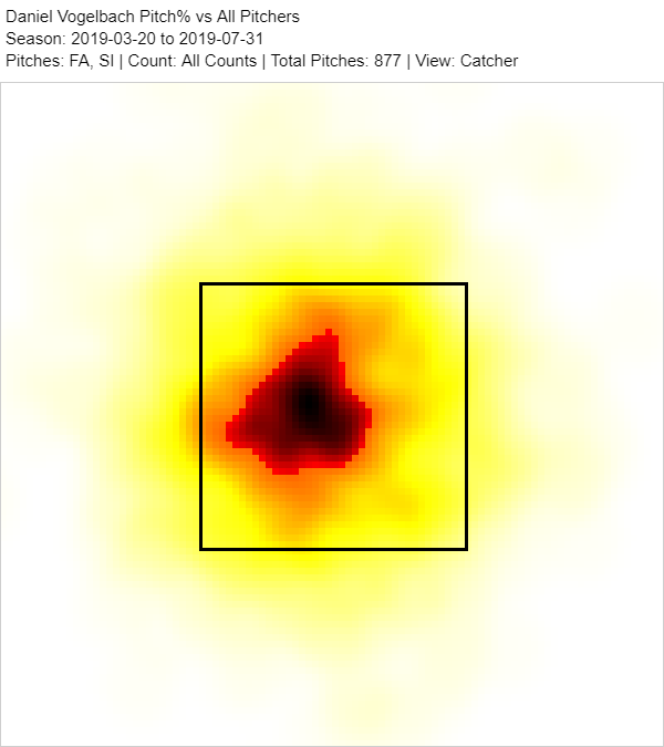
After identifying some changes (or lack thereof), we can then look to see how if the changes are coming not from the player, but from the league. One thing I like to do is look at heat maps.
Here’s how Vogelbach was pitched fastballs through July:
And here’s how Vogelbach was pitched fastballs from August through the end of the year:
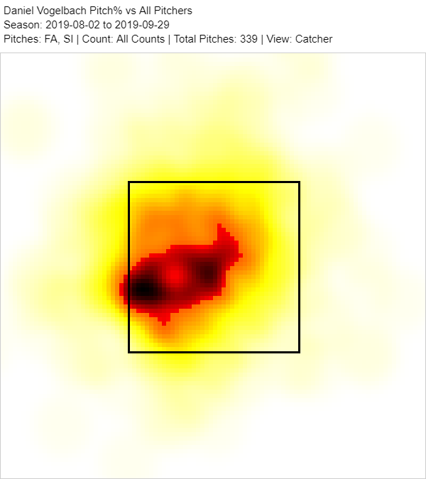
This approach is prone to bias and subjectivity, but to me, I would interpret this as opposing teams increasingly pitching down and away to Vogelbach. This makes sense, as low and away is the area in which Vogelbach struggles mightily. So, while I’m just using this as an example of what I’d look for, we have, perhaps, some interesting findings. Unless Vogelbach was playing through an injury, change in pitching approach (i.e., pitching low and away) could be a cause of Vogelbach hitting more ground balls as well as hitting the other way.
Sustainability
This is where we start to look forward. We can have an idea of who the player is, and now we’re asking ourselves: Is this a sustainable approach? In my 2020 Seattle Mariners hitters profile, this is something that I touched on with several players. Omar Narvaez, Austin Nola, and Tom Murphy all had very solid 2019 campaigns, but I am skeptical of the sustainability of all of their profiles. Each player hung their hat on an approach that leaned on cheap home runs to their pull side that scraped the fence—they overperformed their xwOBAs by .021, .041, and .054, respectively, and that’s simply not going to persist.
I am a huge fan of using expected statistics when they’re used properly. For example, in 2019, Alex Bregman had a .378 xwOBA and .418 wOBA, so some might view him as a regression candidate. That’s appropriate, right? Nope! As Dan Richards wrote, Minute Maid Park is more of a hitters park that previously thought, and Bregman thrives at hitting non-barrel home runs to left field. Aside from Brett Gardner, Eric Sogard, Xander Bogaerts, and Eric Thames, Bregman’s .316 wOBA-xwOBA on pulled fly ball/line drives is the most extreme in Major League Baseball. In other words, his approach fits Minute Maid Park perfectly, and so while it may not fly in all venues, it will continue to work well for him as long as he’s an Astro. This is a prime example of why it can be dangerous to take expected statistics as gospel.
As stated previously, there are a few numbers that I like to keep an eye on. A few of these include metrics like HR/FB and IFFB%. (If you’re willing to put in an extra minute’s work, pop-up percentage (PU%) is superior to IFFB%, and The Athletic’s Eno Sarris has been championing this for years now. You simply take IFFB% and multiply it by FB%. League average is about 3.5%. PU% is sticker than IFFB%, since IFFB% is more unstable due to having fly-ball percentage in its denominator (i.e., FB% makes it noisier). These metrics can help us identify both candidates for regression to the mean, as well as players on the extremes of the respective metric. Meaning, some players hit a lot of pop-ups, and some hit very few pop-ups—these add up! As for HR/FB, most players won’t post a 32.8% HR/FB like Yelich, nor will they have a 5.5% HR/FB like Mallex Smith. Most players will be within a standard deviation of average. In 2019, league averages for these were 15.3% HR/FB, 9.8% IFFB%, and 3.5% PU%. (Additionally, these can skew average launch angle, as I talked about above.)
Second, yes, Andrew Perpetua’s xStats is no longer a thing, but we can still calculate xBABIP! From there, we compare BABIP with xBABIP, but we have to be mindful of the respective player’s sprint speed, opposing shift percentage, park factors, among other things. You can see that the query linked above confirms some of my doubts with Tom Murphy and Austin Nola. It also shows that perhaps Fernando Tatis Jr. and Tim Anderson overperformed some, but the latter two are more likely to sustain their performance somewhat due to their batted-ball profiles and speed.
The CliffsNotes
- Stay away from averages
- Barrels are good at predicting power!
- Don’t just look at xwOBA and call it a day
- Look at hitter and opposing approaches
- Take advantage of FanGraphs and Baseball Savant
- Think about all factors involved—no single metric is gospel
Conclusion
If there is one thing to take away from this article, it’s that there are many ways in which you can be led astray by statistics—both advanced and conventional. I still fall prey to seeing certain statistics and limiting the amount of research that I should do on a player. The goal, I think, is limiting the amount that oneself falls susceptible to this. There are several ways to skin a cat—just don’t be caught doing it carelessly. It could cost you.
Featured Image by Justin Paradis (@freshmeatcomm on Twitter)
