


If you listen to On The Corner or the First Pitch podcasts, you may have noticed that Nick and I are very fond of a metric we like to call CSW rate. Coined and created by Nick Pollack in the 2018 season, CSW rate stands for Called Strikes + Whiffs and the formula for it is simple:
Called Strikes + Whiffs
Total Pitches
It takes into account called strikes, swinging strikes (including blocked ones), swinging pitchouts and foul tips into the glove while excluding foul balls. While the formula may seem rudimentary, the implications are far from it. CSW rate is a simple, fine-tuned and, most importantly, predictive metric that gives us a better glimpse into the true skill of a pitcher. Let’s break all of this down so we can see why.
The Beginning
At the beginning of the 2019 season, I wanted to take a deeper look into the metric Nick and I have been citing for almost a year now. I wanted to see if CSW rate was of any more benefit then some of the stats Nick and I commonly use like swinging strike rate (SwSt%; swings and misses over total pitches). Finally, I wanted to explore if this metric was more than a glimpse into how successful a starting pitcher was during a particular outing. It turns out it was a lot more.
I started by keeping a spreadsheet of every CSW rate from the previous day’s games. I noticed some fluctuation and plenty of noise, but enough to get me curious as to what a larger sample size would reveal. I used Baseball Savant—arguably the best baseball website available right now—to gather the CSW rates of every pitcher in the 2018 season. After pulling the data, I started comparing it to metrics that I thought would be most viable. I started with ERA:
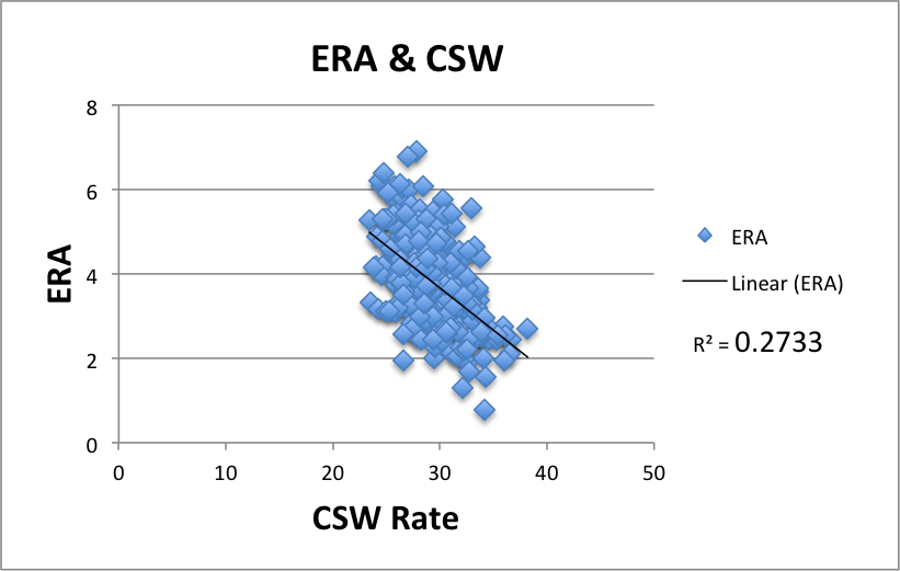
I’m not a data scientist, but I do know that this is not what the ideal datasets look like when seeking correlation. To put it very mildly, you want a high r2 and .27 is far too low.
From the start, we can determine CSW rate does not correlate to ERA. That’s fine and makes sense. A pitcher may be getting a good amount of whiffs, but hitters could still be putting balls in play and CSW won’t tell us anything about contact. The next step was to see how CSW correlated to strikeout rate:
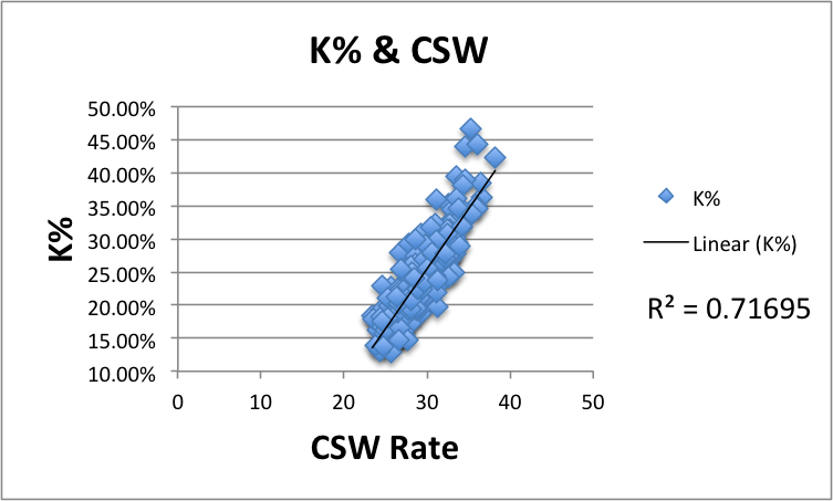
That’s a great correlation and it makes a lot of sense. The more called strikes and whiffs a pitcher earns, the more strikeouts he’s likely to record. The correlation isn’t perfect because not every called strike and whiff lead to a strikeout, but we don’t need it to be perfect. We just want to see if we’re heading in the right direction, and so far so good.
We know from the above that CSW won’t correlate to ERA, but maybe it will correlate to an ERA indicator. Most heavily value strikeouts, a metric pitchers have more influence over, and here are the results with the popular DIPS metric SIERA:
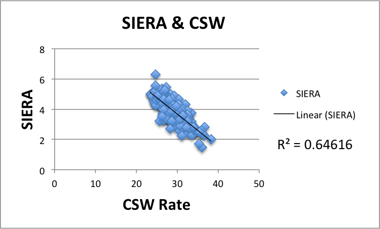
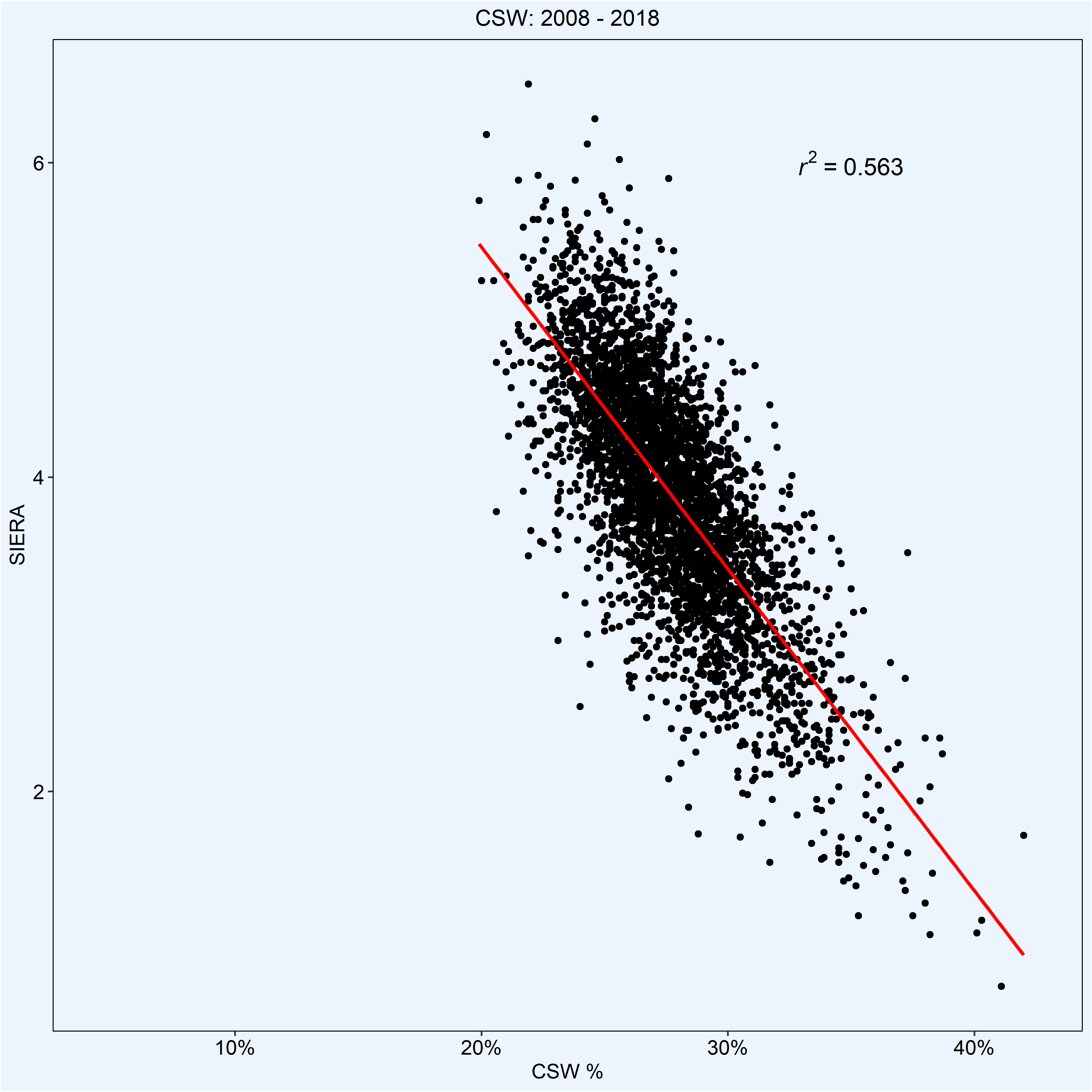
This is where things get really exciting. An of r2 of .64 dictates that CSW rate is very correlated to SIERA. For those unfamiliar, SIERA stands for Skill-Interactive ERA. It is an ERA estimator that suggests strikeouts may be better than FIP suggests, walks are bad but relative to how many you throw, and balls in play are complicated (read here for a deeper dive on SIERA). Most importantly, SIERA is predictive. Like FIP, it can give us a good sense of what a pitcher’s actual skillset is and whether they are over/underperforming their ERA.
When I saw the above chart, it was the first inkling that CSW rate could be a beneficial metric to view in tandem with SIERA. To confirm that, I needed to dive deeper and enlisted the help of data scientist, Pitcher List staff member and all around patient man, Colin Charles.
We’re just getting started.
Bearing Out The Claim
Knowing that SIERA correlated to CSW in 2018 is a great first step, but in order for us to prove that CSW is a metric that analysts and fans alike should have in their back pocket, we need to see if CSW correlates to SIERA over a longer period of time. Colin (whom this piece would not exist without) used Baseball Savant and Fangraphs to get all of the seasonal CSW and SIERA for the past 10 years. Per the advice of Travis Petersen, a senior data scientist at Major League Baseball, the pitches in all of the following models are weighted. In other words, pitchers like Max Scherzer are going to be weighted a bit more than Edwin Diaz.
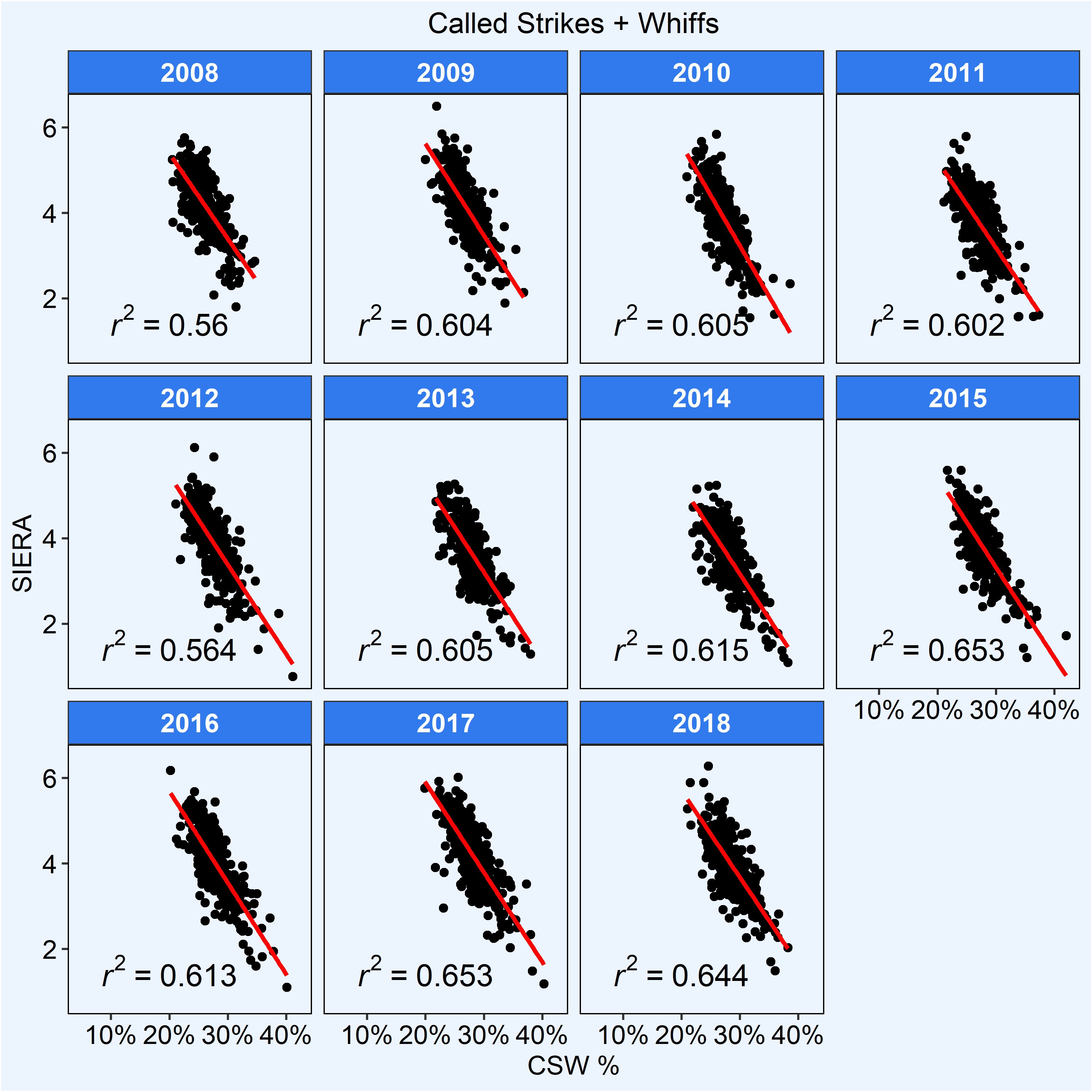
Once again, we see excellent correlations season-by-season, proving that last year was no fluke. After sharing this data with Travis, he suggested the more apt way to see viability would be to. “run the correlation over the whole dataset; i.e. combine all pitcher/year data points into one file and then run.” When a senior data scientist tells you to do something, you do it.
Here are the results:
The correlation gets a little bit weaker, although it’s still encouraging to see. The data begets the question that perhaps we should be viewing relief pitchers and starting pitchers separately. After all, when discussing CSW, the brackets for success are different by pitcher classification. A 30% CSW rate for a starting pitcher who throws over 60 pitches in an outing is very good to see, but a 30% CSW rate for a relief pitcher throwing 20 pitches in an inning would be slightly below average.
We’ve already weighted the data in an attempt to equalize the playing field but at Travis’s suggestion, Colin and I decided to see what would happen if we put the pitchers into their proper buckets.
Here are the results season by season:
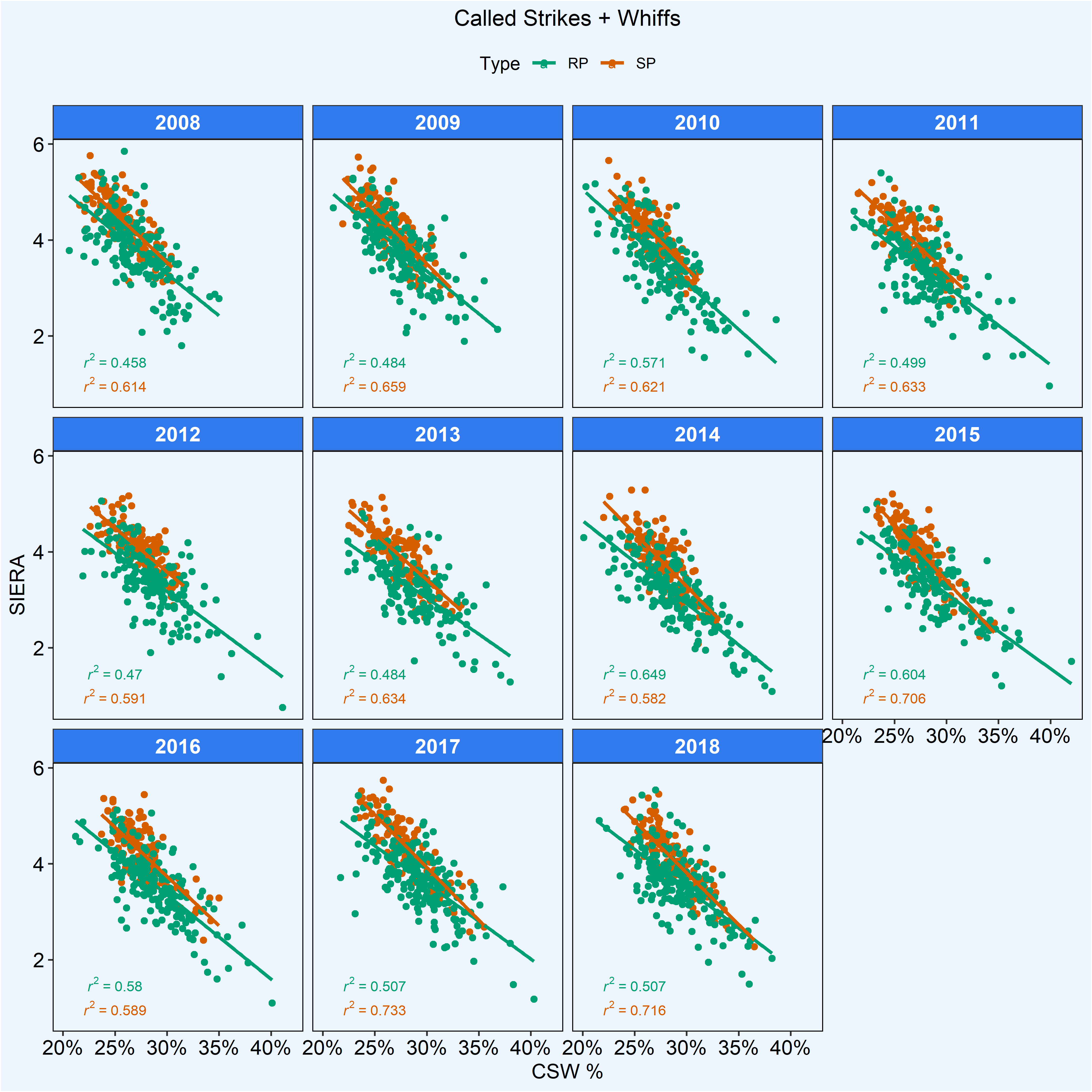
And here are all the results combined across eleven seasons of data separating starters and relievers:
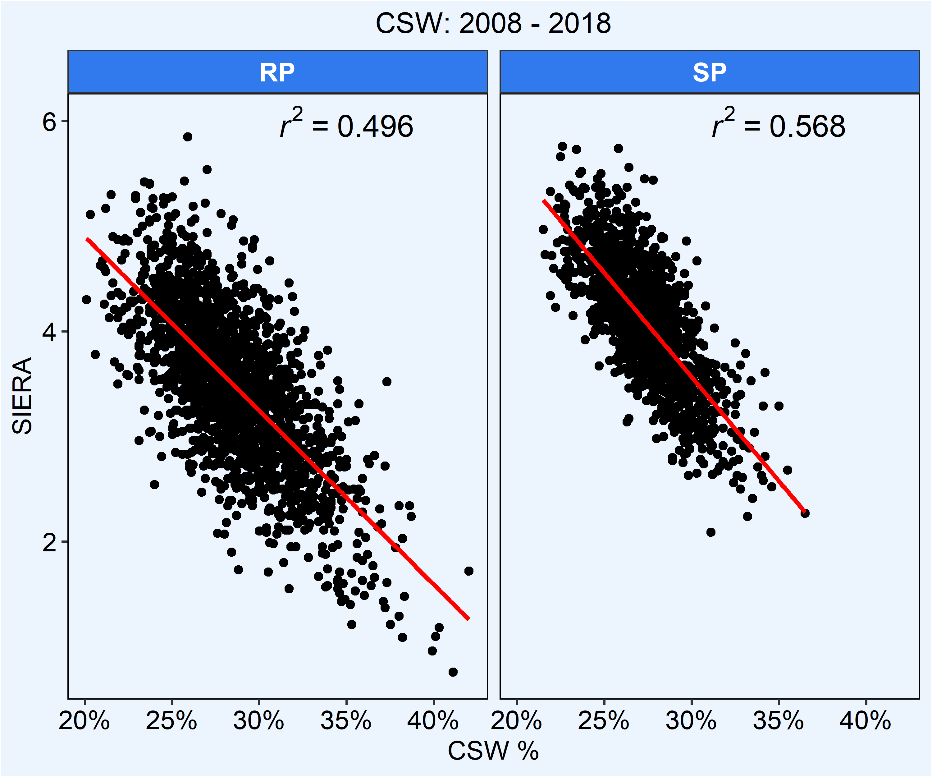
As is to be expected, we find that CSW rate on the whole correlates better to starting pitchers than it does relievers. This doesn’t mean that CSW isn’t pertinent to relievers, it just appears to be more descriptive for starting pitchers.
Things are looking great for CSW, but we can’t draft distinct conclusions until we understand its value relative to other statistics. An r2 of .568 for starting pitchers is encouraging to see in a vacuum, but how does it compare to other popular metrics?
CSW vs SwSt vs Whiff %
At its core, CSW rate is swinging strike rate that brings called strikes into the equation. It posits that while swinging strikes are great to see, called strikes can be just as beneficial. By breaking CSW rate into its individual parts, we can see if any one of the metrics it is comprised of correlates more or less to SIERA.
To make sure all of our bases were covered, we correlated just called strikes, swinging strike rate and whiff rate. For those unfamiliar, swinging strike rate (SwSt%) is the rate of whiff across all pitches seen, while Whiff% is the percentage of whiffs across all swings from the batter.
We’ll begin by comparing called strikes to SIERA for both SP’s and RP’s.
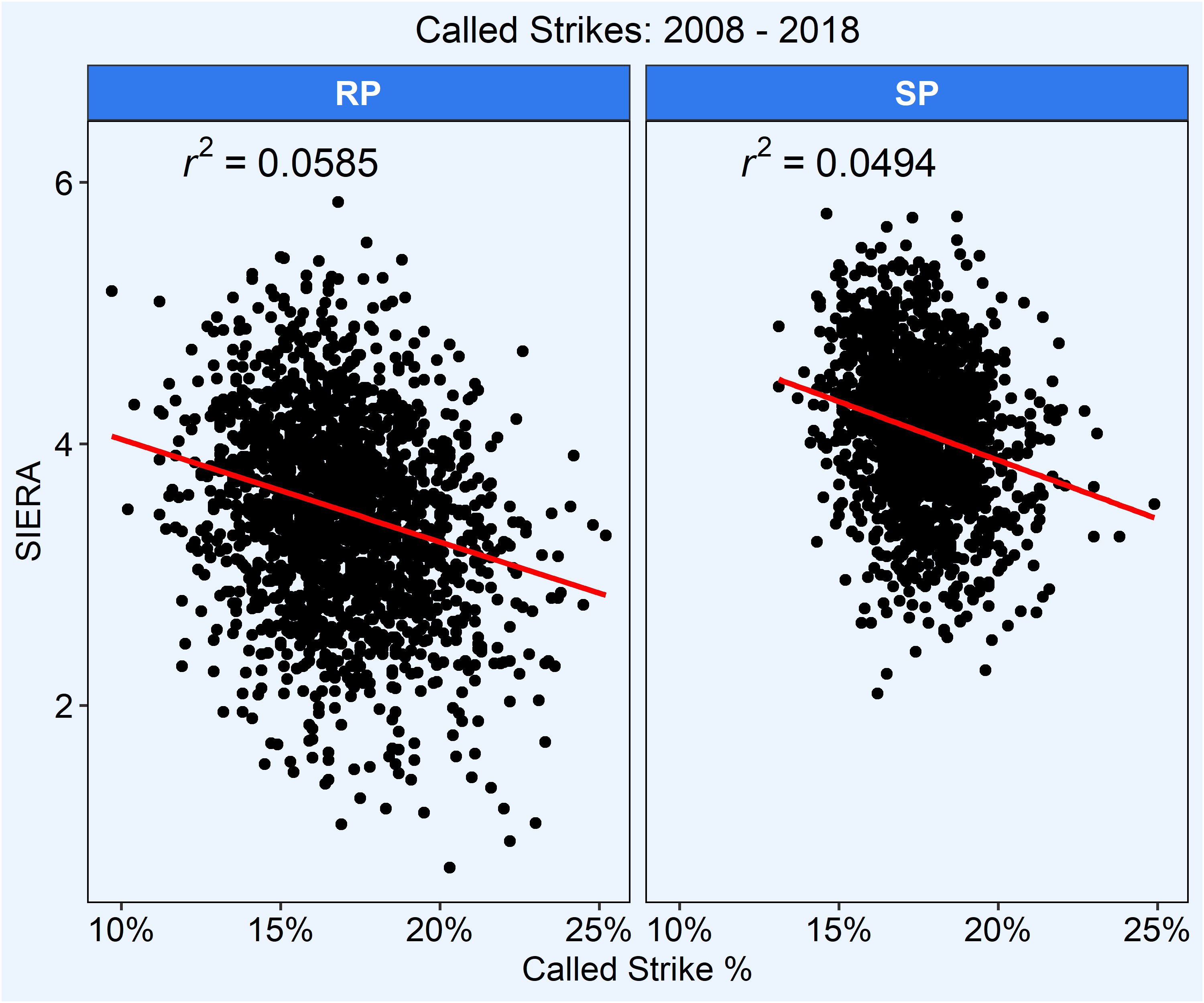
As expected, called strikes alone has little to no correlation whatsoever to SIERA. This is likely why called strike rate isn’t a prominently featured statistic. Let’s take a look at how a more popular metric in Whiff% compares to SIERA.
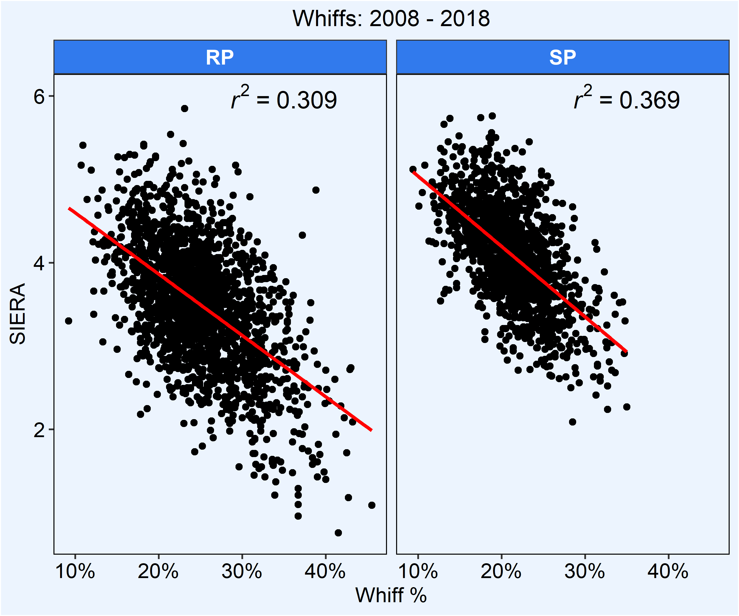
The correlation is far better compared to called strike alone, but not as strong as CSW rate. Let’s take a look at SwSt rate, one of the more popular metrics used to determine a pitcher’s success and abilities.
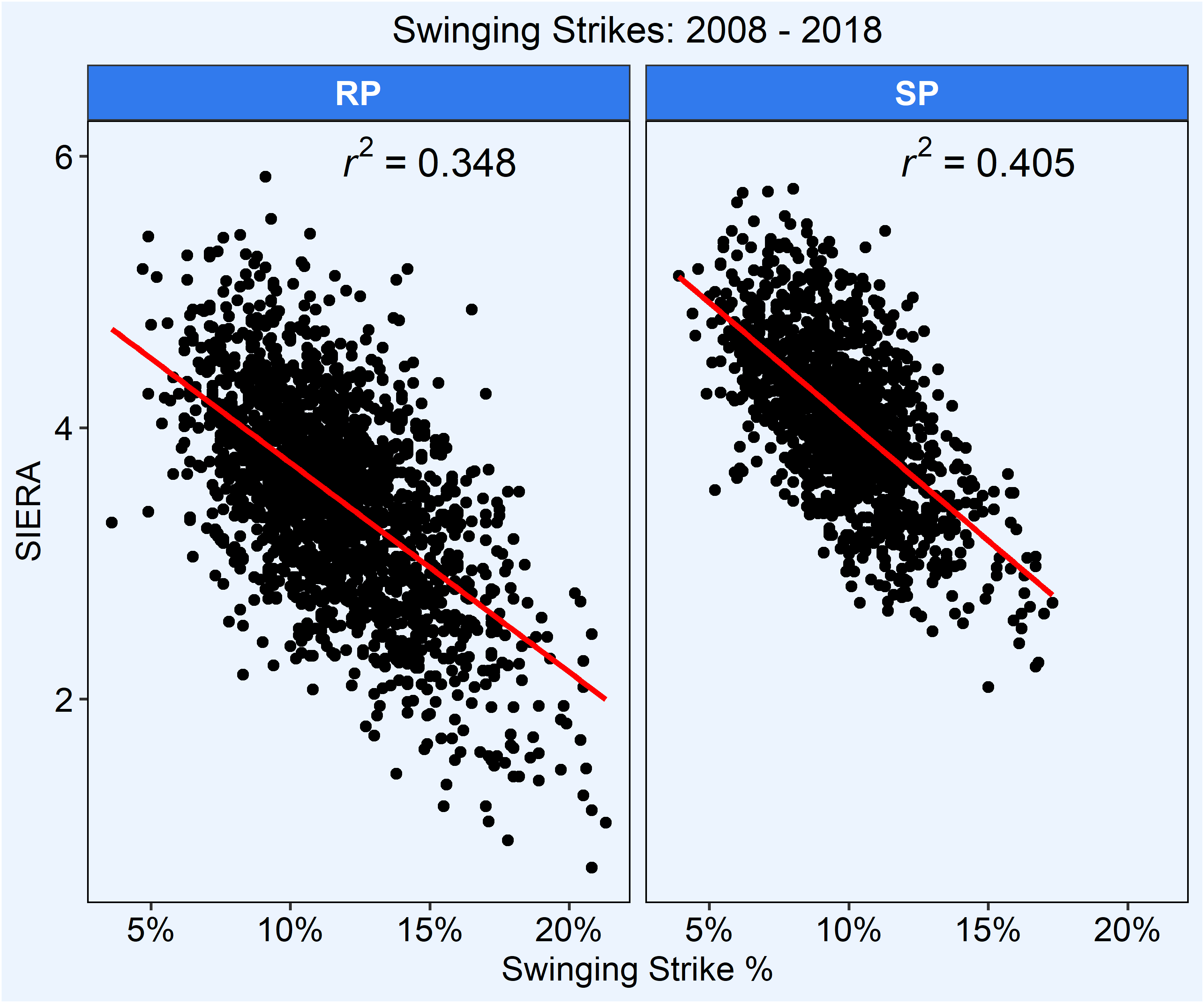
Once again, we see a better correlation to SIERA than whiff rate, but we see that CSW rate still has a stronger correlation than SwSt.
Let’s look at the r2 in an easier to read table:
| Metric | SP r2 to SIERA | RP r2 to SIERA |
| Called Strike | .049 | .059 |
| Whiff | .369 | .309 |
| Swinging Strike | .405 | .348 |
| CSW | .568 | .496 |
That’s a pretty exciting finding.
By adding called strikes to swinging strikes and returning to CSW rate, we’ve found a metric that is stickier to SIERA than one of the more commonly used metrics in SwSt rate. However, the correlations that we’ve been finding have all been run comparing same-year CSW to same-year SIERA. Travis pointed out that this would make the relationship a descriptive one as opposed to predictive. In order to to prove whether CSW rate is, in fact, predictive we’d need to try a different approach.
Mirror Mirror on the Ball…
I figured the best way to determine whether CSW had predictive qualities was to take CSW rates from previous seasons and compare them to the following year’s SIERA to see if there was a change. For example, if a pitcher posted a 30% CSW rate in 2016, and a 38% CSW rate in 2017, we would hope to see their SIERA go down from the ’16 to ’17 season. I called upon Colin again for data—did I mention how incredibly helpful he was? Here are our findings:
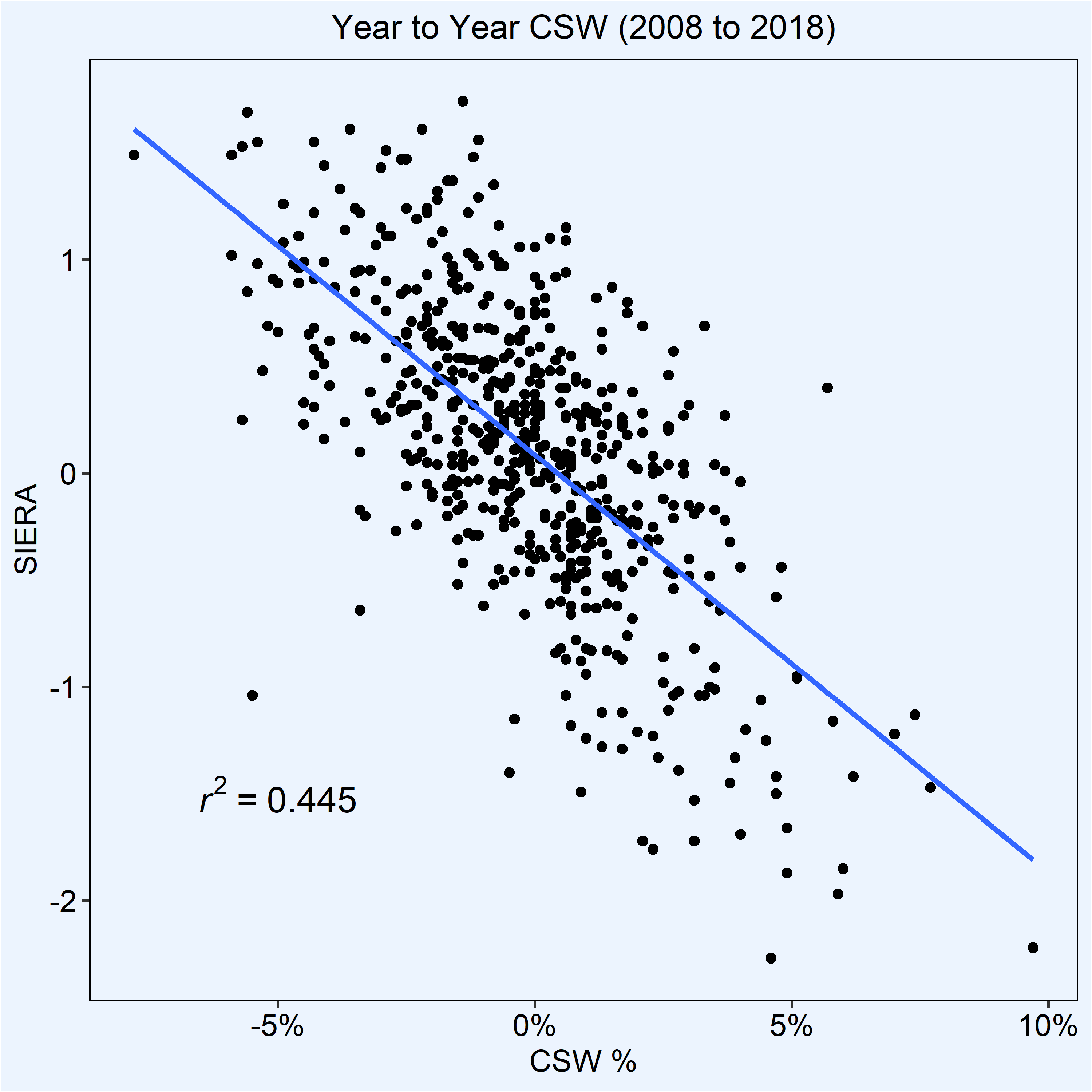
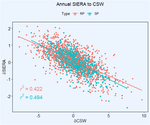
It is nice to reinforce what we’ve already established: that CSW rate is a little bit more applicable to starting pitchers than relievers. The r2 does leave a little to be desired as, at first glance, it doesn’t scream perfection. However, we’ve established by now that this is all relative. If we find that the correlation is stronger than SwSt%, called strike rate and whiff%, then we could be on to something. Here is each stat’s respective chart:
That’s a lot of graphs. Let’s put that in an easier to read table:
| Metric | Year-to-Year r2 to SIERA |
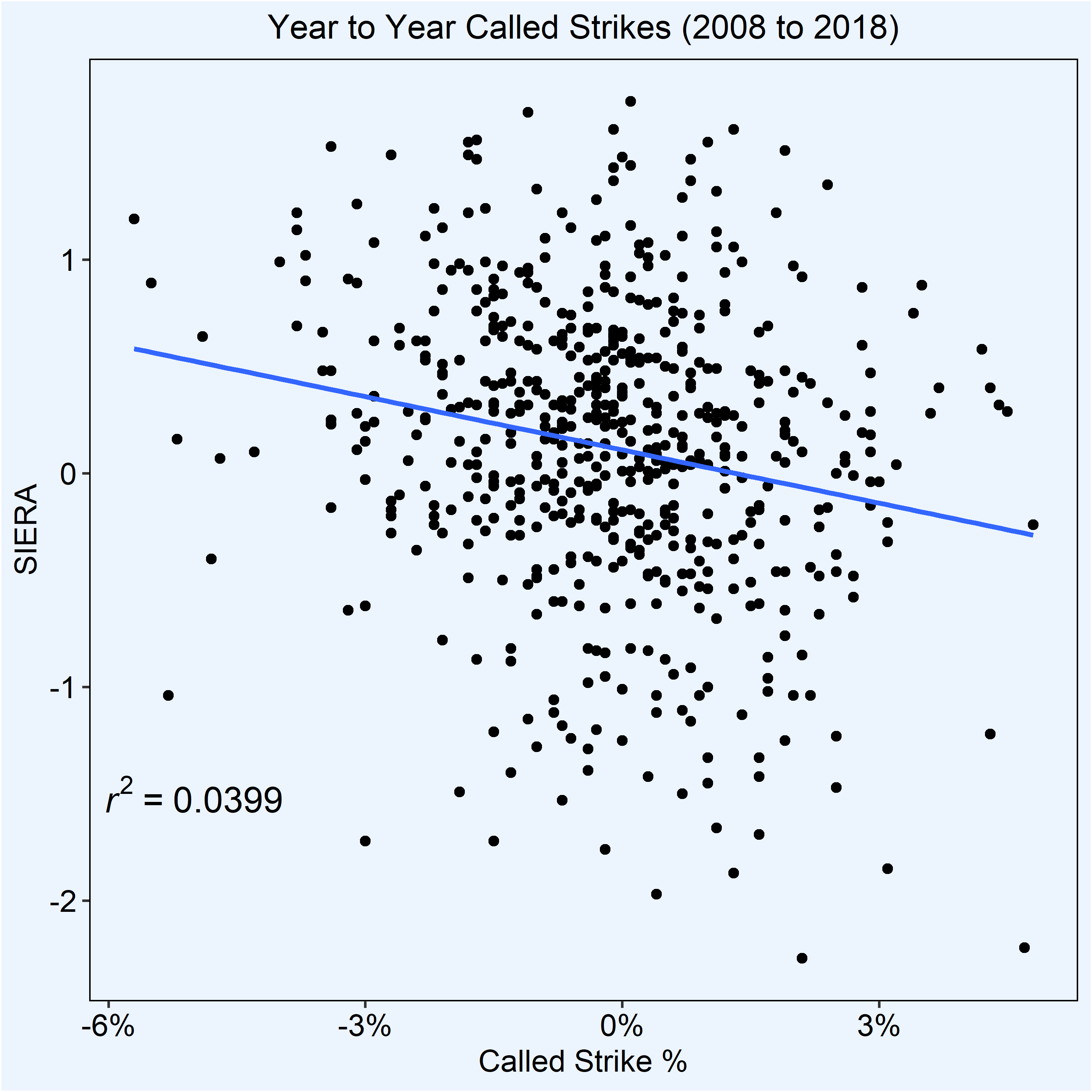
| Called Strike | .0399 |
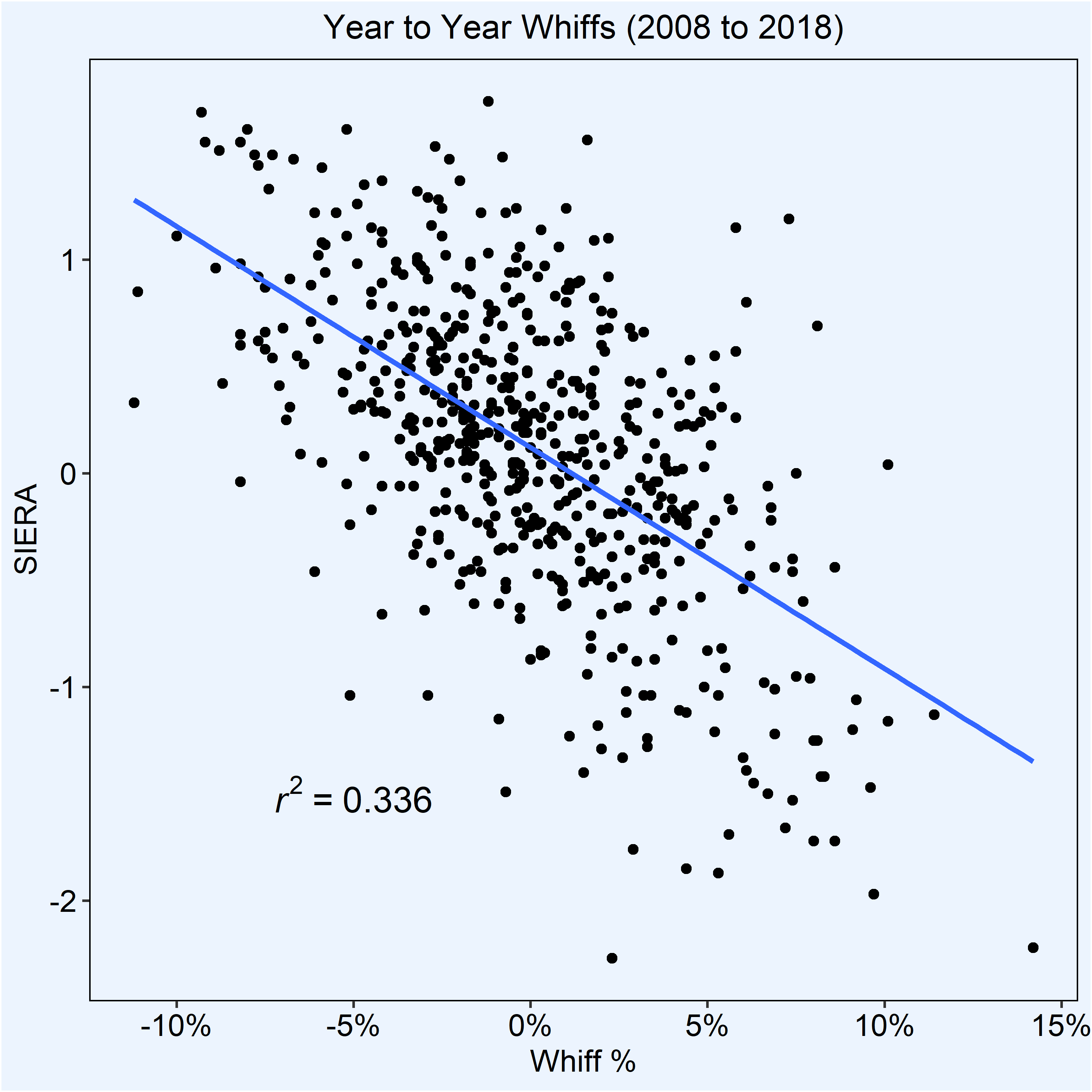
| Whiff | .336 |
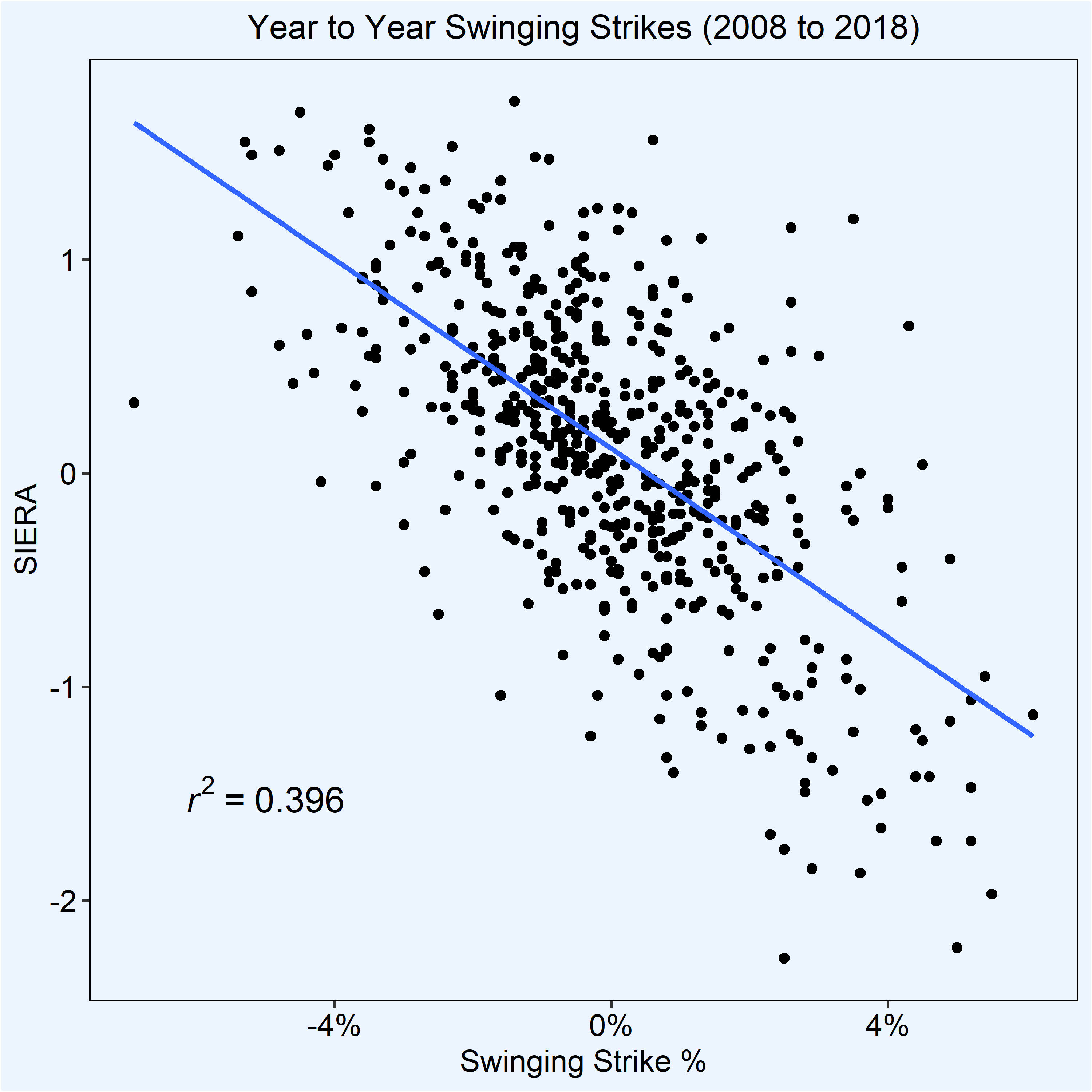
| Swinging Strike | .396 |
| CSW | .445 |
Compared to called strike rate, whiff% and SwSt%, CSW is the more predictive statistic. While over a larger sample size, CSW rate loses a bit of its predictiveness, we can definitively say that it is more predictive than other, more commonly used metrics.
But we’re not done. At what point during a season can we begin to rely on it?
When To Trust CSW
The short answer is obvious. The more innings a pitcher gets, the more predictive this metric is going to be. While it would be very difficult for us to pinpoint an exact inning or pitch count where the metric becomes predictive, Colin and I were able to get a good ballpark estimate.
First, Colin calculated a pitchers CSW rate with each start. Instead of averaging two CSW rates together, he took the total pitches of a pitcher and combined them. For example, if a pitcher throws 100 pitches with 35 called strikes and whiffs in start one and 98 pitches with 20 called strikes and whiffs in start two, then that pitchers CSW rate would be 55/198 or 27.7%. It makes more sense to treat this pitch-by-pitch instead of start-by-start.
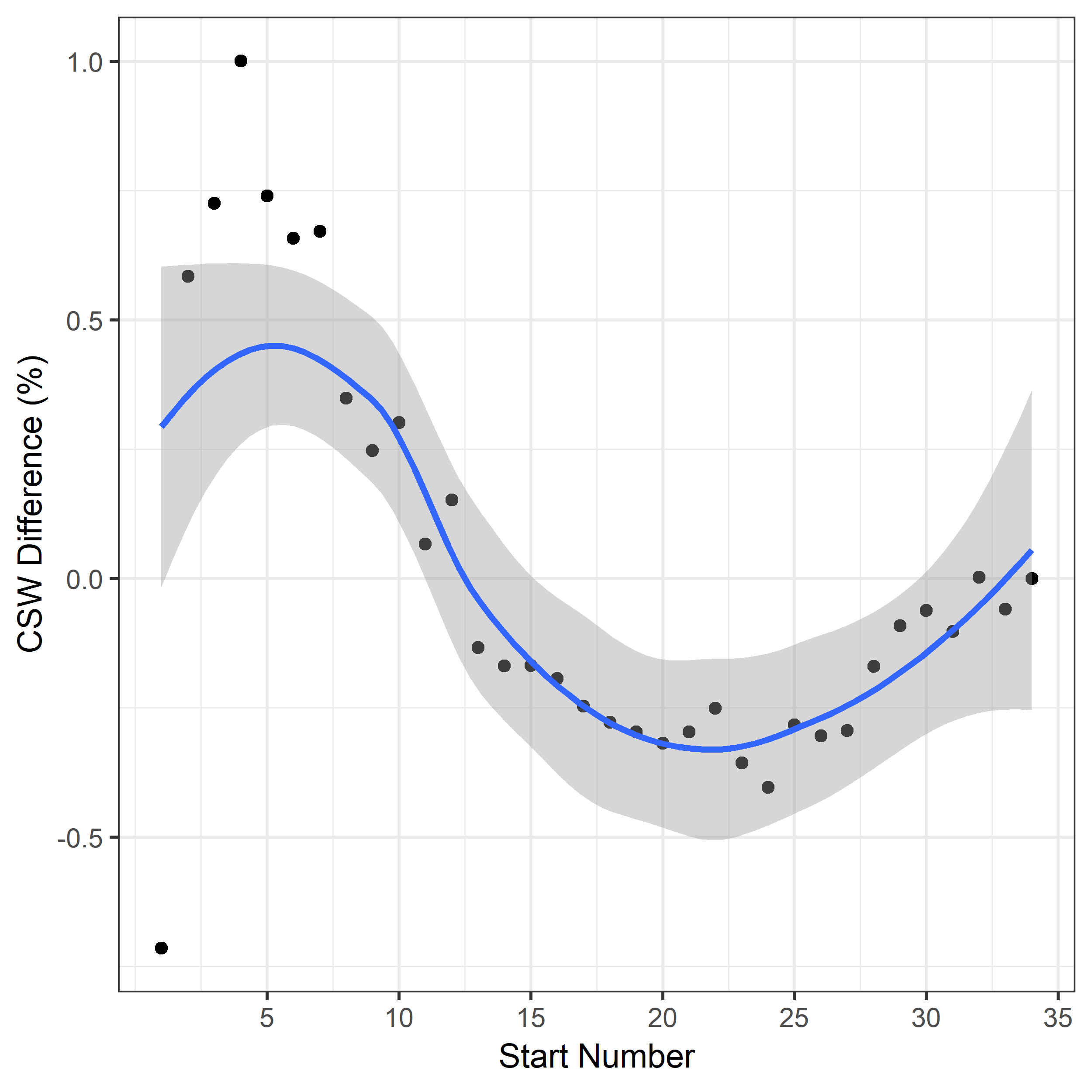
Using this methodology, we see CSW rate start to stabilize around the 10th start. In order to double check our work, I took all of the CSW rates in the first half of 2018 to see if CSW would stabilize by the All-Star break.
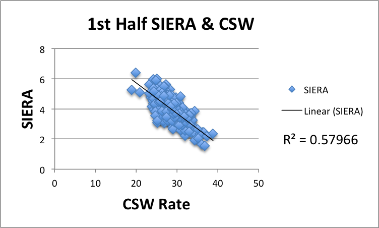
While these methodologies are not perfect, our first attempts to find a stabilization point indicate that CSW rate becomes viable around a pitcher’s 10th start. By the All-Star break, it’s even more predictive and by the end of the year, it can be used very well alongside SIERA to analyze potential changes for the next year.
How Do We Use CSW?
While CSW rate takes around ten starts to stabilize, that doesn’t mean you should completely ignore it until then. A pitcher’s daily CSW rate can still be a good indication of whether or not he had his stuff on that particular day. Below are the classifications we’ve come up with.
| Quality of SP Outing | CSW Rate |
| Poor | 20 – 25% |
| Okay | 25 – 30% |
| League Avg | 28.7% |
| Good | 30 – 35% |
| Excellent | 35 – 40% |
I want to reiterate that “quality of outing” only explains how a pitcher did in terms of their CSW rate. Remember, CSW is not correlated to ERA, so it is possible for a starting pitcher to give up a lot of hard contact and plenty of ER but have a fantastic CSW. What makes this metric so exciting in our eyes is that when a pitcher has an above average CSW rate without the results, it could indicate that the results are soon to follow (much like SIERA). Take Derek Holland for example.
| Start | ERA | SIERA | CSW |
| @SDP | 6.75 | 4.23 | 32.7% |
| @LAD | 5.00 | 4.50 | 34% |
| SDP | 3.38 | 3.85 | 35.2% |
| COL | 4.09 | 4.30 | 31.7% |
After Holland’s first start against the Padres, there was a good amount of regret for taking him in drafts. He only lasted 4 IP and gave up 3 ER. The CSW rate, however, would have you think it wasn’t all that bad. In Holland’s next start, coming against a red-hot Dodgers offense, he gave up only 2 ER in 5 IP of work to bring his ERA down almost two full runs. The one constant in those two starts? His 32+% CSW rate. His next outing was his best, as he lowered his ERA two runs again and struck out nine over 7 IP. In his most recent start, he struggled against the Rockies, posted the lowest CSW rate of the season and his SIERA regressed accordingly.
Let me reiterate: this is a terribly small sample size. Derek Holland could very likely have a string of five consecutive poor-CSW outings that make this four game sample size less appealing. That said, it’s good to see a SIERA act accordingly to its corresponding CSW rates.
Until CSW regulates in about mid-May, the best way to use it is to keep track of how it compares to a pitcher’s average CSW rate and CSW rate in their last outing. If it’s drastically higher or lower for one particular start, it’s no cause for concern, but multiple outings with similar CSW rates could be indicative of something. So where can you find all this data?
A Community Metric
What I love most about CSW rate isn’t its correlation to K% or SIERA, but that it was born of a community. Daren Willman put the data out, Nick Pollack noticed it and created the metric, I tried my best to flesh it out to see if it was pertinent. Colin Charles helped immensely by being an R wizard and compiling countless rows and columns of data while Travis Petersen provided pivotal advice. Dave Cherman provided super helpful feedback and now guys like Jason Johnson, a guy I know solely from Twitter, are taking the next step. The stat isn’t Pitcher List’s. It’s ours.
Here is the link for all of the data that I have compiled so far. You can check this spreadsheet every day for CSW leaderboards, a full log of every pitcher’s CSW rate from every performance and more. Enjoy.
Common Questions
In the few weeks I’ve been experimenting with CSW in depth, a lot of interesting questions have come up that I wanted to address here:
Why doesn’t CSW rate include foul balls?
I added foul balls to a lot of the sample sizes to create CSWF and noticed that it decreased how well the metric correlated to SIERA and K%. Foul balls seem to be incredibly inconsistent, but I still think they’re a viable metric to look at in the short term. In my mind, I think of foul balls as “medium contact.” For those unfamiliar, on a Fangraphs player page, a pitcher’s induced contact is broken up into soft, medium and hard contact. When there’s an abundance of medium contact, it usually ends up falling away into one of two buckets: soft or hard contact. In my mind a lot of foul balls in one outing will turn into either K’s, whiffs, called strikes or hits in another outing. That in and of itself could be another metric but is not beneficial for what we’re trying to accomplish with CSW rate.
How come a pitcher can have a high CSW rate and have a poor outing?
This was addressed once or twice in the above but I think it’s worth repeating: CSW rate does not correlate to ERA. Tyler Skaggs‘ most recent outing was a great example. Despite giving up 3 very loud HR over the course of 4 IP, Skaggs had an above league average 30% CSW rate. As is to be expected, his SIERA is currently lower than his ERA.
What does this mean for hitters?
This is a great question and one we have not begun to scratch the surface of yet. Look for a piece coming about CSW rate and hitters in the near future.
Conclusion
After weeks of analysis, I can say with confidence that CSW is a viable metric that should be integrated into how we analyze pitchers. It correlates heavily to K% and SIERA, the latter of which it correlates better to than SwSt% and Whiff%. On the micro level, it can be used to analyze whether or not a pitcher had their “stuff” during any particular outing. It has shown to stabilize after around 10 starts at which point it can be used as a predictive metric.
I am not a data scientist. Nor am I a traveling salesman hocking CSW rate as the latest metric that is going to revolutionize the way we look at starting pitchers. CSW is not the perfect metric because there is no such thing as a perfect metric (yes, including WAR). A metric does not define a ballplayer. Metrics are small pieces of a puzzle that when put together contextually can help give us a glimpse at the puzzle as a whole. CSW rate is merely a new piece to the puzzle and one that we at Pitcher List feel can be benefit the fantasy and analytical community at large.
Featured Image by Justin Paradis (@freshmeatcomm on Twitter).
