


A player’s Baseball Savant page is filled with useful information. Yet some analysts, myself included, will find themselves paying attention to a specific subset of metrics. When I go to a pitcher’s page, I’ll look at their spin rate, hard hit%, and some expected metrics before diving into individual pitch type data. One particular metric that I used to regularly gloss over was PutAway%. However, after some digging into its purpose and its importance, it will likely be a go to metric for me moving forward.
What is Put Away Rate?
Located in the Pitch Tracking menu on a pitchers Baseball Savant page, PutAway% was – to the best of my knowledge – originally created by a staffer at Baseball Prospectus before Sarah Langs had it incorporated on to Baseball Savant. The formula for Put Away Rate (PAR) is:
Strikeout w/ pitch type
Two strike pitches w/ pitch type
That’s a tricky formula, so I find the best way to explain PAR is with an example. It’s Opening Day and Gerrit Cole has Baltimore Orioles lead-off hitter Hanser Alberto in a two-strike count. Cole throws Alberto a fastball which he fouls off. Cole throws another fastball for a ball. Cole throws a third fastball, and gets the strikeout. While Cole’s K% on his fastball is now 100%, his PAR on his fastball, however, is 33%. He threw three fastballs in a two-strike count, and one of them resulted in a strikeout. PAR and K% share a numerator in strikeouts by pitch type. Though they differentiate on the denominator. For PAR, the denominator is the two-strike pitches paired with a specific pitch type. For K%, the denominator is PA’s that end in that pitch type.
PAR – which is also essentially just CSW rate in two-strike counts – is a measurement of efficiency. The higher the PAR, the fewer balls, fouls or balls in play a pitcher gave up in a two-strike count with that particular pitch. Before we dive deep into PAR, let’s take a look at last year’s leaders* (I omitted CC Sabathia – who finished above Clayton Kershaw – as he retired and therefore won’t help us with our 2020 analysis).
| Name | Put Away Rate |
|---|---|
| Gerrit Cole | 28.6 |
| Chris Sale | 27 |
| Yu Darvish | 26.4 |
| Shane Bieber | 26 |
| Lucas Giolito | 25.8 |
| Max Scherzer | 25.5 |
| Charlie Morton | 25.3 |
| Justin Verlander | 25.2 |
| Walker Buehler | 24.9 |
| Robbie Ray | 24.9 |
| Luis Castillo | 24.5 |
| Matthew Boyd | 24.1 |
| German Marquez | 24 |
| Patrick Corbin | 23.9 |
| Mike Clevinger | 23.9 |
| Sonny Gray | 23.8 |
| Chris Archer | 23.4 |
| Aaron Nola | 23.1 |
| Jack Flaherty | 22.9 |
| Blake Snell | 22.7 |
| Brandon Woodruff | 22.5 |
| Stephen Strasburg | 22.5 |
| Jacob deGrom | 22.3 |
| Clayton Kershaw | 22.2 |
| Trevor Bauer | 22 |
Any time a metric has a leaderboard that looks like that, we should be paying attention.
As a result of PAR being an efficiency metric, one could intuit that it’s a bit more informative than K%. PAR gives us a better overall idea as to how well a pitcher “put away” a hitter with a specific pitch. After all, we want a pitcher who gets Ks the most efficient way possible. So should we prioritize PAR over K% in our analysis?
Put Away Rate vs K%
No. Well, maybe. It’s tough to tell.
Let’s start by looking at how well K% and PAR correlate to one another. All charts below solely look at starting pitchers and are fully interactive.
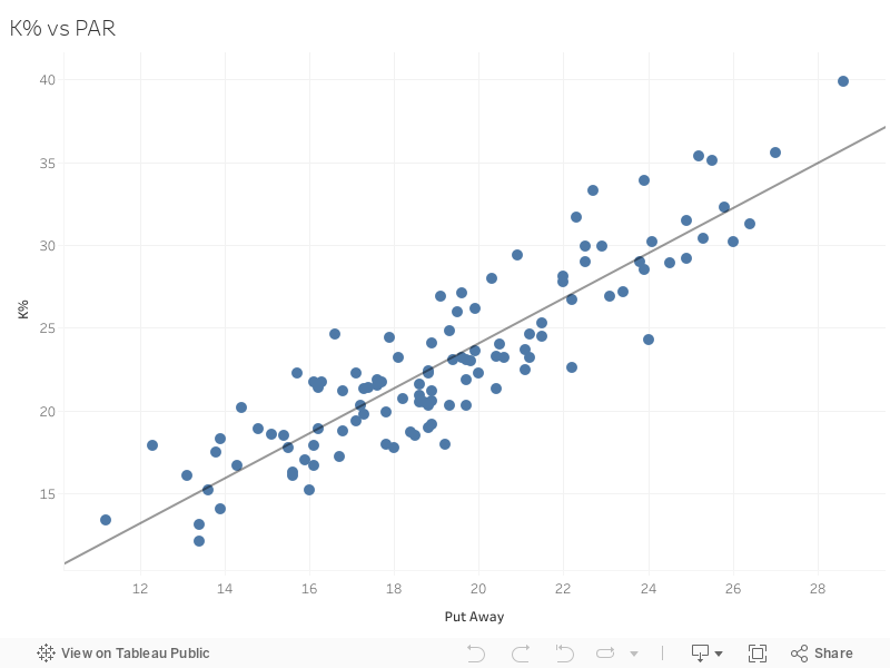
This makes sense as both metrics are studying when a pitch results in a strikeout albeit in slightly different ways. However, it doesn’t really give us any insight as to which is a more informative metric. Let’s take a look at how it correlates to SIERA, a predictive ERA indicator that values Ks a bit more than FIP does.
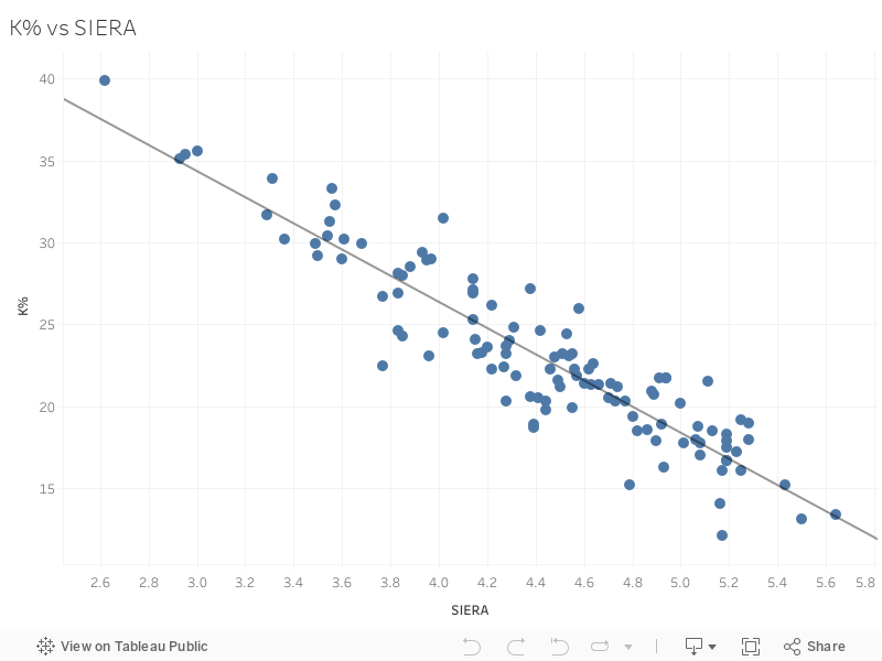
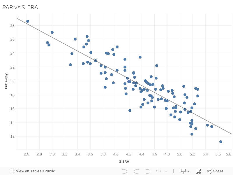
If you hover over the trend line you’ll see that K%’s 0.85 r2 is a bit higher than PAR’s 0.76 so we can say that K% correlates better to SIERA than PAR does. This too is intuitive as K% is literally built into SIERA’s formula. Considering that PAR and K% are very similar, it makes sense that PAR correlates well to SIERA. While the relationship isn’t stronger, that doesn’t mean the metric in-and-of-itself is not viable. While I wouldn’t prioritize PAR over K%, the former’s strong relationship to SIERA shows us that it can be a useful metric; it just needs to be utilized correctly.
Utilizing PAR
In a recent podcast, Nick and I were talking about a rule of thumb frequently mentioned by analysts like Jason Collette and Alex Chamberlain: a K% should be about double a pitchers SwSt. A too-large gap between the two could theoretically hint towards some regression for a pitchers strikeout input. With that in mind, I wanted to see if PAR could help explain some of the larger gaps between those two metrics.
Interesting. It seems as if PAR can provide some insight into certain SPs who have large gaps between their K% and SwSt. If a pitcher has an elevated K% with a SwSt that’s quite far from it, there’s a good chance it’s because that SP is being highly effective with their strikeouts. Is the adage still true though that SwSt*2 should equal K, and can PAR account for the difference there?
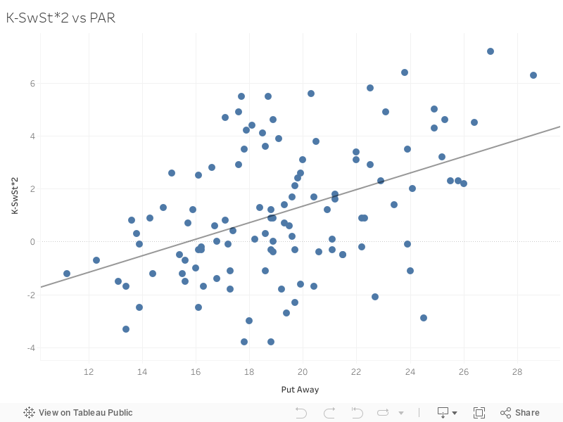
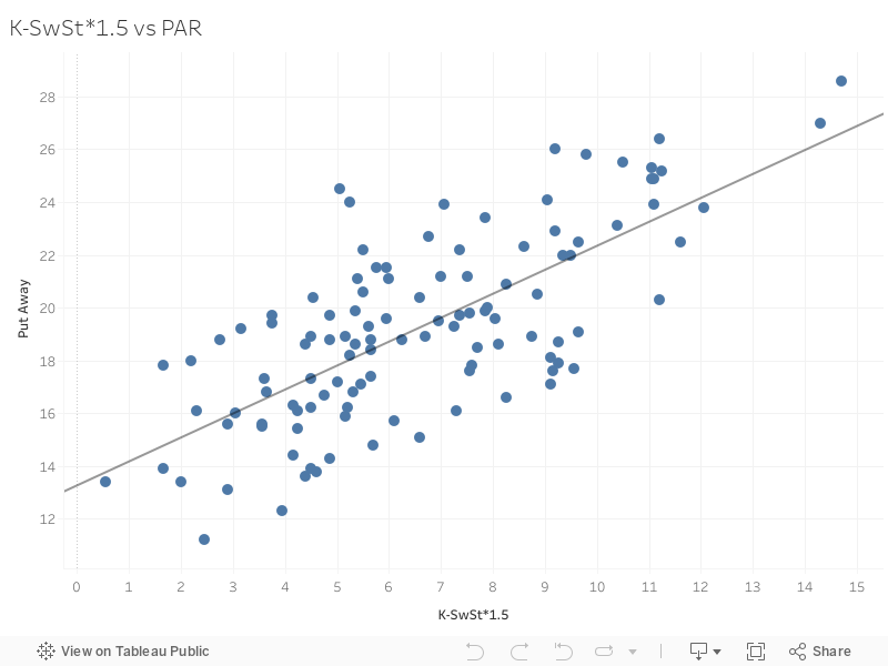
My initial reaction to this was that it made sense: by lessening the multiplier, we bring it closer to the original K%-SwSt equation which correlated very well to PAR. I do think it important to note however, that the stark drop in r2 between the two charts above (0.19 for 2x and 0.52 for 1.5x) makes me believe the rule of thumb should be closer to 1.5 than 2 but that’s a bit pedantic.
While this does provide some answers on what an optimal gap between K% and SwSt would look like, we’re still left with an important question though: what do we want more? A higher PAR or a higher K%? Do you want a pitcher who can efficiently get strikeouts, or a pitcher that works a bit harder for a better result. As we proved, K% correlates better to SIERA but sort of cheats as we’re comparing apples to apples (SIERA is made of K%). The best way to answer the question may be to see which is stickiest both year over year and over the course of a season.
PAR Year Over Year
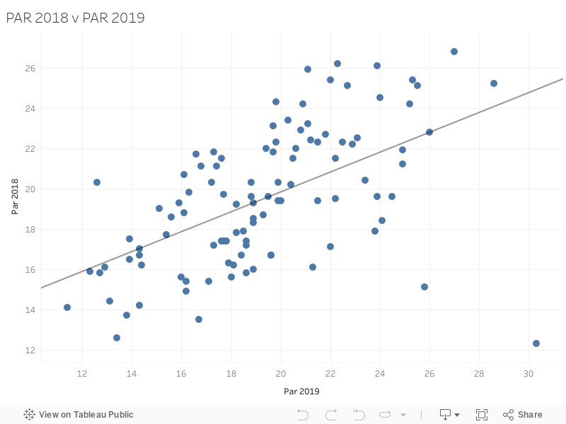
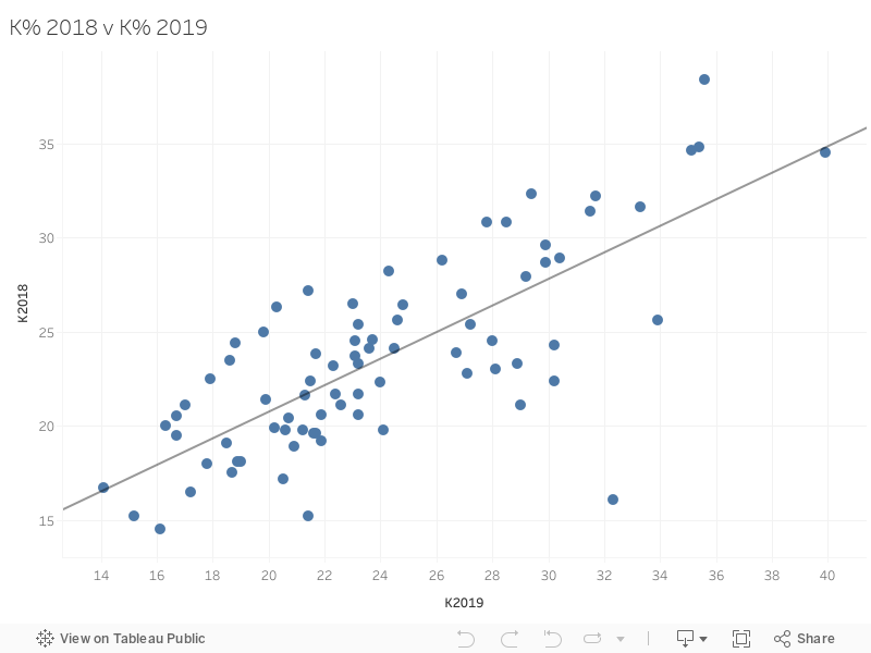
It seems that PAR isn’t as sticky as K% year over year. Another victory for K%. So I guess this entire article has just been proving why I should use K% over PAR, right? Well, when you consider that PAR can help explain large gaps between K% and SwSt and combine that with the fact that PAR isn’t sticky year over year, you come to what I think makes PAR so exciting: SPs who are over reliant on PAR may have difficulty repeating the success they had. Therefore, PAR in relation to K% may help us avoid drafting prime strikeout regression candidates. Let’s take a look at who that applies to:
| Name | K% | PAR | K%-PAR |
|---|---|---|---|
| Jason Vargas | 19.2 | 18.9 | 0.3 |
| Aaron Sanchez | 19 | 18.8 | 0.2 |
| Sandy Alcantara | 18 | 17.8 | 0.2 |
| Ivan Nova | 14.1 | 13.9 | 0.2 |
| Jake Arrieta | 18.5 | 18.5 | 0 |
| Trevor Williams | 17.8 | 18 | -0.2 |
| Antonio Senzatela | 13.1 | 13.4 | -0.3 |
| Mike Leake | 15.2 | 16 | -0.8 |
| Dakota Hudson | 18 | 19.2 | -1.2 |
| Brett Anderson | 12.1 | 13.4 | -1.3 |
This doesn’t really seem like a list you’d want to be apart of. Not only are these pitchers not getting to two-strike counts a lot, they’re not capitalizing on the two-strike counts that they do get to.
Lets take a look at the top of the charts:
| Name | K% | PAR | K%-PAR |
|---|---|---|---|
| Gerrit Cole | 39.9 | 28.6 | 11.3 |
| Blake Snell | 33.3 | 22.7 | 10.6 |
| Justin Verlander | 35.4 | 25.2 | 10.2 |
| Mike Clevinger | 33.9 | 23.9 | 10 |
| Max Scherzer | 35.1 | 25.5 | 9.6 |
| Jacob deGrom | 31.7 | 22.3 | 9.4 |
| Chris Sale | 35.6 | 27 | 8.6 |
| James Paxton | 29.4 | 20.9 | 8.5 |
| Vince Velasquez | 24.6 | 16.6 | 8 |
| Chris Paddack | 26.9 | 19.1 | 7.8 |
That looks a lot better (although Velasquez sticks out like a sore thumb). These pitchers are efficient with their strikeouts but aren’t overtly relying on that efficiency.
One thing that pops out from the above chart is that most of those pitchers have elite fastballs. That highlights an important caveat that centers around the importance of looking at a pitcher’s arsenal as opposed to his overall metrics.
PAR by Pitch Type
A pitchers total PAR is comprised of a bunch of different pitches which can be problematic as starters often rely on certain pitches more often then not to get their Ks. We know that PAR isn’t sticky year over year, so if we look at PAR on a pitch-by-pitch basis we may get a more accurate picture as to which particular pitches will suffer. Doing that may also elucidate whose K% will suffer, too. For example, if pitcher X has a great overall PAR, but his FB hints at heavy regression, that may be an important indicator that player X’s K% will take a dive.
This amazing interactive graphic was created by Nick Kollauf (@Kollauf). Be sure to hover over each individual icon as there is a plethora of information regarding each pitch type.
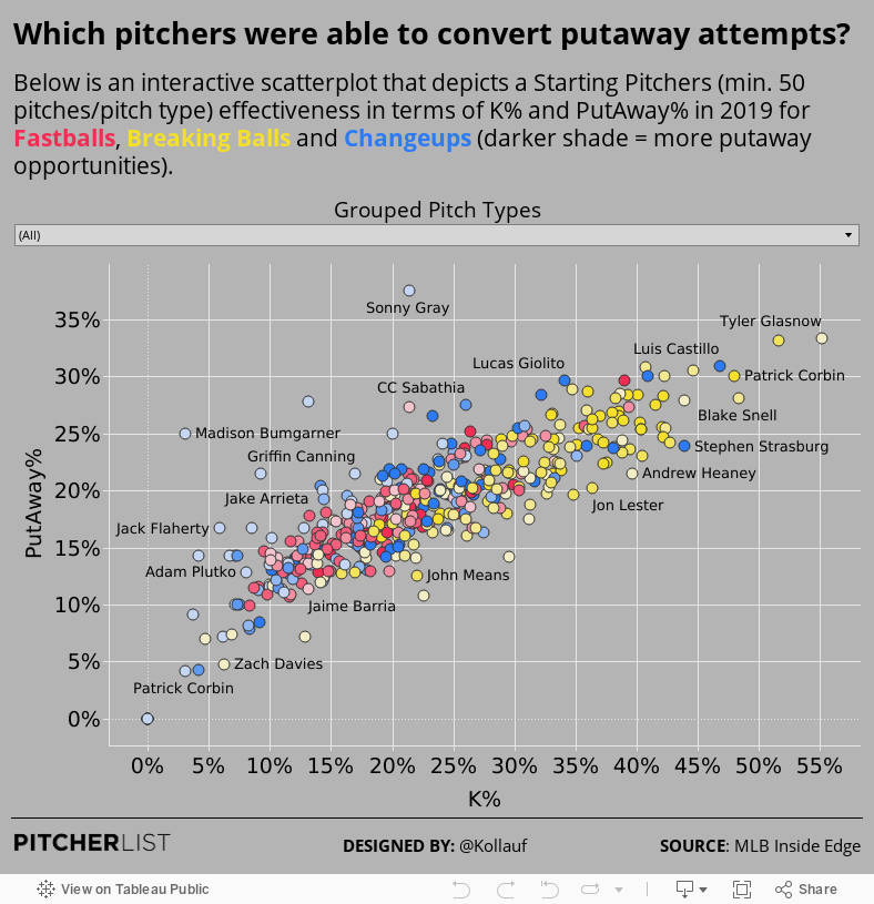
This is a lot of information to process, so I’m going to make it a bit easier by highlighting the individual pitches that have the largest disparity between K% and PAR. For the below table, I sorted by pitches that had a sample of at least 25 with a K% higher than 20.
| Pitch Type | pitches | player_name | PutAway | K% | K-PAR |
|---|---|---|---|---|---|
| FB | 31 | Tyler Glasnow | 27 | 21.7 | -5.3 |
| FT | 26 | Brandon Woodruff | 25.2 | 20.8 | -4.4 |
| SL | 33 | German Marquez | 25.4 | 22.9 | -2.5 |
| CH | 30 | Wade Miley | 22.6 | 20.5 | -2.1 |
| CH | 27 | Jose Berrios | 22 | 20.5 | -1.5 |
| FT | 43 | Sonny Gray | 30.7 | 30.7 | 0 |
| CH | 48 | Eduardo Rodriguez | 20.2 | 20.3 | 0.1 |
| SI | 77 | Joey Lucchesi | 21.5 | 21.7 | 0.2 |
| FT | 49 | Julio Teheran | 23.3 | 23.6 | 0.3 |
| FC | 77 | Yu Darvish | 28.2 | 28.7 | 0.5 |
| CH | 64 | Mike Minor | 24.1 | 24.8 | 0.7 |
There are a lot of high draft picks on this list. While I sincerely hope no one will largely fade guys like Glasnow, Woodruff and Darvish as a result of this table, they shouldn’t be surprised to see regression in their individual pitch performances in ’20. Remember that confusing example I gave at the beginning of this section with player X? That’s literally about Tyler Glasnow. His elite 30.3% PAR closely resembles his 33% K rate. Yet when you look at the individual pitch types, you see how unsustainable that K% really is.
On the other hand, here are the individual pitches that weren’t overly reliant on PAR and could theoretically see an uptick in their K% (I upped the sample size here as I feel it better reflects who serves to benefit most):
| Pitch Type | pitches | player_name | PutAway | K% | K-PAR |
|---|---|---|---|---|---|
| KC | 67 | Trevor Bauer | 24.6 | 41.6 | 17 |
| SL | 68 | Sonny Gray | 23.7 | 40.7 | 17 |
| SL | 115 | Jakob Junis | 26.7 | 44.4 | 17.7 |
| CH | 76 | Stephen Strasburg | 22.9 | 41.3 | 18.4 |
| FB | 103 | Chris Sale | 27.4 | 46.2 | 18.8 |
| SL | 69 | Kyle Gibson | 26.2 | 45.7 | 19.5 |
| CB | 58 | Dinelson Lamet | 33.1 | 52.7 | 19.6 |
| SL | 161 | Patrick Corbin | 30 | 50.6 | 20.6 |
| KC | 108 | German Marquez | 29.7 | 50.7 | 21 |
| CB | 61 | Blake Snell | 28.2 | 51.3 | 23.1 |
So far, we’ve established that PAR’s lack of stickiness year over year makes it a viable tool in our off-season analysis. What about during the season though? Should it be ignored or can it also be utilized to help us identify potential strikeout candidates on our waiver wires?
In-Season PAR
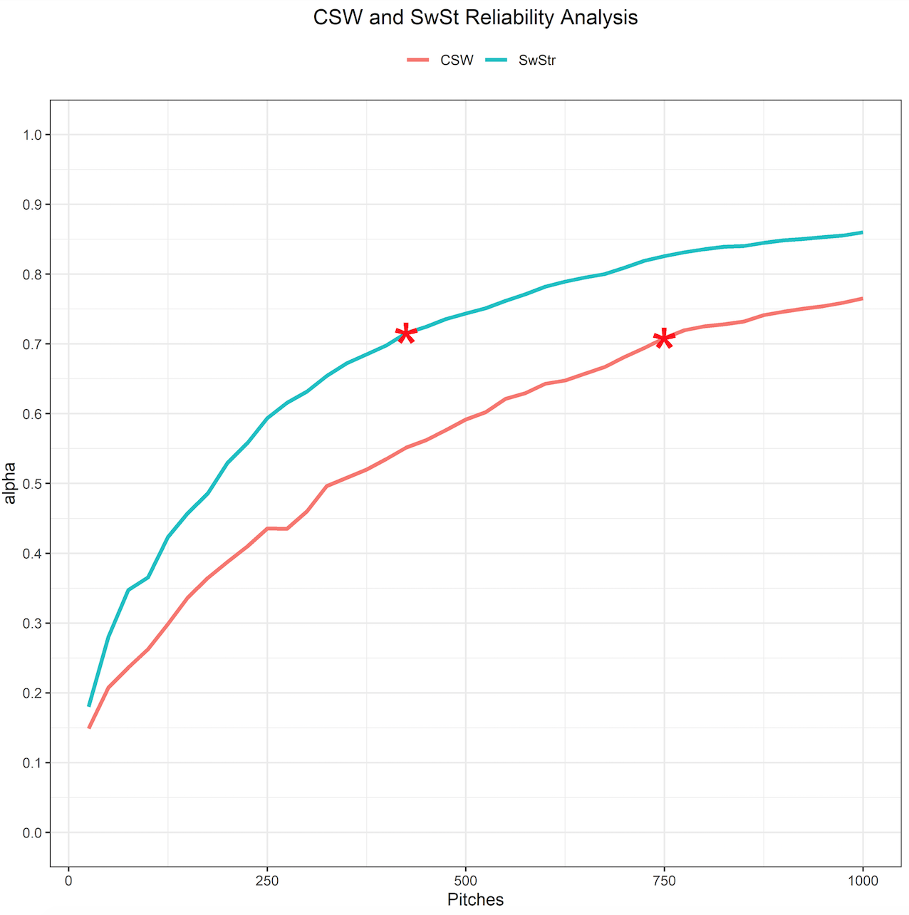
There’s another metric we talk heavily about at Pitcher List that becomes reliable fairly early in season: CSW.
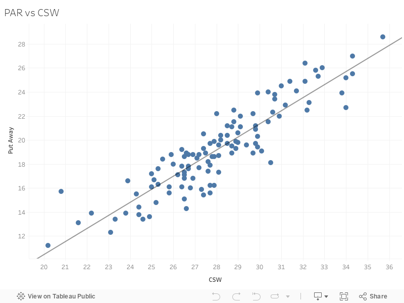
Considering PAR is just CSW in two-strike counts, their close relationship to one another makes sense. Thanks to Colin Charles and Fangraphs open source reliability code, we were able to determine that CSW becomes reliable around 750 pitches or around 7-8 starts.
 If PAR has a strong relationship to CSW, does it stabilize just as quickly?
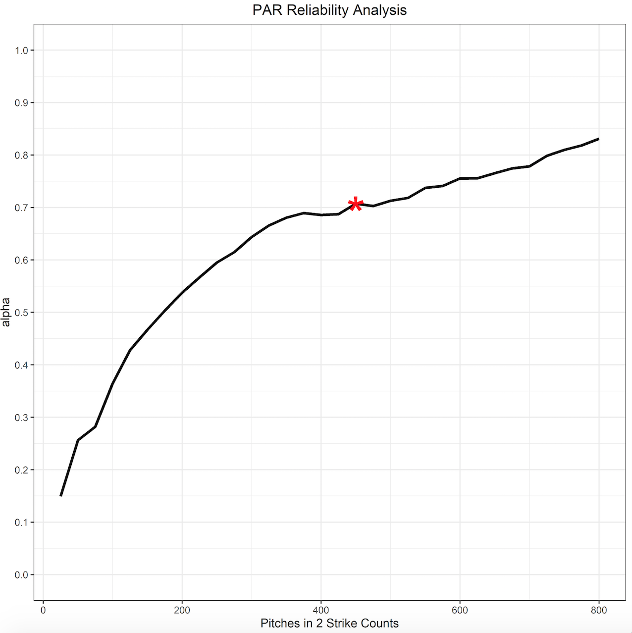
On average there were about 30 pitches in two-strike counts thrown per game in 2019 (I’ll spare you a billionth chart here) which means PAR would become reliable around the 10th or 11th start for an SP. For those starting the season healthy, that’s around mid-May which is relatively quick. There is one metric that stabilizes even quicker than CSW though: our old trusty friend K%:
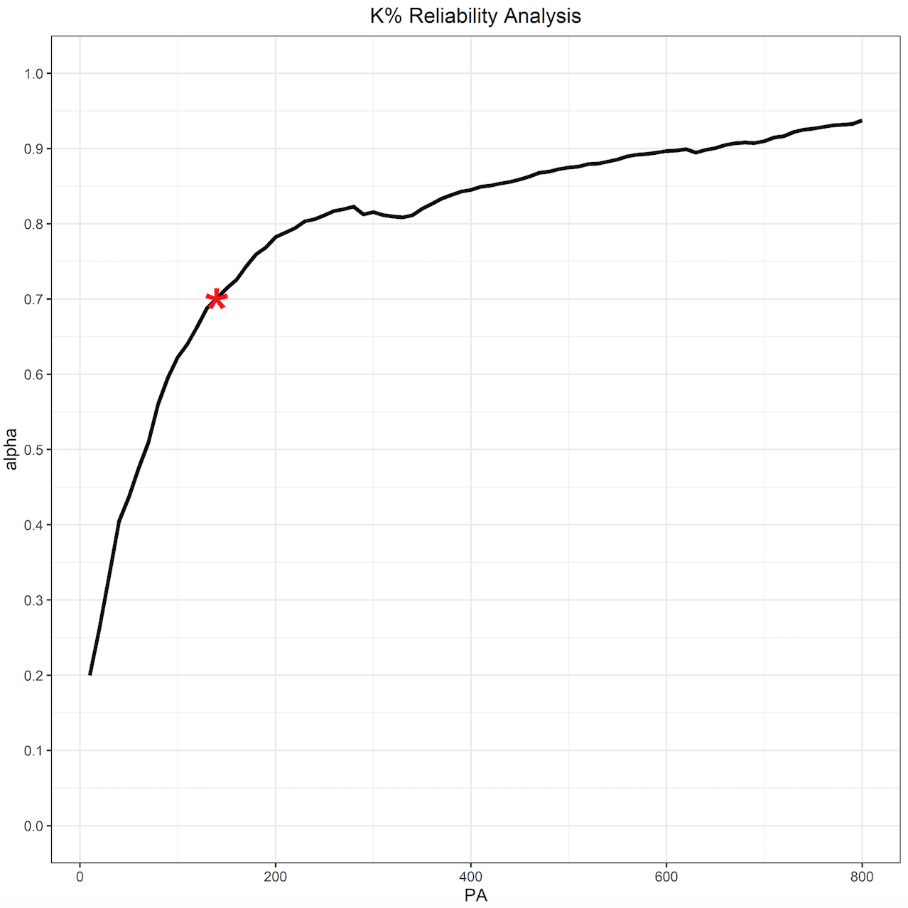
K% stabilizes very quickly. Around 140 PA’s which would be after about five or six starts from an SP. When observed in correspondence with K% and CSW, PAR could show us very early whose performance may be legitimate and who may be due for some regression.
Conclusion
A lot of this article has shown just why K% is a go-to metric by analysts. If you’ve read my work for a while though, you’ll know that I’m not a fan of relying heavily on one particular metric when others can help provide context and nuance. While PAR shouldn’t supplant K%, it can be utilized to help elucidate it. PAR can you help you in your draft prep by illuminating possible regression candidates. PAR’s quick stabilization rate also makes it a helpful tool to use in tandem with CSW in figuring out who to pick up off the waiver wire during the course of the season. Where can you find in season PAR? It’s coming soon to our very own leaderboard.
If you’d like to do your own research leading up to your drafts, here is a spreadsheet with every pitchers PAR from 2019, including their PAR on individual pitch types.
Photo by Quinn Harris/Icon Sportswire) | Adapted by Michael Packard (@designsbypack on Twitter & IG).
Data Analysis by Colin Charles (@s_scolary).
Interactive graphic by Nick Kollauf (@Kollauf).
Love the metric, thanks
Thanks for checking out the piece!
You do great work Alex, you won’t find many articles that are more thoroughly researched and detailed than here at Pitcher List. Let the haters hate!
Haha, thanks for the kind words, Ed! Much appreciated.
How does this compare with Relievers and smaller samples? Top 10 in PAR for RPs?
Don’t want to make too many assertions about RPs as I primarily focused on SP and don’t want to lead you astray. That said, here’s the link to the top 10 for RPs: https://baseballsavant.mlb.com/statcast_search?hfPT=&hfAB=strikeout%7Cstrikeout%5C.%5C.double%5C.%5C.play%7C&hfBBT=&hfPR=&hfZ=&stadium=&hfBBL=&hfNewZones=&hfGT=R%7C&hfC=2strikes%7C&hfSea=2019%7C&hfSit=&player_type=pitcher&hfOuts=&opponent=&pitcher_throws=&batter_stands=&hfSA=&game_date_gt=&game_date_lt=&hfInfield=&team=&position=RP&hfOutfield=&hfRO=&home_road=&hfFlag=&hfPull=&metric_1=&hfInn=&min_pitches=0&min_results=50&group_by=name&sort_col=pitch_percent&player_event_sort=h_launch_speed&sort_order=desc&min_pas=0&chk_pitch_type=on&chk_count=on#results
Thanks for this! I know the metric is literally put away rate and we should only care about strike three and treat everything else as a failure to get strike three but I really want to remove foul balls here and count them as neutral. I think that would give us a better correlation to K% without penalizing a neutral event like a 2-strike foul ball. It feels weird to count a foul ball the same as a ball or a ball in play. I think this current PAR metric is important in defining put away efficiency and therefore still very important.
The most important pitch in baseball has always been strike one.
Also I’d be tempted to mess around with removing 3-2 counts from this analysis since often times the pitcher’s approach shifts toward inducing contact and avoiding a BB vs. putting a hitter away with a K like they would try in 0-2, 1-2, 2-2. Better yet I’d be curious if there were a way to weight each count slightly differently knowing the pitchers’ intentions 0-2 are very strongly in favor of K vs. contact and slowly shift as you head toward a more batter neutral count and then 3-2.
When the list ends up looking like every other list of the top pitchers, what exactly is the value? To think that is what makes it good is kind of a strange idea. How about the SIERA list and I just add .01 if you name starts with a vowel? Is this not a study of noise within a K rate leader board? Efficiency is largely not in a pitcher’s hands – there are a lot of variables ranging from hitters to umpires. I wonder if this isn’t quantifying luck. I would settle for K/9 but that is too easy to interpret.