


The season may have started already, but it’s never too late for projections! For those of you who are unfamiliar with Optimal Location Ratios, or OLR for short, it is a statistic I created this past winter and debuted during PitchCon this year to analyze how well pitchers locate their pitches inside and outside the zone in their optimal locations according to the the so-called Blake Snell Blueprint of four-seam fastballs up and everything else down. In fact I wrote a primer on it a few months ago explaining how I created OLR, its strong connection to pitch success, and its ability to potentially predict future performance. One of the most important parts of testing a new, predictive statistic is to actually try and make predictions using it and see how it unfolds. That is exactly what I set out to do.
I hoped to have these out before the season started but unfortunately A.) I think I probably underestimated just how many pitchers I would need to project (A through D alone is just over 100 pitchers!), and B.) the coding turned out to be much trickier than I anticipated. Before I actually roll out the projections, though, I’m going to briefly explain my projection process and then I’ll pick a few players that stand out to me and walk through how I made my projection for that player. Before we do that though there are a few things to make clear.
- OLR is a ratio comparing the rate at which a pitcher throws a pitch in it’s optimal location (Four-seam fastballs up, sinkers, breaking balls and offspeed pitches down) inside the strike zone and the total rate at which they throw the pitch in that optimal location as a whole. It will always be somewhere between one and zero.
- OLR has a range it wants to sit in. Too low an OLR and you aren’t throwing it in the zone enough to fool the hitter, but too high an OLR and now you’re throwing it in the zone TOO much and it’s going to get tattooed. Today, and for the next couple days, we’re talking about four-seam fastballs, and in this case, the range we are roughly looking for is between .40 and .45. There can be exceptions above or below that range, but usually you only want to trust them with repeated success.
- OLR was created using pVAL as a measure of success. It doesn’t predict how successful or unsuccessful a pitch will be: There are hundreds of things that determine degrees of success and OLR is just one of them. But OLR does have a strong connection with predicting success or failure according to pVAL. With that in mind, that’s all these projections will attempt to predict: Whether or not the pitch will be successful or not in 2022.
Okay! With all that out of the way, let’s move on to how I make my projections:
Projection Methodology
The first key component to how I make my projection that you have to understand is what’s called the Many Model Theory. At their core, models are a simplified way of looking at the world or a set of data so we can better understand it. Models can be mathematical equations or algorithms, they can be a visualization or image, heck in my personal favorite example, The Mississippi River Basin Model, they can be literal three dimensional models.
OLR in and of itself is a model as it is a simplified way to use a single number to understand the effects of pitch location in certain areas linked to pitch success. The Many Model Theory is the idea that the more accurate, non-redundant models you can use to explain something, the more accurate it will be. In this situation, the average of multiple models used to predict OLR will lead to a more accurate and nuanced projection. Many projections systems, such as Ariel Cohen’s ATC projections or FantasyPros’ Aggregate ADP, already use this theory to make better projections.
If you think of this set of projections as OLR 1.0 (I do), then I will be using two different models to make predictions and then also create a third model by averaging them together. I will then use these three models to inform my projection. Eventually, depending on how well the initial projections go, I will then probably add more models for 2.0 and 3.0 to help refine projection accuracy but for now here are the two models I am using:
Linear Regression Model
We’ve all seen linear regression models used in the baseball world. Linear regression is used to test two independent variables to see if you one changes when you alter the other while also testing to see if the variables are good predictors of a specific dependent variable. In this case, those variables are OLR and the date of the game. It’s not quite full blown time series analysis or anything (that’s next), but we are using time as one of the variables, as I did want to evaluate if time and temperature seemed to play a role in OLR, or what we call seasonality. For instance, here is the linear regression for Dean Kremer’s four-seamers spanning 2020 and 2021:
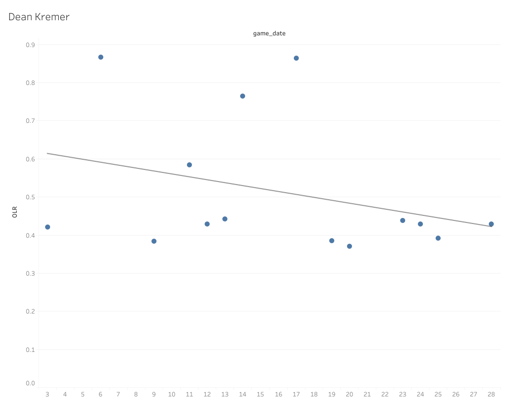
The line running across is known as the regression line, and it’s defined as the line that best describes the behavior of the data set. A simpler way to put it is that it shows the trend of the data. For the record, the equation to determine a trend line is y = m(x) + b, and I will never stop being annoyed that my eighth grade middle school algebra teacher was absolutely right when she said I would use that equation my whole life. I’m sorry Mrs. Wright: You were totally, well, right, I suppose.
Anyways, what the linear regression prediction model is going to do is attempt to predict what the next point would be using that regression line. I’m using this model type because I wanted something of a naïve (statistically speaking) prediction. While the trend follows each individual point, how to interpret each point isn’t changed or effected by the other points, hence the naivety. The model attempts to make this prediction 50 times and then I use the average of those predictions. That average is the first of my three projection data points.
ARIMA (Autoregressive Integrated Moving Average) Model
Don’t get overwhelmed by the fancy name and acronym: This is pretty simple once everything is defined. ARIMA models are a type of Time-Series analysis. Time-Series analysis is defined as a specific way of analyzing a sequence of data points collected over an interval of time. Autoregression is a Time-Series model technique that uses observations from previous time steps (often called lag steps) as input to predict the value of the next step. Finally, a moving average is defined as a statistic that captures the average change in a data series over time. If you follow the writing and analysis of my good friend here at Pitcher List, Scott Chu, you’ve actually already seen a ton of moving averages. He has a deep, unabiding love for rolling charts (for good reason), and in reality a rolling chart is simply the visualization of a moving average. Using Dean Kremer again as our example, here’s a rolling chart displaying an OLR moving average:
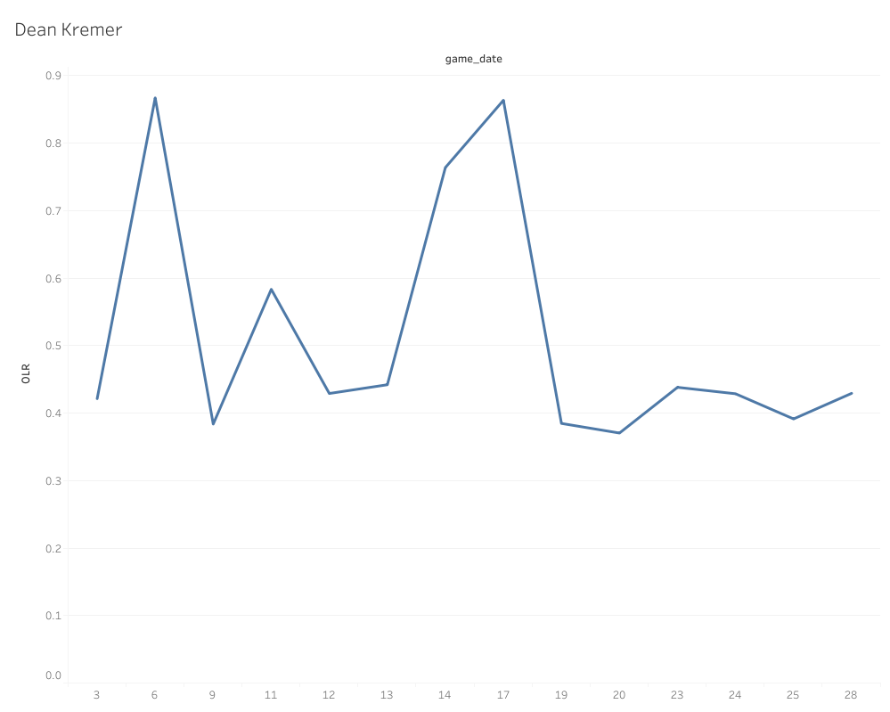
This rolling chart shows how the average of the data changes and shifts over time (hence moving average), and if you want to know all the potential uses for these charts and moving averages in general, I highly recommend Scott’s PitchCon presentation I linked above. What ARIMA models do is integrate autoregression. The model is going to predict a certain number of data points beyond that last point, but with each prediction it is going to interpret each consecutive point through the lens of the previous data while also incorporating each new point into the next points prediction.
For example, the model predicts point 29 on the moving average in the example rolling chart above based on the points and trends that came before it. Then it’s going to do the same for point 30, but it’s also going to take into consideration the newly predicted point 29 as well. Point 31 is going to do the same by considering the data and point 29 and 30, and so on and so forth for as many steps as I ask the model to run.
Given that, these days, a full season of starting pitching is right around 32 starts, I asked the model to predict the pitcher’s OLR 32 data points into the future. The model then repeats this process 50 times and I take the average of the results. This is the second data point in my predictions. The reason why this is a unique model from the linear regression model is that it is altered heavily by the trend of the data and the points aren’t actually viewed independent of each other.
In the case of OLR (and many other predictive baseball statistics) it can make it a lot easier to spot skill improvement or approach changes, confirm stabilization of a skill, or filter out random noise in the data. Finally, for the third point in my projections, I take the average of the two prediction models because it combines the prediction based on what is (linear regression) and the prediction based on what could be (ARIMA model). We also know from the Many Models theory that the average of two unique models is going to be more accurate on average than either one by themselves.
The Projections
Now that I have my three data points for each pitcher’s fastball, now I have to make a projection. One common misconception about analytics and statistics is that we just take the number and be done with it, but if you do that you don’t really learn anything. You end up with the what, but not the why. If you look at all the information provided though, you can learn so much more about the pitcher. For the rest of the article I’m going to point out a few specific cases that I find interesting and hopefully give you some insight into my thought process. If you want to peruse through all 900 of the projections done so far, you can dive into them here:
Four Seam Fastball Optimal Location Ratio Projections
I’m working on getting a Tableau Dashboard put together eventually so it’s a little prettier to look at and I can add some visualizations and filters, but for now, if you want to search for a specific player click on the icon next to the “Names” column that the red arrow is pointing at in this image:
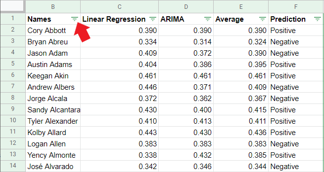
That will bring up the ability to search for players and even choose multiple players for comparison purposes. That way, you do not have to search through 900 players to find whomever you want to look at. Let’s take a look at some specific examples I find most interesting/instructive:
Ian Anderson is a confounding and contradictory pitcher to evaluate, so I think this makes a really interesting. None of those OLR numbers indicate that he should have a positive pVAL, but the ARIMA does indicate that his OLR has been trending up. It’s important to remember that if you are trending a moving average upward, that means Anderson’s OLR has been either higher than .354 or even .376 in order to pull that ARIMA projection that high, or Ian Anderson lives on the extremes of OLR, riding a roller coaster from game to game where more of his games have good OLR, but some have very bad OLR as well. That would pull a linear regression line down, but the ARIMA would more heavily weight the good OLRs if there were more of them.
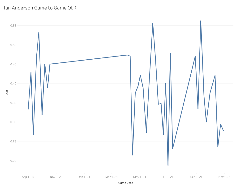
This line chart is not a rolling chart; this is showing the four-seamer OLR score for each individual game Ian Anderson has pitched in, and as you can see, they are all over the place. Most of those games sit in the ideal to just-below-average range with a few really extreme scores in either direction. What if I turned this into a scatter plot with a regression line?
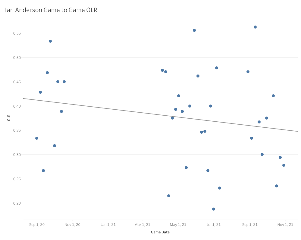
A regression line is going to be a bit more affected by the extremely low outliers than an ARIMA model and tries to fit all the data as best it can, so it’s also pretty heavily weighted by how many games are right between .350 and .400, hence the downward trend. This is useful information. It tells us that, for the most part, any random given day Anderson pitched on, chances were his four-seamer OLR would end up somewhere between .350 and .400. Now, a moving average on the other hand …
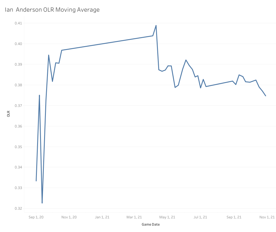
You can totally see here why the ARIMA model looked at the trend of the moving average and ended up with a higher projection. This is why it’s so important to use both models, as they tell us two very different things. The linear model keys us in to how erratic Anderson’s four-seamer control can be from game to game up in the zone, but the ARIMA model tells us it’s highly likely the high, average and just-below-average (think like .380) games are much more likely than a below-average to poor game. It’s also worth noting that the moving average looks like it certainly found a decently stable range in 2021, and the moving average helps us see that and it is reflected in the result of the ARIMA model itself.
So why choose positive? Because the last part of this is to factor in past performance, and according to pVAL, Anderson’s fastball has been a positive pitch for his entire career. How is this possible? My take is that since there are more good to okay OLR games than outright bad, and Anderson throws the pitch almost 50% of the time, that volume overwhelms the erratic and poor games when he doesn’t have his control, even if it is roughly 1/3 of the time.
Let’s look at one other example. There have always been questions surrounding the quality and sustainability of Shane Bieber’s fastball, and for good reason, since it doesn’t exactly have standout velocity, movement or spin. For most of his career, Bieber’s fastball has gotten positive results according to pVAL, with 15.7 pVAL in 2019 and 7.8 pVAL in the shortened 2020 season. On the other hand, it was worth -6.6 pVAL in 2018 and -3.0 pVAL in 2021. Given that one of Bieber’s calling cards is command and location, I have sneaking suspicion that OLR can help shed some light on this pitch’s success/or failure. Here is what the models tell us:
We can start with the OLR consistency game to game.
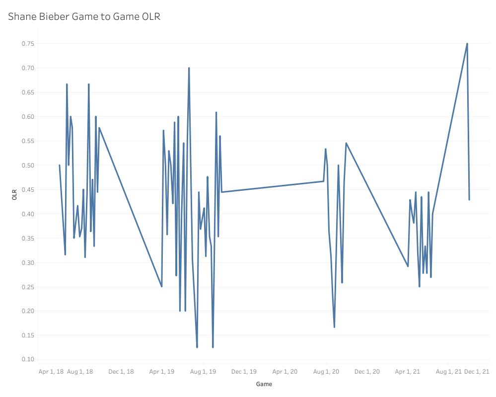
You can see some of the same consistency problem that we saw with Ian Anderson, but what’s fascinating is that the seasons where Bieber found success with his four-seamer were the years he spent most of his games on one extreme or the other of the OLR spectrum. Off the bat, this makes me wonder if those huge swings are deliberate as part of a game plan for handling individual teams and matchups. What about the linear regression?
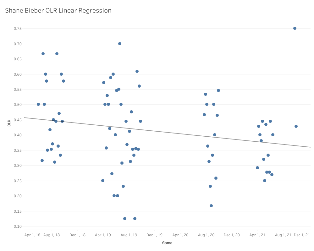
It looks a lot like Ian Anderson’s, only about 2 to 3 ticks higher up overall, which explains the linear model’s prediction of .385. That’s a bit more solid than Anderson’s, and as I mentioned before, the fluctuations aren’t nearly as extreme. How about that moving average?
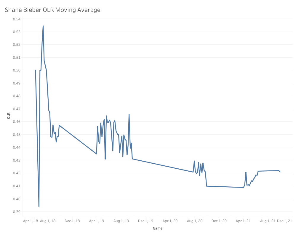
That ARIMA prediction makes a ton of sense when you look at the moving average trend. Even in 2021, when the four-seamer produced poorly, it started off lower and slowly built its way back up to where it normally sits. While .410 is right in our sweet spot for four-seamer success, it does appear like Bieber needs a slightly higher OLR than normal for his fastball to be successful.
In Bieber’s career, he has generated 215 called and swinging strikes up and in the zone. 130 of those strikes (60.4%) were of the called strike variety, so based on that, my theory is that Bieber generates a lot of his four-seamer value from stealing called strikes up in the zone and therefore needs a higher OLR in general to really find success, since that means he’s throwing a higher percentage of his fastballs up in the zone. Unless I see a trend of that OLR being down toward .400 again this year, I’m going to bet on the positive side of things for this fastball in 2022.
So these are just two examples of how we can use OLR and my projection system to evaluate four-seam fastballs and make predictions of their future success. In the next few days I’ll be releasing the next batch of these projections (probably E through K), and since I won’t need to dive quite as much into the overall methodology, we can spend most of that article diving into so many more interesting fastballs and explore these projections in greater detail.
Be on the lookout for that to drop soon and please don’t hesitate to reach out to me or comment below if you have questions!
Design by J.R. Caines (@JRCainesDesign on Twitter and @caines_design on Instagram)
Daniel this is outstanding work. I’d love to see how this develops with more data.