


A few weeks ago, I wrote an article describing the relative value of various ERA estimators, including FIP, xFIP, SIERA, and xERA. What I found was that FIP and xERA are highly descriptive of ERA in the same season, and that SIERA and xFIP are more predictive of ERA in the following season. All four ERA estimators, in fact, are more predictive of pitchers’ second-season ERA (S2ERA) than ERA itself.
Nevertheless, none of them worked particularly well as predictors. Moreover, in that article, I discovered that K-BB% alone was more predictive of S2ERA than both xFIP and SIERA. To their much-deserved credit, Tom Tango and GuyM initially conceptualized an effective ERA estimator using K-BB% called kwERA. That got me thinking: what if I were to build a new ERA estimator starting with K-BB%?
To that end, I’ve spent much of my free time while in lockdown learning how to program in R. On that score, I have to thank Eric Colburn for his help. And, with that knowledge, I successfully built an ERA estimator that is more predictive of ERA than other publicly available ERA estimators. Let’s call it Forecasted Run Average (FRA).
Below, I’ll detail how I created and tested FRA, the FRA model’s results, and a discussion and application of FRA for the 2020 season.
Methods
First, I selected a sample of all pitchers with 100 IP in back-to-back seasons since 2015. There were 352 such results. Then, I tested a number of independent variables to determine which were relevant in season one to predicting S2ERA. I obtained that data from FanGraphs and Baseball Savant. The sample included: K-BB%, wOBAcon, xwOBAcon, ISO, SLG%, xSLG, AVG, xBA, HR/9, Brls/BBE%, Brls/PA%, Average Spin Rate, Average Velocity, Average Exit Velocity, Exit Velocity on Fly Balls and Line Drives, Average Launch Angle, WHIP, Hits/IP, (Brls+Solid+Flares+Burners)/IP, Hard Hit Rate, Hard%, Soft%, GB%, FB%, and LD%.
That is a laundry list of variables–many of which patently overlapped with one another–that you do not need to memorize. I included it there so that you can see what I tested. More importantly, I then utilized feature selection algorithms called Boruta and LMG to rank all of those independent variables by how relevant they were to S2ERA. In that way, I was able to eliminate a number of independent variables that were unimportant.
Next, I created a correlation matrix to help control for collinearity. That enabled me to winnow down the list of relevant independent variables to simply K-BB%, Average Exit Velocity (aEV), and Average Launch Angle (aLA). One does this to avoid including highly correlated independent variables, which can lead to double-counting and, therefore, inaccurate predictions. As applied here, the highest variance inflation factor of the four independent variables was 1.05, well below the generally accepted threshold of 2.50 (which is a good thing).
After finding my variables and controlling for collinearity, I was left with a data frame consisting of 352 S2ERAs, K-BB rates, aEVs, and aLAs. I divided that data randomly into a training set (80%) and a testing set (20%). I did this four times to repeatedly test the model for overfitting.
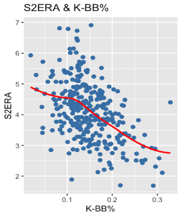
I used linear regressions on the training set because the independent variables and dependent variable share linear relationships. For example, plotting K-BB% against S2ERA, and using backward compatibility to auto-generate a line of best fit, indicates that the relationship, in this case, is mostly linear.
With linear regressions, I was able to find the coefficient of determination (R2) between the independent variables (K-BB%, aEV, aLA) and the dependent variable (S2ERA), which illustrates how much variance in the sample of S2ERAs is explained by the independent variables. The higher the R2, the greater the independent variables explain changes in the dependent variable (though R2 will never exceed 1). Adjusted R2 specifically was used here because the model incorporated multiple variables. The Adjusted R2 of the model will only increase where independent variables are successively incorporated into the model if the new fit compensates for the loss of degrees of freedom.
I further found the Root Mean Squared Error (RMSE) of the model. The value of RMSE is twofold. First, it is scaled to the units of the dependent variable, so you can understand it in terms of ERA. Second, it is a measure of how spread out your model’s values are from the line of best fit. In other words, it is representative of the average error of the model’s predictions. In this case, the lower the RMSE, the lower the average error of the FRA values relative to the observed S2ERAs. RMSE is the most important measure where the main purpose of a model is prediction.
Finally, I used a machine-learning algorithm in the Caret package to train a linear model for predicting S2ERA from the training set. The FRA training model produced R2 and RMSE results of 0.267 and 0.823, respectively. More on that below. For now, just know that I also generated FRA values for the testing set, and the R2 and RMSE of those values for the S2ERAs in the testing set were:
- Testing set 1: 0.362 R2, 0.761 RMSE.
- Testing set 2: 0.211 R2, 0.879 RMSE.
- Testing set 3: 0.367 R2, 0.776 RMSE.
- Testing set 4: 0.276 R2, 0.839 RMSE.
Not only do those results illustrate that there is no overfitting to the model, it is also worth noting that the coefficient were stable each go around. K-BB%’s existed between -8.3 and -7.7, aEV’s between 0.09 and 0.11, and aEV’s between 0.01 and 0.03.
Basically, by reserving data, testing it, and getting good results, I ensured that the model works on data it has never seen before (works better, actually), and not just on data that it has the answer to already. To further ensure reliability, I also employed repeated 10-fold cross-validation on the training set while generating the model.
Ultimately, the model produced a simple formula: FRA = -3.44548 + (-8.33919*(K-BB%)) + (0.01894*aLA) + (0.0984*aEV).
Results
Many likely skipped over the preceding section, and that’s fine. It is there for those interested to understand and potentially check my work.
But here comes the fun part. Fundamentally, FRA is more predictive of S2ERA than all of ERA, FIP, xFIP, SIERA, xERA, and Baseball Prospectus’s DRA.
| ERA Estimator | Adjusted R2 | RMSE |
|---|---|---|
| ERA | 0.072 | 1.120 |
| FIP | 0.128 | 0.978 |
| xFIP | 0.180 | 0.902 |
| SIERA | 0.197 | 0.876 |
| xERA | 0.128 | 0.974 |
| DRA | 0.133 | 1.170 |
| FRA | 0.245 | 0.823 |
Again, my sample was the 352 pitchers with 100 IP back-to-back seasons. Take FIP, for instance. All of the FIPs in season x were tested against the same pitchers’ ERAs in season x+1. Considering the Adjusted R2, we can see that FIP in season one explained 12.8% of the variance in S2ERAs. That’s not great, leaving 87.2% of the variance unexplained. Further, the average error of predicted S2ERAs with FIP was nearly a full run (0.978 RMSE).
Previously, as a matter of predictiveness, the best publicly available ERA estimator was SIERA. SIERA explained 19.7% of the variance in S2ERAs, and the average error from using SIERA to make predictions was 0.876 runs. That’s still not great, but is nonetheless reasonable given the inherent randomness to ERA, a fact evidenced by how poorly ERA predicts itself in the following season (0.078 Adjusted R2 and 1.12 RMSE).
Enter FRA. According to the Adjusted R2, FRA explained 24.5% of the variance in S2ERA. That is by no means perfect, but as with everything else in life, the value here lies in FRA as a relative proposition. Indeed, the Adjusted R2 for FRA~S2ERA is over four points (a 24.3% improvement) better than SIERA~S2ERA, the next-best relationship in the table. It’s 36.1% better than xFIP~S2ERA.
The average error of FRA predictions is over five points (a 6.1% decrease) smaller than SIERA’s and eight points (8.75%) smaller than xFIP’s. That 6.2% decrease is a larger improvement over SIERA than SIERA is over xFIP (2.9%).
It’s worth noting that many (most?) of the other ERA estimators are not intended to function as predictors. Instead, they’re descriptive metrics that indicate whether a pitcher has gotten lucky or “earned” his ERA. If it’s May 1 and you want to know whether someone with a 1.50 ERA truly earned that mark, you should consider his FIP or xERA.
Besides predictive power, FRA is also stickier year-to-year than all of ERA, FIP, xFIP, and SIERA. (To save time, I did not test DRA or xERA for stickiness given they were not competitive as predictive metrics.)
| ERA Estimator | R2 |
|---|---|
| ERA | 0.078 |
| FIP | 0.238 |
| xFIP | 0.423 |
| SIERA | 0.399 |
| FRA | 0.474 |
Based on this table, you can be more confident employing FRA than its ERA estimator counterparts because it is less subject to random fluctuation year-to-year. FRA is 12.1% stickier than the next-closest ERA estimator, xFIP. It is 18.8% stickier than SIERA. Further, FRA should stabilize quickly. Although I have not calculated an exact stabilization point, I do know, thanks to Max Freeze’s handy compilation, that each of the four independent variables comprising FRA stabilize by 64 IP at the latest.
Manifestly, FRA is a robust model for predicting ERA. It is more predictive than its ERA estimator counterparts. It is stickier than them too, and it likely stabilizes quickly. Further, you should be confident in FRA’s accuracy (relatively speaking) given the rigorous testing detailed above.
You can find a full list of pitchers’ FRAs (min. 100 IP) dating back to 2015 here. For now, I’m housing the data in a Google Sheet until the next iteration of the Pitcher List Leaderboard, at which point you’ll be able to find it there. The above link includes 2019 FRAs, which should, in theory, be more predictive of 2020 ERA–to the extent there is a 2020 season–than the other publicly available ERA estimators.
Discussion
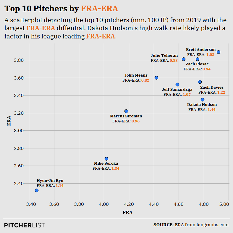
To illustrate the practicality of FRA, let’s look at the ten pitchers FRA predicts to have the biggest drop in ERA in 2020 (min. 100 IP):
Data Visualization by Nick Kollauf (@Kollauf on Twitter)
To me, the most salient aspect of this graph is that these pitchers all overperformed their ERAs because they had unimpressive K-BB rates, which is the most important component of the model. While each of these pitchers maintained ERAs under 4.00, they also had K-BB rates under 20%. In fact, Hyun-Jin Ryu (19.2%) is the only pitcher on this graph with a K-BB rate over 15%. As to Ryu specifically, note that FRA still predicts a 3.46 mark, which is excellent and a boon to any fantasy baseball team. His inclusion on this list is simply a warning not to expect a repeat of his pristine 2.32 ERA from last year.
This graph also illustrates a potential limitation of FRA. Many of these pitchers are ground-ball specialists, finding themselves on the top of FanGraphs GB% leaderboard (min. 100 IP): Dakota Hudson (2nd), Brett Anderson (4th), Marcus Stroman (6th), Mike Soroka (11th), and Ryu (14th). Sonny Gray, who had the 11th-largest FRA-ERA differential and therefore just missed making the graph, is 13th on the leaderboard.
I eliminated GB% from the model because it accounted for less variance in S2ERA than aLA and was, unsurprisingly, highly correlated with aLA. Yet, aLA may not adequately capture which pitchers run high ground-ball rates (though aLA was obviously useful for the model in other respects). Ultimately, I could only keep one. It’s possible that FRA is not sufficiently accounting for some pitchers who are able to overperform their K-BB rates by keeping the ball on the ground.
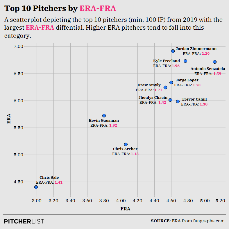
Now, let’s take a look at those ten pitchers with the brightest prospects ahead:
Data Visualization by Nick Kollauf (@Kollauf on Twitter)
For fantasy purposes, the most interesting pitchers on this graph are Chris Sale, Chris Archer, and Kevin Gausman. Unfortunately, Sale won’t be pitching in 2020, but his inclusion is unsurprising in light of his fourth-best K-BB rate in MLB (min. 100 IP), which shows he was actually dominant in spite of the bloated ERA. For his part, Archer had a decent 16.7% K-BB rate, and if reports are true about the Pirates’ new approach to analytics, he might make an interesting late-round target. Finally, perhaps Gausman still has something left in the tank, though his 18.2 K-BB% is likely inflated by his time spent in the bullpen.
What I find more interesting is that many of the pitchers on this graph exhibited ERAs higher than any pitcher’s FRA over the last five years. The same was true of the other graph, though in the reverse. In fact, the highest FRA of the last five years belongs to 2016 Mike Pelfrey’s 5.19 mark. Yet, there have been a number of pitchers with higher ERAs than 5.19 over the last five years. Every pitcher in this graph besides Chris Sale had at least a 5.19 ERA or higher, and this graph only includes 2019 pitchers.
This suggests that, in general, FRA distribution is much narrower than ERA. To that point, Pelfrey had a 1.9% K-BB rate in 2016. He nearly walked as many batters as he struck out. But even with that rate, he only earned a 5.19 FRA. This begs two additional observations:
- FRA is stickier year-to-year than ERA, in part, because it regresses pitchers closer to the mean. Indeed, the standard deviation–i.e., the degree of spread–of all 2019 FRAs (min. 100 IP) was 0.51, as compared to the 0.94 standard deviation for 2019 ERAs.
- FRA’s regression to the mean is deliberate and reasonable. It enables better ERA predictions because pitchers tend to run unremarkable K-BB rates. In short, some pitchers may experience good or bad luck in a given season, resulting in an ERA under 3.00 or over 5.00. However, unless their underlying skills are as bad as Pelfrey’s (in which case they’re likely out of the league) or as good as Gerrit Cole’s (34% K-BB rate, 2.57 FRA in 2019), they generally will not repeat outlier ERAs, which is why FRA’s conservative predictions are more accurate than others.
Remember I said Ryu’s in for regression? His 3.46 FRA was still 11th-best in baseball (min. 100 IP). Again, FRA doesn’t predict a repeat 2.32 ERA for him, as it only suggests that three pitchers will have ERAs under 3.00 (Cole, Max Scherzer, and Justin Verlander). There just aren’t that many true aces according to FRA. The model clusters all but those pitchers with elite or terrible underlying skills close to the FRA mean (4.12 over the entire sample).
Some other items of note:
- Brandon Woodruff’s 3.30 FRA was seventh-best in 2019 (min. 100 IP).
- Like many other ERA estimators, FRA likes Matthew Boyd (3.62). It likes him more than it likes Patrick Corbin (3.77).
- Regression may be coming for Mike Minor and Sandy Alcantara given their 4.09 and 4.60 FRAs, respectively.
- One ace up, one ace down: Blake Snell (3.47 FRA), Aaron Nola (3.97 FRA).
- Yu Darvish and Robbie Ray may have better days ahead, with 3.49 and 3.66 FRAs, respectively.
Conclusion
FRA is a step in the right direction, as it is more predictive of S2ERA than any of ERA, FIP, xFIP, SIERA, xERA, or DRA, and stickier, too. Again, you can find a list of all FRAs dating back to 2015 (min. 100 IP) here.
However, a word of caution. While it is better as a predictor, bear in mind that FRA only explained 24.5% of the variance in the S2ERA sample. It is, therefore, highly imperfect, and there remains substantial unexplained variance in approximating future ERA.
Featured Image by Rick Orengo (@OneFiddyOne on Twitter and Instagram)
Awesome analysis – would love to see the code used to do the season-over-season comparisons.
Thank you! By code, do you mean the a spreadsheet housing the sample of pitchers? All I did was run a simple regression over the sample, with s1 FRA against s2 FRA, for example.
This may be a stupid question, but should you use a pitchers 2019 FRA to try to predict their 2020 ERA?
Yes you should!
Looks good – I like it! Question regarding “FRA only explained 24.5% of the variance in the S2ERA sample.” I’m no stats expert, so my ignorance may shine through. Is this variance between… for example… the actual 2018 ERA and the projected FRA for 2018? I’d think there are a lot of variables that would be extremely time-consuming and data-rich to capture and some that could never be captured. For instance, injuries or nagging ailments (e.g. Sale), change in the baseball (e.g. 2017 and 2019), change in ballparks (e.g. Bumgarner to AZ in 2020), ballpark effects (e.g. Coors Field), breakouts (e.g. Giolito from 2018 to 2019), etc.. What would you consider an acceptable % of explained variance and how do the other models compare (ERA, FIP, xFIP, SIERA, xERA, and DRA)? Thanks!
Thanks for the question. It means variance between the S2ERA sample. Take 2018-19, for example. If the R2 were .245 between 2018 FRA and 2019 ERA, then the 2018 FRA numbers explained 24.5% of the variance in the actual 2019 ERAs. You’re absolutely correct that a lot of variables (e.g., injury) will be difficult to capture and will, therefore, leave significant variance unexplained no matter how good the model is. In that respect, I don’t think there’s an “acceptable %”, I only think that everything is relative, and if FRA explains more than some other ERA estimators, then it is valuable.
Thanks Dan. That’s what I meant, just didn’t say it accurately (got a little twisted between actual ERA and projected FRA). I should have said between 2017 FRA and 2018 ERA. Looking forward to seeing it on the leaderboard (as you mentioned).
Thanks – this sounds really promising. Could you give the results of more (relevant) pitchers? Why not post the FRA-ERA for the top 100 fantasy SP’s?
Hey Lou, for now, this is the best it’s going to get: https://docs.google.com/spreadsheets/d/18gJc4ClWqiU-t_O4BwO8u5vUH23_0pTjr6tNS5BFtDY/edit?usp=sharing
We will add this to the leaderboard in due time, where it will be easily accessible and include pitchers with fewer than 100 IP. Thanks for reading!
I can work with this! ?
The problem with this awesome pieces: 1) Read a few times, 2) Take notes, 3) Love it and spend a lot of time on it, 4) Click through the 3-4 hyperlinks and repeat Steps 1-3. Haha, thanks man!! Great job.
Thank you!