


In 2018, Ian Happ had some holes in his swing.
Among players with at least 150 PAs, he was dead last in z-contact at 66.7%. His 36.1% strikeout rate was the 6th highest. And all the more impressive — if we can say that — was that he played almost the full year: 462 PAs over 142 games. He was, quite frankly, not ready.
So, in 2019, the Cubs sent him back to Iowa to figure things out in AAA. And it worked: Happ’s 2019 z-contact rate jumped to 79.5%. His strikeout rate dropped down to 25%. And those changes came with huge gains in his overall results, too. His wOBA jumped 40 points. A 150 point jumping in his SLG helped raise his OPS from .761 to .898 despite a drop in his walk rate. He was, without a doubt, pummeling the ball. So, of course, his hard-hit rate actually dropped slightly in 2019 from 40.5% to 38.2%.
Is it a problem that HardHit% couldn’t tell us anything about Happ’s first mini-breakout? It depends on what we expect from it. For many, HardHit% is a “tool” stat: it says something about how often a player’s balls in play are hard enough to deliver meaningful results. If Happ’s changes were mostly about how often he made contact, then HardHit% did its supposed job.
But, if we’re going to call this a “tools” stat, that begs the question: how do we use it? Comparing players by using HardHit% means only learning about what happens if they make contact. And in the case of 2018 Ian Happ, that was a mighty big “if.”
When we compare players using contact-only stats like HardHit%, Barrel%, dHH%, and wOBACON, that big “if” about contact can lead to some outlandishly bad results. These numbers have their place — the problem comes when we make them the default.
And we’re long, long overdue for a review of our default settings.
What Makes a Good Comparison?
If we’re in the business of analyzing players, it’s not enough to know about baseball. We have to know what it takes to be correct about baseball. And that means knowing how to build a fair comparison.
These typically have a few elements:
- They measure things that players can control. We wouldn’t conclude the Michael A. Taylor is a better player than Christian Yelich just because he’s won a World Series. This is also the same reason we avoid using things like RBI to compare how effective hitters are. Generally, it’s a good idea to try not to rely on stats that are influenced mostly by luck or circumstance.
- They don’t overlook or exclude important data. There are a few different versions of this. We wouldn’t conclude that Elvis Andrus is a better home-run hitter than Juan Soto because he happens to have more hit home runs, because that would be overlooking that Andrus has played more than five times as many games. This is why we tend to use rate states to answer most questions of talent. When it comes to rate stats, though, we can run into the same problem by looking too narrowly. Arguing that Tim Anderson would be a better leadoff hitter than Brandon Nimmo by looking exclusively at batting average ignore that Nimmo’s huge number of walks make him more likely to get one base, for example.
- The numbers match the situation. This often has to do with more qualitative arguments or drawing the right conclusions from good data. An easy example would be arguing that Eric Hosmer is better than Pete Alonso because he’s paid more. Thanks to the rookie pay rules of the MLB’s collective bargaining agreement, pay doesn’t necessarily have anything to do with talent, so conflating the two doesn’t make a whole lot of sense.
Do all this, and you’ll be evaluating players on an even playing field, where the better player actually achieves what you want them to. But when we’re comparing reasonably similar players, it’s not always obvious that we’ve failed to do this, so it’s important to stress-test stats become up with examples as extremes as the ones above to push the boundaries on how we think. The Yelich and Soto examples should be obvious to a lot of baseball fans, and while the Nimmo one isn’t, it’s easy to use good stats like OBP to explain it.
For unfamiliar stats where we don’t have finely-tuned expectations, that can be a little trickier. A less obvious (but equally extreme!) example would be saying that Austin Blandino is a better contact hitter than Mike Trout because his 81.2% contact rate is better than Trout’s career 80.1% contact rate. Offering up this comparison begs the question: why is Contact% a good measure of whether someone is a good contact hitter? To stress-test that stat and find out if it’s worth listening to it, we’re looking for a lurking variable — a factor that we’re ignoring — that would explain why Blandino’s contact rate is sky-high while also making him a worse contact hitter overall.
And in that case, that lurking variable isn’t hard to find. In his career, Blandino has swung at just 52.9% of pitches in the zone, 14 points below league average. And he’s doing this despite opposing pitchers throwing in the zone 53.5% of the time, also well above league average. As a result, Blandino’s 25.6% called strike rate is 11th among the 619 batters who have seen at least 200 pitches since the beginning of 2019, with only two position players ahead of him (remember pitchers hitting? It’s not pretty). The overall result? A career 28.3% strikeout rate and .238 batting average. It looks like Blandino’s only swinging at the easiest pitches to hit. This doesn’t make him a better contact hitter — but it does show us why Contact% can be misleading.
If we try to take a step back and look at rate stats more broadly, the fractions always work the same way:

The Contact% example points us toward something we want to look for: how the different pieces of the stat can lie to us by excluding data important to answering our question. If the two sides of the fraction both measure different skills or choices — in the case of Contact%, contact ability on the top and selectivity on the bottom — then there’s no guarantee that the resulting number will always send us the same signal. A high Contact% could mean elite bat-on-ball talent, or it could mean a wildly broken plate approach.
We can take this example and create a general template for bad rate stats:
Numbers built like this have two ways to get bigger: you can be good at the skill on top, or you can cheat by being bad at the skill on the bottom.
While every statistical will be a little bit unreliable because of variance, this kind of broken is especially bad. In statistics, there are a set of assumptions that we make when we run a linear regression to find correlation known as the classical assumptions of ordinary least squares, OLS assumptions for short. When they’re met, these assumptions are likely to guarantee that we’ve eliminated as much noise as possible from our regression. When they’re not, though, that typically means we’ve left in unnecessary noise and diluted any signal we could find. If we tried to find the correlation between Contact% and batting average, we’d break two to three of these assumptions. While players with low contact rates are almost all going to have poor batting averages, players with high contact rates will be a little more inconsistent because there are multiple pathways to those high numbers. If you’re attempting to use a situational stat to answer a big-picture question, chances that there’s significant improvement being left on the table.
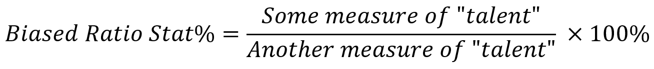
Unbiased rate stats, on the other hand, will give us a clear picture of a player’s talent by making sure to only test for one input. And that means the bottom will be completely neutral: an “even playing field” for them to show off that talent:
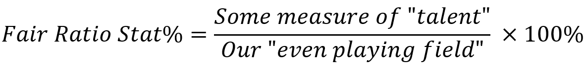
For most questions about big-picture outcomes, we will use plate appearances as the “even playing field.” K%, BB%, OBP, and the original formula for wOBA (it now excludes sacrifice bunts and intentional walks) all use PA as the denominator. Want to know who strikes out more often? Plate appearances are players’ chances to strike out, so K% makes the most sense for that comparison. Same for walk rate: a higher BB% always means a batter walked more. If we wanted to figure out who hits more home runs, it would make sense to use HR/PA. Even K-BB% is a per-PA stat. A player who’s good at these skills might play more often, but their amount of playing time won’t make their strikeout rate better or worse. And that’s what makes it fair.
What Does HardHit% Tell Us?
HardHit% is, of course, a situational stat. In case you’re not familiar with exactly how it’s calculated, here it is:
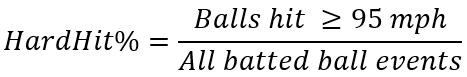
In the most literal sense, this number tells us which players hit the largest portion of their batted balls at least 95 mph. As MLB.com’s Statcast glossary explains it, that number is a result of looking into their data and observing a powerful trend: “balls hit at 40 mph or 70 mph will affect your average exit velocity differently, but in terms of outcomes, they’re just two varieties of weakly hit balls. For true production, you need to get to 95 mph.” There are some issues here that I’m going to set aside for now; A 96 mph batted ball and a 116 mph batted ball will lead to very, very different outcomes. But, it feels reasonable to assume this number would tell us something.
But what, exactly? In a very literal sense, its name tells us that it’s trying to measure who hits the ball hard more often. When I first started seeing and hearing writers and podcasters use it, it was usually as a “tools” stat that tells us about a player’s ability to hit for power. Joey Gallo has a career 50.0% HardHit%, so he hits the ball really hard. José Altuve has a career 32.4% HardHit%, so he doesn’t. Cut, print, roll credits.
To put that usage to the test, I want to go back to Ian Happ. In 2018, his HardHit% was 40.5%. But in 2019, it was 38.2%. So, did his power tool get worse? Well, if we’re going to use HardHit%, we’re assuming that “pitches he made contact with” is an even playing field. So, we need to put that to the test and look for compelling reasons that it wouldn’t be.
Happ made two big changes in the minors in 2019: he changed his stance, allowing him to make contact with high fastballs more easily, and he started to swing more. This prompted opposing pitchers to throw him slightly fewer pitches in the zone. It’s not enough to just quote his changing contact% or swing%: it’s important to see just how much Happ changed on the big-picture level. All percentages given below are out of all pitches that Happ saw, rather just those that were in the zone, that he swung at, or both. So, what I have labeled as ZoneTake% is really Takes in the Zone / All Pitches.
| 2018 | 2019 | |
|---|---|---|
| Zone Take | 17.1% | 12.4% |
| Zone Swinging Strike | 10.7% | 7.4% |
| Zone Contact | 21.5% | 28.9% |
| Total Zone | 49.3% | 48.7% |
| Out-of-Zone Take | 40.2% | 35.9% |
| Out-of-Zone Swinging Strike | 5.5% | 7.9% |
| Out-of-Zone Contact | 5.0% | 7.5% |
| Total Out-of-Zone | 50.7% | 51.3% |
These two seasons of data look like they should come from totally different people. Happ’s changes in approach meant that he cut a huge chunk of both called strikes and called balls out of his diet. While this did add while adding some swinging strikes out of the zone, his change in mechanics culled many of his swinging strikes in the zone. Slightly less of his overall contact came from pitches in the zone (81% in 2018 vs 79% in 2019), and he was clearly seeing fewer pitches in the zone overall.
So we might ask ourselves: were those pitches he suddenly started putting into play just as difficult to hit as the ones he’d been making contact with all along? Let’s consider which pitches he’d most likely be adding to his swing diet. In all likelihood, these aren’t going to be meatballs in the middle of the zone — they’re going to be marginal strikes toward the edges that are difficult to make solid contact with. If he wasn’t swinging at them before, there’s a reason for that. That’s why simply increasing a swing rate won’t typically yield the same results.
We could try to test this theory in a variety of ways. We could exclusively compare his results in and out of the zone to see if his power results were better or worse in 2019. This would assume that all pitches in the zone are equally easy to hit, though, which seems wrong. If we continue heading down this route, though, we end up dividing the zone into tiny bins and looking for signals from samples of just a couple dozen. Looking at Happ’s HardHit% on balls in the top third of the zone means caring about just 18 of the 630 pitches he saw in 2019. That’s excluding a lot of data, and also welcoming huge margins of error from small samples. As long as we’re continuing to dice up a player’s season into tiny situational stats, we’re continuing to drown out anything meaningful with an ocean of fuzz.
I chose Happ for this example because he is the ideal case of HardHit% being relatively stable despite changes elsewhere. But if Happ is suddenly putting roughly the same power behind a more difficult selection of pitches, isn’t it possible that his power is better than we expected? HardHit% won’t be able to tell us.
The larger issue here is that the tradeoff between power and contact isn’t one solely because of mechanics or physical strength. It’s also about choices. Consider, for example, the case of Boston 1B/3B prospect Triston Casas. Trevor Hooth wrote about Casas’ choice to choke up on the bat and how that affects his numbers, digging out an incredible statistical nugget: Casas produced a higher batting average when behind in the count (and typically choking up) than when ahead in the count. He’s choosing to sacrifice some two-strike power to strike out less, but that doesn’t mean that he has less raw power. If we choose to use HardHit% to measure Casas’ raw power when he hits the majors, we’re going to miss the bigger picture.
In the other direction, a player like Keston Hiura who changes his approach to sell out for power will shoot up HardHit% leaderboards, setting us up to overrate his tools. After putting up strikeout rates at or below 20% through AA, Hiura started swinging more aggressively during his 2019 AAA stint, hitting 19 HR in just 57 games alongside a 26.3% strikeout rate. He was called up that year and put up a HardHit% of 50.0%, which was beyond what many of his old reports would have suggested was possible, but struck out 30.7% of the time. If you had predicted that he’d be able to cut his strikeout rates back to his low-minors numbers well keeping that power, you’d have missed that his new approach is what made that power possible. If we use something like HardHit% or even Barrel% to assess him, we factor in the benefits of his change without considering the gigantic tradeoffs it brings.
It may not be obvious, but HardHit% is the result of measuring two different skills. The top side of the equation has something to do with power, but the bottom side — batted ball events — is related to a player’s hit tool. The result is a mixed signal: a high-percentile HardHit% might mean a player is an elite bat who belongs in the heart of the order, but it also might mean they’re the power version of Austin Blandino.
We can take this same line of thinking to pretty much every other contact-only stat. The thing we call Barrel%, which is Barrels/BBE, is likewise biased toward three-true-outcomes hitters. Trying to compare Miguel Sano’s Barrel% to Eddie Rosario’s won’t make much sense. They’re choosing not to be the same player; we can’t measure their skills through a lens affected by those choices.
The same criticism should even be extended toward more forward-looking stats like Connor Kurcon’s Dynamic Hard Hit rate. Kurcon focuses on fixing how we define hard-hit, accounting for differences in how difficult it is to put velocity behind balls hit at imperfect launch angles. But dHH% leaves the “rate” portion of the equation the same, and so falls into the same traps: players who aren’t always choosing to hit for maximum power will sink down the leaderboards. Kurcon does use dHH%’s guts in other extremely useful ways, especially by turning it into a component of what he called TruwOBA (I’ll let you guess what it attempts to predict). But, given two players, simply knowing that one has a higher dHH% will not guarantee that they are capable of hitting the ball “hard” more often going forward.
Can We Compensate for Contact?
If HardHit% contains a bias toward players who don’t make contact often, using it requires us to check for that and compensate in some way. In a lot of cases, players with similar plate discipline profiles can still be compared with HardHit%. But what if they don’t?
Knowing that we need to look at a player’s strikeout rate isn’t the same as knowing what to look for or how to translate. Let’s take a look at a blind comparison. Who hit for more power?
| Player A | Player B | |
|---|---|---|
| K% | 36.1% | 17.0% |
| BB% | 15.2% | 5.3% |
| HardHit% | 40.5% | 29.4% |
| Barrel% | 12.2% | 4.7% |
| xOBP | .336 | .294 |
| xSLG | .393 | .400 |
| xWOBA | .321 | .303 |
Player A in this comparison clearly tapped into their power more often when they made contact. But by striking out or walking in more than half of their PAs, they don’t have many opportunities to show that off. Player B, on the other hand, ends 50% more of their PAs with a ball in play, compensating for their seemingly lower raw power. The result? Player A, 2018 Ian Happ, ends up with more red on his Statcast page, but both his xSLG and his home run pace lagged behind Player B, 2018 Ozzie Albies. The gaps in xOBP and xwOBA? That’s almost entirely thanks to Happ’s 15.2% walk rate.
In this case, that gap in how often they put a ball in play is the clue for what we need to do differently going forward. If we subtract out Albies’ strikeouts, walks, and HBP in 2018, we find that he made contact in 527 of his 684 PAs, 77% of the time. Of those, 29.4% were hard-hit. So, Albies produced a hard-hit ball in 22.7% of his PAs. Happ, on the other hand, made contact in just 48% of his PAs, and while 40.5% of those were hard-hit, that’s just 19.5% of his PAs. Hitting the ball hard in a vacuum isn’t relevant. All that matters here is that Albies’ total package of skills yielded hard-hit balls more often.
Because we have to repeat this process every single time we want to compare players, we may as well just put in the work to fix the stats instead. Let’s write it out in words for HardHit%:
![]()
If we cancel out some common terms…

…we get HardHit/PA%.
This number tells us how often a player put a hard-hit ball into play out of their chances to do so. It requires exactly two inputs: HardHit events and PAs. It’s not a black box. If you want, you can even run a Statcast search and pull a leaderboard for a past season on your own. Not coincidentally, it’s also on the same scale as most of the other fair stats we already use, such as K% and BB%.
Why would we want to know this? Well, let’s compare the modern-day Ian Happ to a handful of his outfield contemporaries. Who hit for the most power?
| Ian Happ | Christian Yelich | Andrew McCutchen | ||||||||||||||||||
|---|---|---|---|---|---|---|---|---|---|---|---|---|---|---|---|---|---|---|---|---|
| PA | 231 | 247 | 241 | |||||||||||||||||
| BBE | 136 | 124 | 170 | |||||||||||||||||
| K | 63 | 76 | 48 | |||||||||||||||||
| BB | 30 | 46 | 22 | |||||||||||||||||
| HBP | 2 | 1 | 1 | |||||||||||||||||
| HardHit | 65 | 69 | 68 | |||||||||||||||||
| Barrels | 14 | 15 | 14 | |||||||||||||||||
| HardHit/BBE% | 47.8% | 55.6% | 40.0% | |||||||||||||||||
| Barrels/BBE% | 10.3% | 12.1% | 8.2% | |||||||||||||||||
| HardHit/PA% | 28.1% | 27.9% | 28.2% | |||||||||||||||||
| Barrels/PA% | 6.1% | 6.1% | 5.8% | |||||||||||||||||
| K% | 27.3% | 30.8% | 19.9% | |||||||||||||||||
| BB% | 13.0% | 18.6% | 9.1% | |||||||||||||||||
The answer is, well, up to your own interpretation. All three of them played close to the full season last year, but they all hit near-identical numbers of barrels and hard-hit balls. But, if we started with Barrel% or HardHit%, this wouldn’t be the impression that we would get — all three of them took very different paths to that result. But, starting with HardHit/PA% and Barrel/PA% as the default would mean that we could immediately answer identify which players hit the ball “hard” or barrel the ball most often. And in either real or fantasy baseball, that’s useful information.
So, who rises the most in the percentile ranks when we make this change?
| Player | HardHit/BBE% (Percentile) | HardHit/PA% (Percentile) | Percentile Change | |||||||||||||||||
|---|---|---|---|---|---|---|---|---|---|---|---|---|---|---|---|---|---|---|---|---|
| Jose Iglesias | 35.7% (37th) | 30.0% (82nd) | 45% | |||||||||||||||||
| Yuli Gurriel | 35.4% (35th) | 29.1% (78th) | 43% | |||||||||||||||||
| Josh Naylor | 33.7% (30th) | 27.9% (70th) | 40% | |||||||||||||||||
| Nolan Arenado | 33.7% (30th) | 27.9% (70th) | 40% | |||||||||||||||||
| Jared Walsh | 39.1% (52nd) | 31.5% (89th) | 37% | |||||||||||||||||
| Willie Calhoun | 38.8% (50th) | 30.6% (87th) | 37% | |||||||||||||||||
| Elvis Andrus | 37.5% (45th) | 29.7% (80th) | 35% | |||||||||||||||||
| Luis Arraez | 30.4% (18th) | 25.6% (52nd) | 34% | |||||||||||||||||
| Maikel Franco | 38.6% (49th) | 30.0% (82nd) | 33% | |||||||||||||||||
| Ketel Marte | 40.5% (61st) | 33.8% (94th) | 33% | |||||||||||||||||
| *all percentiles based on minimum 100 PA | ||||||||||||||||||||
Marte in particular is an easy example of why this change is important. His 33.8% HardHit/PA% was 19th among all batters with at least 100 PAs. While his 2019 was better in terms of outcomes, he actually hit the ball “hard” more often in 2020. There were some other elements that couldn’t repeat themselves — Marte wasn’t able to carry over his increased FB% from 2019 during the 2020 season — but his increased power from 2019 wasn’t entirely a fluke. The barrels and top-end velocity did dip (we might have a wrist injury to thank for that), but checking for those is also simpler by looking at things on a per-PA basis: 10.7% of his PAs turned into a 105+ mph ball in play in 2019, versus just 8.2% in 2020. There’s another complicated story for the rest of the list, but the research is easier when we start by looking at their power outcomes on a per-PA basis. You can find a full list for 2020 here, and, it’s just a simple FanGraphs or Savant search away for any other season.
So, who falls the most if we look at the other end of this list?
| Player | HardHit/PA% (Percentile) | HardHit/BBE% (Percentile) | Percentile Difference | |||||||||||||||||
|---|---|---|---|---|---|---|---|---|---|---|---|---|---|---|---|---|---|---|---|---|
| D.J. Stewart | 21.4% (22nd) | 46.2% (84th) | -62% | |||||||||||||||||
| Joey Gallo | 22.1% (28th) | 43.8% (76th) | -58% | |||||||||||||||||
| Evan White | 25.7% (53rd) | 52.5% (95th) | -42% | |||||||||||||||||
| Niko Goodrum | 20.7% (20th) | 40.2% (59th) | -39% | |||||||||||||||||
| Gary Sanchez | 25.8% (55th) | 50.0% (93rd) | -38% | |||||||||||||||||
| Miguel Sano | 26.8% (62nd) | 57.3% (99th) | -37% | |||||||||||||||||
| Yasmani Grandal | 23.2% (34th) | 42.9% (71st) | -37% | |||||||||||||||||
| Matt Olson | 24.9% (48th) | 45.9% (83rd) | -35% | |||||||||||||||||
| Chance Sisco | 17.4% (8th) | 36.8% (43rd) | -35% | |||||||||||||||||
| Austin Meadows | 24.3% (44th) | 44.0% (77th) | -33% | |||||||||||||||||
| *all percentiles based on minimum 100 PA | ||||||||||||||||||||
I like to point to Miguel Sano often because he is, without a doubt, one of the most misunderstood players in the majors. Despite only putting the ball in play in roughly half of his plate appearances, he still rates as above-average in HardHit%. He also finished last year 6th in Barrels/PA among players with at least 100 PA. While it’s possible to argue against a huge Barrel% by bringing up his strikeouts, the per-PA numbers are impossible to dismiss.
It’s also worth noting that almost every player on this list has a walk rate above 10%. One of the most common forms of pushback I tend to get when I argue for HardHit/PA or Barrel/PA is that it unfairly punishes players with high walk rates. By looking at this list, it’s clear to see that they’re being punished. But is it unfair?
Sano, Joey Gallo, Yasmani Grandal, and Matt Olson all walk more than 10% of the time. They have combined to hit zero home runs in PAs when they are walked, the same number of home runs as in PAs where they have struck out. Walks are a way to spend a plate appearance, and players who walk often — either by choice or because they just don’t see pitches worth swinging at — aren’t going to hit the ball hard when they do so. Walks clearly help their team, you wouldn’t want to use HardHit/PA% in a vacuum to identify how valuable someone is on the whole. But we wouldn’t do that with BB% either, and because they’re on the same scale, we can use the two numbers in combination to help answer the “how good is he?” questions.
This might feel like an unsatisfying conclusion if your goal is to use Statcast data to measure batters’ “tools.” It’s tantalizing to dream up a number that can do the same job as scout grades, but more accurately and without having to pay people for their highly skilled labor. But choices, skills, and circumstances — pitch recognition, approach, and even lineup position to name a few — all influence these outputs and cloud the usefulness of HardHit% or Barrel% as a measure purely of talent or skill. And given the usefulness of max exit velocity as a “raw power” barometer, there’s just no need to use such a blunt tool to solve that task.
The point of a change like this is that any research done on things like Barrel%, HardHit%, or anything like them should still be accessible. Alex Chamberlain’s research on “blasts,” his word for the subset of barrels that are almost guaranteed to be gone, is just as useful — because the leaders in Blasts will almost certainly be the players with the most home runs, the leaders in Blasts/PA will probably be the leaders in HR/PA. Kurcon’s dHH% would be able to answer questions about future hard-hit events as dHH/PA%. And almost all of these same insights work just as much, if not more, about pitchers — I started looking into these same things on the pitching side last November, and the results were incredibly helpful in finding out which pitchers are best at suppressing hard contact.
The Bigger Picture: How Do We Sell Sabermetrics?
In comparison to FanGraphs, Baseball Reference, or even ESPN, Baseball Savant has decided to try to use its player stat pages to tell its readers who is and isn’t good. This is a hugely important decision, and one I generally support. Numbers mean nothing without context — just check out this laughably unclear tweet from Italy’s Serie A. Even for people familiar with soccer data, it’s meaningless.
A giant's month ⚫️🔵
🔹 Technical efficiency at 97%
🔹 Physical efficiency at almost 99%
🔹 Excellent pass-property (K-Pass 96%)
🔹 Optimal play-choices: K-Solution at 93% and K-Movement at 95%@RomeluLukaku9 is the February #SerieATIM MVP!https://t.co/oDCaWWSf3k pic.twitter.com/vX8fZ1vBVH— Lega Serie A (@SerieA_EN) March 2, 2021
Compare this graphic against Ian Happ’s 2020 Statcast sliders. The only difference between the two is that almost nobody, including forward-thinking soccer fans, is likely to know what K-Solution% is trying to measure. But, without a great deal of familiarity, it’s easy to run into the same problems with Savant’s numbers.
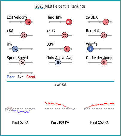
There are five different stats that end with a percent sign on the chart. When we describe strikeout rate or walk rate, we don’t even have to think about what they’re out of — it’s the percent of PAs that a player strikes out or walks. In casual conversation, we shorten that comfortably and without fear that a reader or listener will misunderstand us. They become how often or the percent of the time that a player strikes out. We unknowingly and unintentionally cut out half of the information needed to fully understand K% or BB%. And, in all honestly, I think that’s fine in these cases.
But, when HardHit% or Barrel% are placed next to them with the same lack of context, readers are left to interpret on their own. It’s very, very easy to assume that Barrel% means Barrels/PA% — as I did for months! — if there isn’t any specific reason not to. Yes, readers can head to the Statcast glossary, and I eventually did. But if the point is to inform people about baseball, assuming that readers come in with an understanding is a recipe for confusion and misunderstanding.
Making matters worse, of course, is that more than half of these numbers aren’t suited for the unqualified comparisons that percentiles encourage. Just like Barrel% and HardHit%, average exit velocity is biased toward players who never sacrifice power for contact. And all of the issues with Contact% apply for Whiff% because, well, they’re just the inverse of each other. So, when these numbers are placed next to xwOBA, K%, and BB%, Savant leaves it to us to find out on our own to determine which are actually worth listening to. The result? These sliders turn into a game of counting reds and blues.
Even more confusing is that several of the people behind Baseball Savant seem to passively acknowledge these problems while doing nothing about them. Head to Statcast’s Exit Velocity and Barrels Leaderboard and the default sort column is Barrels/PA%. When we want to compare hitters based on their power results, they show off their flagship power stat in its clearest possible form. But if you click on 2020 Barrels/PA% king Fernando Tatis Jr.’s Savant page, these per-PA numbers are nowhere to be found. Even MLB.com’s writers seem to acknowledge that, as standalone numbers, HardHit% and Barrel% can be misleading — if they weren’t, then Mike Petrielo wouldn’t have to go out of his way to explain that Jeimer Candelario’s HardHit% isn’t lying to us in his list of breakout players to watch (and, to be clear, he’s right: Candelario was in the 87th percentile in both HardHit% and HardHit/PA%).
This issue is part of the larger problem with convincing casual fans to trust sabermetrics. While the data Statcast is collecting is pushing our understanding of the game forward, the public-facing tools we’re creating from it often require a baseline level of understanding to draw the right conclusions. Any poorly-built or poorly-named stat we rely on gives room for old heads to discredit and undermine what should just be good baseball. So, it’s extremely important to make sure that the numbers we place most prominently in front of eyeballs are crafted with the same care that tracking cameras should be installed with.
Done right, though, fixing HardHit% could give us a template for how to chip away at the anti-saber attitudes that still persist in too many broadcast booths. Rather than strictly relying on stats that can be like black boxes to announcers who couldn’t pass Algebra 1, moving toward fair, eye-test verifiable stats that are per-PA would make for easy discussion. Want to talk about what to expect from Ian Happ? Well, here’s a chart with per-PA as the default that even Alex Rodriguez could (hopefully) understand:
| 2017 | 2018 | 2019 | 2020 | |||||||||||||||||
|---|---|---|---|---|---|---|---|---|---|---|---|---|---|---|---|---|---|---|---|---|
| K% | 31.2% | 36.1% | 25.0% | 27.3% | ||||||||||||||||
| BB% | 9.4% | 15.2% | 9.6% | 13.0% | ||||||||||||||||
| HBP% | 1.3% | 0.6% | 0.0% | 0.4% | ||||||||||||||||
| HardHit% (Barrel%) | 23.0% (7.7%) | 19.5% (5.8%) | 25.0% (9.0%) | 28.6% (6.1%) | ||||||||||||||||
| Weak Contact% | 35.1% | 28.6% | 40.4% | 30.7% | ||||||||||||||||
| wOBA | .349 | .329 | .368 | .369 | ||||||||||||||||
| *all percents per-PA | ||||||||||||||||||||
Because all of the percentages are on the same scale, these figures (sans barrels, in parenthesis for a reason) add to 100% each year, making it easy to see how a player has changed year-over-year. Want to see what happened when Happ cut his swing rate in 2020? Easy: he traded in about 10 weakly hit balls per 100 PAs for a handful more walks, strikeouts, and hard-hit balls. Want to know whether the 2018 version of him was actually a power hitter or just a hacker? That’s where percentiles can start to come in. He was producing barrels more than league average (68th percentile), but not hard-hit balls (14th percentile). And if we strip away misleading situational stats like xwOBACON or Whiff%, stats like wOBA can more easily stand out as the best indicators of how valuable a player’s particular skillset is.
The HardHit% we currently use doesn’t have to go away completely. It can be and is used properly by people who know what its limits are. It’s also useful for evaluating whether a player is hitting the ball hard often even to be viable with their particular plate discipline profile. And alongside other contact numbers, it’s useful for evaluating whether a player deserved their BABIP, which can be helpful with finding regression candidates. In the same way that we might look at Whiff% after SwSt%, we could look at HardHit/BBE% after first looking at HardHit/PA%.
But, if the goal is to inform as many people as possible accurately and quickly, the thing we currently call HardHit% — and most other situational stats, really — shouldn’t be among the first things we’re using when we discuss players. It’s not just about being right about Ian Happ, or anyone else, really. It’s about making it easier for everyone to be right about their favorite players, too.
Photo by Carlos Herrera/Icon Sportswire | Adapted by Justin Redler (@reldernitsuj on Twitter)
Fantastic article. Thanks!
Such a great article, thanks!
Brings to mind several analogies:
– Can’t see the forest for the trees (so many numbers, formulas, acronyms to get lost in)
– Looking at a forest 5,000 feet above the canopy while wearing reading glasses (e.g. WAR)
– Hunting for morel mushrooms – if you don’t know when and where to look, forget about it (e.g. career, season, trends, changes, SSS, etc.)