


Many analysts throw around ERA, FIP, xFIP and SIERA interchangeably. Worse yet, some simply pick the ones that best prove their point for a particular pitcher.
A great example of this is Zack Wheeler. You could argue that he was in ace form in 2018, pitching to a 3.31 ERA and a 3.25 FIP. Or, you could claim that he was overrated by pointing to his 3.81 xFIP and 3.87 SIERA. There really is no right answer based on these indicators alone, and each should be considered in the context of a pitcher’s overall profile.
However, some indicators did perform better than others in 2018. I’ll take three steps to determine which. First, I’ll define each indicator so you have a reference point. Second, I’ll show the in-season correlations for 2017 and 2018 to see which has the best in-season “fit” with ERA. Third, by finding the Root Mean Square Error (RMSE), I’ll illustrate the degree to which each indicator in 2017 was predictive of ERA in 2018.
I think this exercise will be very useful for evaluating pitchers’ performance going forward. As the season develops, it’s important to understand which 2019 indicators are best for evaluating a pitcher’s current ERA, and which from last season are best to use for projecting ERA going forward.
Definitions
Let’s consider each statistic and its definition, provided by Statcast’s glossary:
- Earned Run Average (ERA) – Earned run average represents the number of earned runs a pitcher allows per nine innings—with earned runs being any runs that scored without the aid of an error or a passed ball.
- Fielding Independent Pitching (FIP) – FIP focuses solely on the events a pitcher has the most control over—strikeouts, unintentional walks, hit-by-pitches and home runs. It entirely removes results on balls hit into the field of play.
- Expected Fielding Independent Pitching (xFIP) – xFIP takes a pitcher’s FIP, but it uses projected home-run rate instead of actual home runs allowed. The home run rate is determined by that season’s league average HR/FB rate.
- Skill-Interactive Earned Run Average (SIERA) – SIERA quantifies a pitcher’s performance by trying to eliminate factors the pitcher can’t control by himself. But unlike a stat such as xFIP, SIERA considers balls in play and adjusts for the type of ball in play.
Correlations
For my sample, I selected all pitchers with a minimum of 60 IP in each of 2017 and 2018, for a total of 170 results. I set the threshold at 60 IP in order to sweep in some relievers, but only those whose samples would be large enough to avoid a sample size error.
| 2017 ERA Indicator | r with 2017 ERA |
| FIP | 0.8412 |
| xFIP | 0.7350 |
| SIERA | 0.7498 |
By the Pearson Correlation Coefficient (r), each ERA indicator moves positively with ERA. This is not exactly surprising, as they’re all scaled to an earned run average over nine innings, meaning that they should not only move with ERA, but also act as a measure of what ERA should look like.
In 2017, FIP had the best fit with ERA. In other words, plotting each pitcher in the sample’s expected ERA by simply plugging in that pitcher’s FIP gives the closest result of the three indicators to the pitcher’s actual ERA. SIERA is second best, with xFIP a close third.
| 2018 ERA Indicator | r with 2018 ERA |
| FIP | 0.8039 |
| xFIP | 0.7006 |
| SIERA | 0.6797 |
Even in 2018, the results were similar, as FIP maintains the best fit with ERA. But this time, xFIP and SIERA switched. Those two results are so close to each other, however, that had I enlarged or shrunk the sample, they could have flipped.
One conclusion we can draw is that FIP correlates most strongly to ERA in-season. It will be the most useful for explaining whether a pitcher has really earned his earned run average looking backward.
Normalizing the home run rate (xFIP) or adding in batted ball data (SIERA) can still be helpful in analyzing why a certain pitcher’s ERA is higher or lower than his FIP. Perhaps a pitcher generates a lot of hard contact, which makes his ERA higher than his FIP. To confirm, you can also look at a pitcher’s SIERA to see if it’s higher than his FIP as well. In this way, SIERA and xFIP are, of course, highly valuable, but as a general matter, FIP will be your best in-season ERA indicator.
Predictiveness
In terms of predictiveness, the story changes. Here, I endeavored to apply the Root Mean Square Error (RMSE) instead of the Pearson Correlation Coefficient because it is a measure of predictiveness rather than correlation. Additionally, the value of RMSE lies in its intuitiveness (as explained below).
The RMSE is the square root of the standard deviation of residuals (prediction errors). In laymen’s terms, it is a measure of how spread out your model’s values are from the fitted line between two samples.
Most things are best illustrated by an example as opposed to abstract language, so I’ll start with the RMSE of 2017 and 2018 ERA.
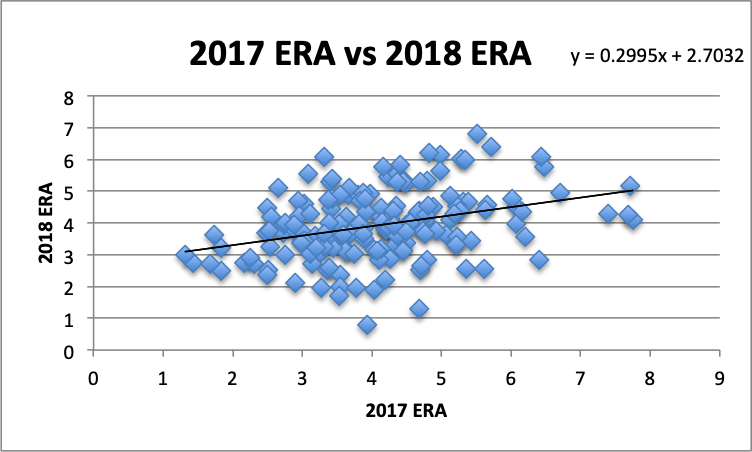
I calculated model values by plotting 2017 ERA against 2018 ERA, generating a line of best fit, then plugging in the 2017 ERA values into that line. Next, I determined the residuals be taking the difference between the actual values (2018 ERA) and those model values. Square that difference, then take the square root of the average of the squares and, voilà, we have our RMSE!
As a starting point, the RMSE between 2017 ERA and 2018 ERA is 1.0009. As I noted, RMSE is the average distance of our model values from the line of best fit. What’s great about it is that it’s measured in terms of the samples’ units. Therefore, if we’re looking at 2017 and 2018 ERA, and the RMSE is 1.0009, that means that for the 2017 ERAs, the average distance from the line of best fit is approximately one earned run. Put differently, using ERA in 2017 to predict 2018 ERA provides an average error of about one earned run.
Next, let’s examine 2017 FIP and 2018 ERA. How predictive is a pitcher’s FIP from one year to ERA in the next?
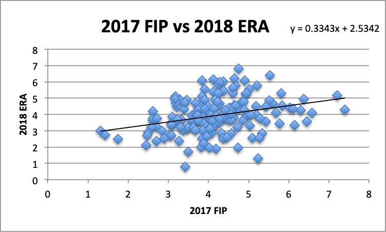
For FIP, the RMSE was even higher than ERA, sitting at 1.0103. At least as between 2017 and 2018, it was more useful to look at a pitcher’s ERA in 2017 to determine his ERA in the following year.
Third, let’s look at the predictive value of xFIP.
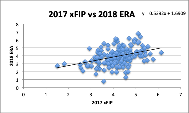
As before, using our trendline, we can create model values for the residuals, square them, take the average of the square and the square root of that average for the RMSE. Here, the RMSE is 0.9826, the best value yet. For the first time we see an average difference between the model values and the actual 2018 ERA values is under a run.
Finally, let’s determine the value of SIERA as a predictive measure.
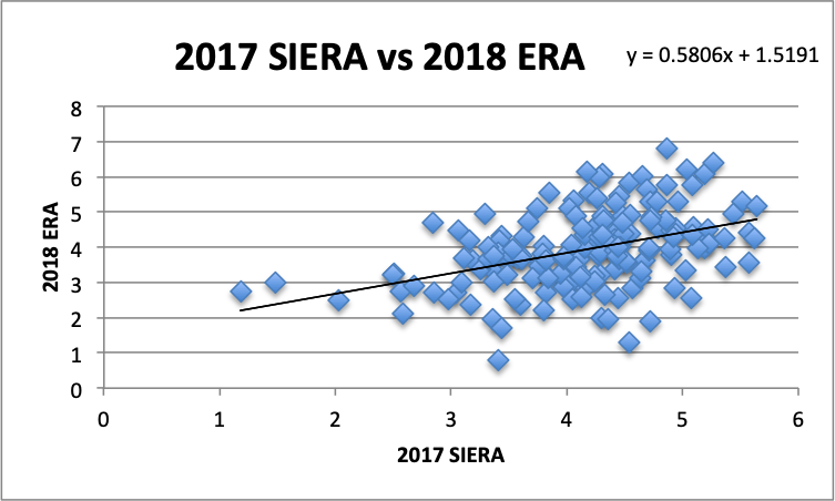
For 2017 SIERA to 2018 ERA, the RMSE is 0.9643. In other words, for these two seasons, SIERA was the most predictive of all the ERA indicators, including ERA itself. This is reflected in their r^2 values as well.
| 2017 ERA Indicator | r^2 with 2018 ERA |
| ERA | 0.1138 |
| FIP | 0.0971 |
| xFIP | 0.1458 |
| SIERA | 0.1774 |
What these r^2 values indicate is that, for example, 17.74% of the variance in the 2018 ERA sample is explained by the 2017 SIERA sample.
Again, what we can surmise is that ERA was more predictive of itself in the next year than FIP, but not as predictive as xFIP or SIERA, with SIERA leading the way. After calculating the RMSE, these R^2 results are altogether unsurprising. The reason is that there is a direct relationship between RMSE and the Pearson Correlation Coefficient, and R^2 is, of course, just the square of the latter.
Conclusion
Take my findings with a grain of salt. I’ve only examined 2017 and 2018, meaning that it’s entirely possible that, over a larger sample, one of the other ERA indicators correlated more strongly with ERA in-season and was more predictive of ERA in the next season.
That said, at least for these two years, FIP best tracked ERA in the same season by a significant margin. SIERA was most predictive of ERA going forward, but only marginally more so than xFIP, with FIP providing no predictive value over just looking at a pitcher’s prior ERA. However, none of the ERA indicators were particularly predictive of ERA in the following season. The fantasy community longs for something better.
As for Wheeler, my best guess in 2018 would have been that his 3.31 ERA was appropriately earned by his 3.25 FIP. Going forward, he’s more likely to be the 3.81 or 3.87 ERA pitcher indicated by his xFIP and SIERA, respectively.
Photo by Joshua Sarner/Icon Sportswire.
First of all, I really appreciate the article, especially the prediction section. I certainly wasn’t expecting FIP, xFIP and SIERA to be this close in terms of predicting ERA the next season. I certainly would like to see how these results change for other seasons.
Turning to the correlation part, (please forgive my lack of training in math), is it a given that FIP will correlate with ERA better than xFIP simply because FIP uses actual home run numbers versus expected home run numbers in xFIP?
Thanks, Hank! That has to be the reason why it correlates better, as that’s the only difference between FIP and xFIP. And my guess is that’s always going to be the case, because giving a pitcher his actual home runs will peg him closer to his ERA than the league average.
I agree with the above comment, this is one of the better articles I’ve read on the site. I love the hard data and predictive section as well. Keep the technical and predictive content up! Great job!
Thanks Matt!
Is there information that points to when SIERA becomes statistically significant? Basically Im wondering at what point in the year (IP) can you say a pitcher has turned a corner by pointing to his lowered SIERA?
Thanks for the valuable info. Where can you get daily match ups that show a pitcher’s xFIP and SIERA?
Glad you liked it! You can see a pitcher’s season-long xFIP or SIERA on his personal player page at Fangraphs. If you’d like to see how a pitcher fared in terms of xFIP or SIERA after a particular matchup, you can go to his game log on the player pages
Hello there! This is kind of off topic but I need some advice from an established blog. Is it hard to set up your own blog? I’m not very techincal but I can figure things out pretty quick. I’m thinking about making my own but I’m not sure where to begin. Do you have any ideas or suggestions? Thank you
When you used data to “find” ERA was better at predicting next season’s performance than FIP, did you use all of the same pitchers? If you’re doing a team-by-team comparison, the bullpens change lots year over year.