


Where do you get your ideas? This is a question I often get when I talk to people about this fun job I have. The truth is, I have no idea.
Now I don’t have as much experience as my colleagues here at Pitcher List do. But in the time I’ve been doing this, I’ve found that inspiration is a fleeting thing. Creativity will be there like a tidal wave forcing you effortlessly through your design. Then suddenly, the tide recedes and you are stuck looking at a blank Photoshop screen thinking, “What now?”
I’ve heard songwriters talk about how their best songs have come to them quickly. Perhaps they’ve heard the melody in a dream (McCartney’s Yesterday), or a conversation sparks the creativity (Lennon’s Instant Karma), or even found the words while extending a favor to a friend (Bowie’s All the Young Dudes). This creativity spark is is something I very much can relate to (though not at the creative genius level of those legends). There are times where I can just see the image in my head right away. These tend to be my favorite graphics. Though the creation tends to take longer, especially when I don’t know how to make what I see in my head (YouTube for the win).
When I don’t get that burst of inspiration, it can be a slog. Sometimes I will work on a graphic for hours upon hours and it will be complete junk. I imagine it’s how Matt Shoemaker must feel walking back to the dugout.
To complicate or in some cases simplify the process, we are typically working on behalf of the writers to convey a story. Our writers here at Pitcher List give us tremendous creative freedom even if they have some type of thought about what it might look like. It takes off some of that creative burden when there isn’t such a narrow focus from the person you are making the design for.
In the absence of divine intervention, we need tricks. Here are the practical ways I’ve found to crank out the content. You will see from the designers’ favorite June images some of these techniques employed. So I’m not the only one using these:
- Start with a great article title – The easiest path to my creativity bone is through a unique title or description submitted by our writers.
- Spoofs – We very often will pay homage to a great movie poster, album cover, heck, even a great gif (as you’ll see below). These are fun to create but also resonate well with our readers.
- Random photos or fonts – As designers we look through a lot of photos. A ton really. There are backgrounds, textures, landscapes, city skylines, sunsets, you name it. Sometimes I see a majestic photo and I’ll bookmark it so I can use it at a later point in time. Player photos can be a source of inspiration too. Particularly those photos where emotion is just dripping from the screen.
- Inspiration from peers – This day in age there are lots of designers producing amazing sports graphics and art. We have them here at Pitcher List and they are everywhere on Instagram, Twitter, and other Social Media outlets. These creative forces push us all to become better at our craft.
Let’s see what inspired our designers last month. Presenting our favorite images of June 2021:
Doug Carlin
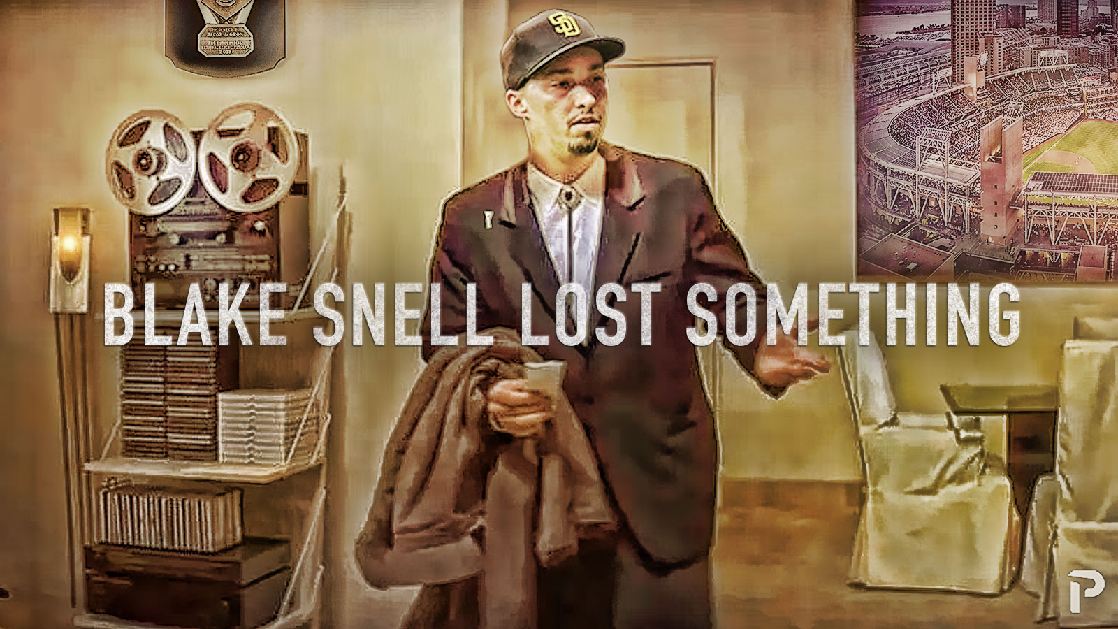
Photo by Larry Radloff/Icon Sportswire | Adapted by Doug Carlin (@Bdougals on Twitter)
From: Blake Snell Has Lost Something by Michael Ajeto
Background from Doug: Here is my favorite for June. When asked what kind of graphic was needed for this article we got the delightful reply “Do what you do! Nothing I can think of” this is always the most fun. I get to do whatever pops into my head first. So all I have to go on is the article title, which made this particularly easy. “Blake Snell Lost Something” I immediately thought of good ol’ confused Travolta the rest was easy. My favorite part of this graphic is the Cy Young Award that I snuck in on the wall behind confused Blake. Inside info: It’s an Image of deGrom’s Cy Young I couldn’t find Blakes’ either.
Quincey Dong
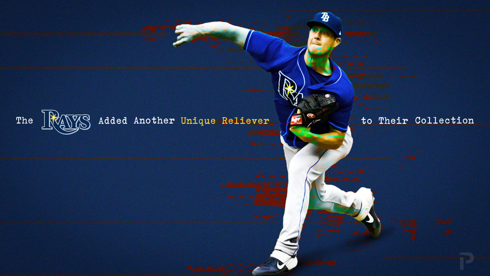
Photo from Keith Gillett/Icon Sportswire | Design by Quincey Dong (@threerundong on Twitter)
From: The Rays Added Another Unique Reliever To Their Collection by Jack Stern
Background from Quincey: Some would say the Rays are a “machine” that takes flawed arms and turns them into quality options. My use of this glitch effect was an attempt at a metaphor for Matt Wisler’s Major League journey up until this point.
Ethan Kaplan
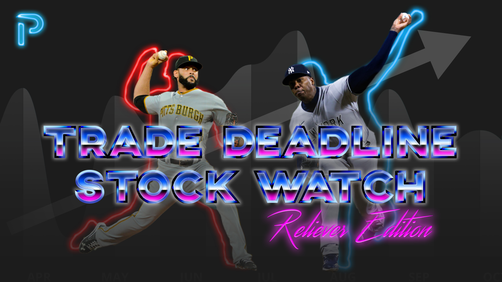
Photos by Rick Ulreich/Icon Sportswire and Frank Jansky/Icon Sportswire | Adapted by Ethan Kaplan (@DJFreddie10 on Twitter and @EthanMKaplanImages on Instagram)
From: Trade Deadline Stock Watch: Reliever Edition by Eric Dadmun
Background from Ethan: When an article is submitted to the graphics team, we get a headline and a brief description of what it will be about. The headline for this one sent my mind immediately to the 1980’s. Stocks and the stock market always make me think of movies like Trading Places, and Wolf of Wall Street. I had seen this tutorial on 80’s style lettering a few weeks before the request came through and had kept it in the back of my mind.
I spent the most time on the border around “Trade Deadline Stock Watch”, which was done by hand. Other than that, the neon around Chapman and Rodriguez was tricky to find the right balance, but once I did, it came together quickly. I’m really happy with how it came out!
Michael Packard
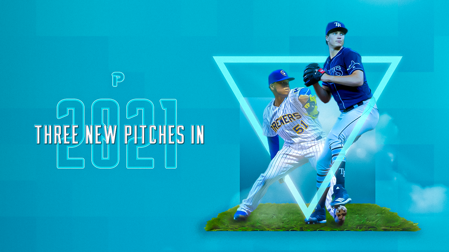
(Photos by Julian Avram & Dan Sanger /Icon Sportswire | Design by Michael Packard (@designsbypack on Twitter @ IG)
From: Three New Pitches in 2021 by Sean Roberts
Background from Michael: For this graphic, I was able to improve on some effects that I had used earlier in the year. What I enjoy most about this graphic is how clear the hierarchy in the main text is, despite the text being overlaid on top of each other.
Justin Paradis
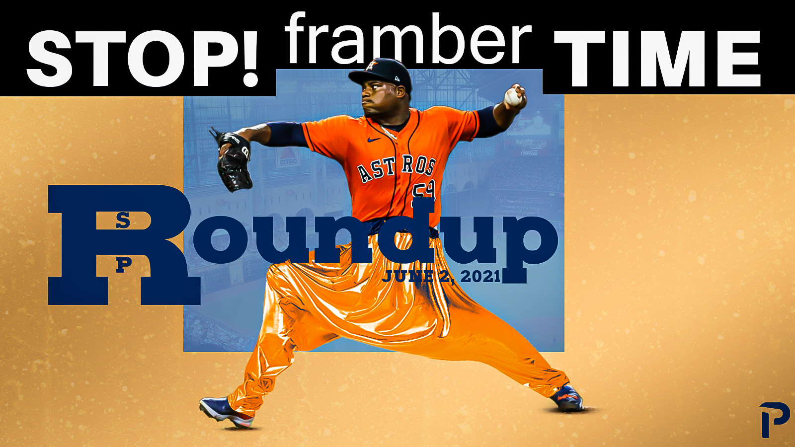
Photo by Leslie Plaza Johnson/Icon Sportswire | Adapted by Justin Paradis (@JustParaDesigns on Twitter)
From: SP Roundup: Stop! Framber Time by Nick Pollack
Background from Justin: As much as we always want our graphics to be cool, and awesome; for me, there always is a place for humor. Never will MC Hammer pants, formerly known as parachute pants, not be funny. I suggested the Stop! Framber Time headline to Nick for the SP Roundup. This was mostly because I really just wanted to put those funny pants on a baseball player. When I got the OK from Nick, the hard part was finding pants that were in a similar position to a pitcher’s windup. Through the magic of Google search and Adobe Photoshop’s puppet warp tool, I was able to find Framber’s perfect size pants. The overall graphic is an homage to the album art M.C. Hammer’s single U Can’t Touch this that was released in 1990.
James Peterson
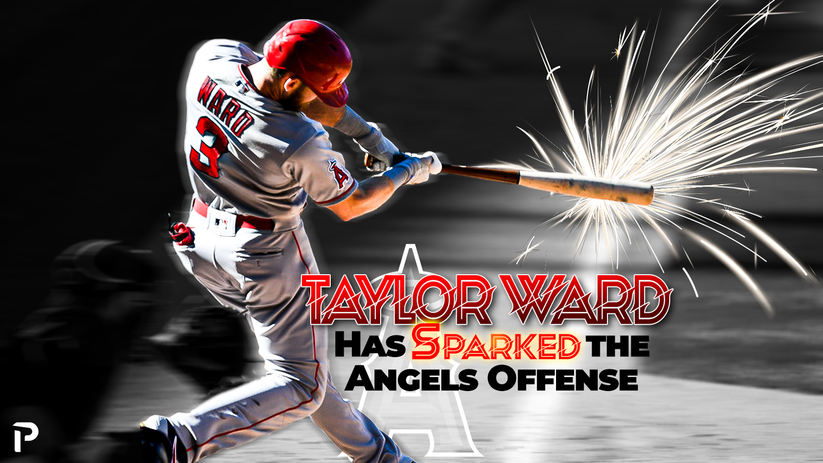
Photo by Dustin Bradford/Icon Sportswire | Feature Graphic Designed by James Peterson (Follow @jhp_design714 on Instagram & Twitter)
From: Taylor Ward Has Sparked the Angels Offense by Matt Wallach
Background from James: Being that my favorite team is the LA Angels, it wasn’t difficult to select this graphic. I wasn’t given too much direction for this one so I wanted to create a graphic that related to the title. Being that the title had “spark” in it, I wanted to create that type of effect and was able to find a great photo of Taylor Ward and thought this came out pretty good.
Aaron Polcare
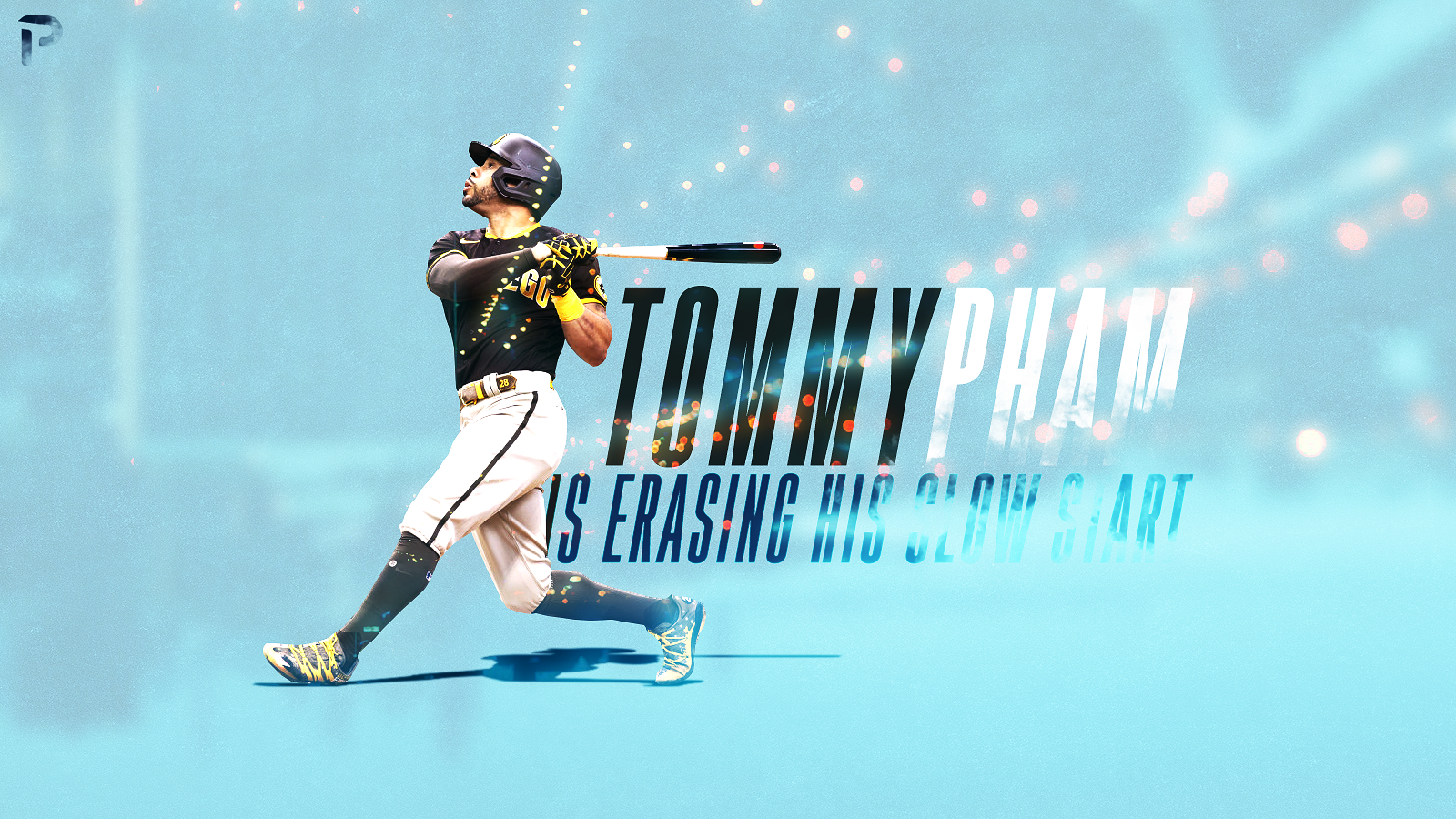
Photo by Joe Robbins/Icon Sportswire | Adapted by Aaron Polcare
From: Tommy Pham is Erasing His Slow Start by Matt Wallach
Background from Aaron: This was an easy pick for me, even though its article was published back on June 1st. Sometimes as a designer you get very wrapped up in a piece, no matter what it is or what it’s for. I reworked this graphic a few times before finally settling on this final version. Unsure how it would be received as I posted it to the team. It immediately received praise from a few of the other designers. Sometimes it’s the small things like quick admiration from your peers that keep you going and keep striving to make the best content you can.
Justin Redler
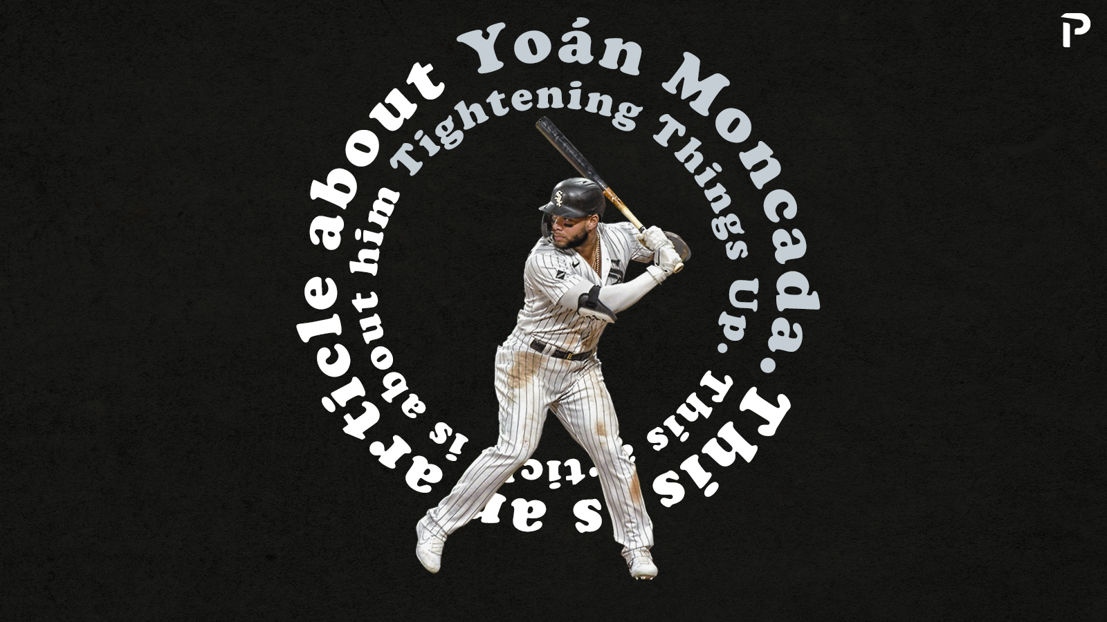
Photo by Nick Wosika/Icon Sportswire | Feature Image by Justin Redler (@reldernitsuj on Twitter)
From: Yoán Moncada Tightens Things Up by Zach Hayes
Background from Justin: I always enjoy combining design with music, so it was great when Zach Hayes brought forth this idea for his Yoan Moncada graphic. Since the article was about Moncada “tightening up” his launch angle and seeing more success, it was only fitting to make a Black Keys inspired graphic for one of their most popular songs “Tighten Up”. Being able to create that style and play around with the typography for Zach’s graphic was tons of fun to produce.
Jake Roy
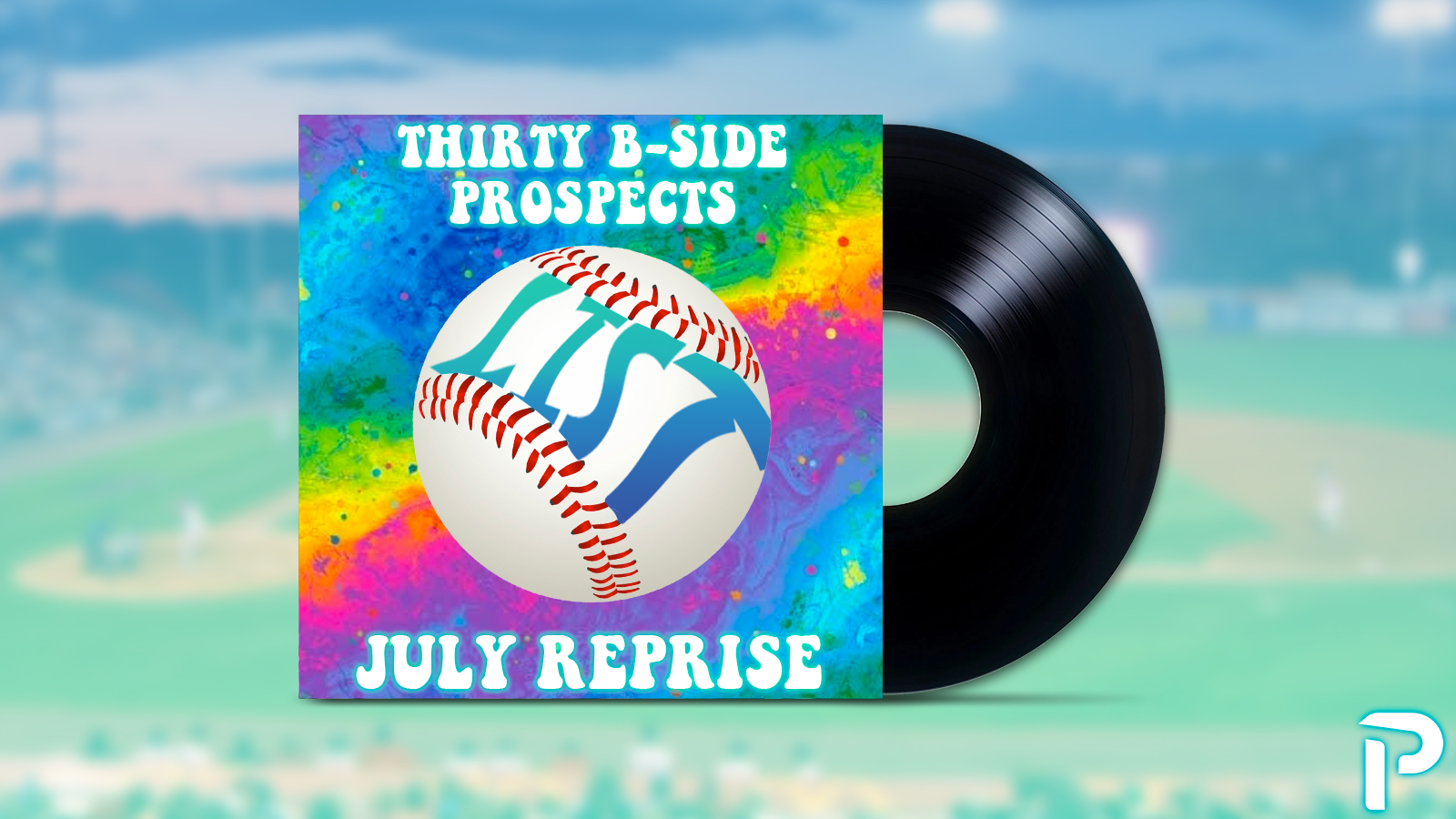
Featured Image by Jacob Roy (@jmrgraphics3 on IG)
From: B-Side Prospects: July Reprise by Nate Handy
Background from Jake: The 30 prospects to watch update was my favorite. It was fun to try to recreate a logo style from a classic band (Phish).
JR Caines
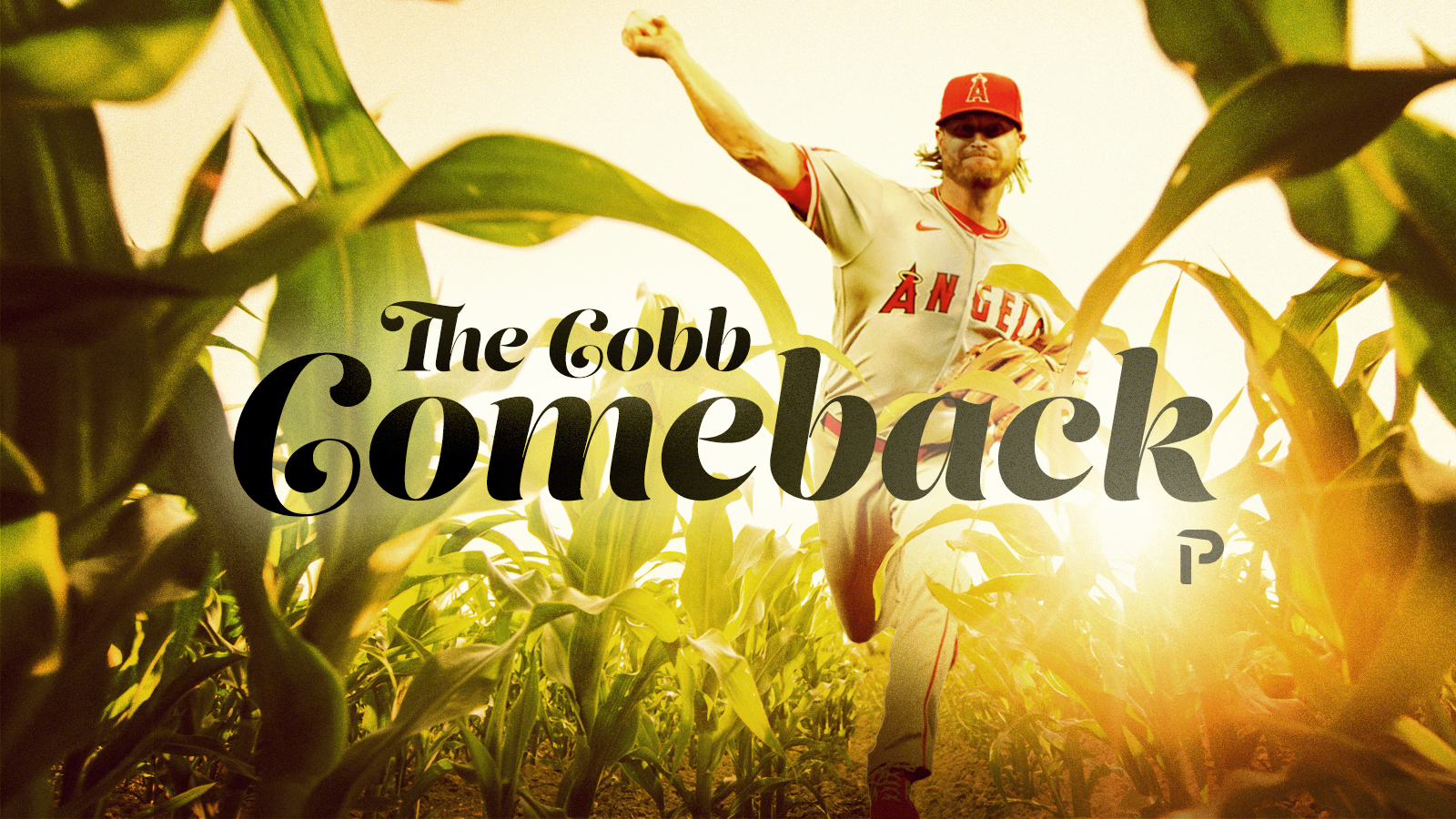
Photo by Ken Murray/Icon Sportswire | Design by J.R. Caines (@JRCainesDesign on Twitter and @caines_design on Instagram)
From: The Cobb Comeback by Max Greenfield
Background from JR: It’s hard not to immediately think of corn when you hear Cobb, so instead of fighting it, I leaned into it. The concept was sort of a mix of Field of Dreams and the idea that Alex is coming out of the field, walking away from the sunset, defying the mid-30’s and fading into the background. The execution pretty much 100% relies on the blending of the color between the cornfield image and the image of Alex Cobb. It took a lot of time playing around with the shadows, highlights, and color mixing between the two to get the right blend. Even so, I am not sure I am totally satisfied with it, but it works. The typeface is Lust Script and I chose it for its elegant but organic flow, sorta mimicking the shape of the corn stalks, but not in an obvious or cheesy way. It gives the image an emotionally important feel. Almost cinematic.
That wraps up June 2021. Did we miss your favorite image from the month? Let us know in the comments.
Photos by Icon Sportswire | Main Featured image design by Michael Packard (@designsbypack on Twitter @ IG)