


Alright, let’s talk about contact outcomes.
Statistics are funny, multi-faceted things; static and unchangeable, but moldable and pliant. You’ve probably heard it before (“Lies, damned lies, and statistics”*)—there are a lot of ways to make statistics tell a story that they don’t really tell.
What does this have to do with contact outcomes? Well, a lot, actually. I’ll come back to that. One of my favorite things to research over the last couple of months has been Baseball Savant’s contact outcomes: Barrel%, Solid%, Flare/Burner%, Topped%, Under%, and Weak%. While researching, I came across our very own Jonathan Metzelaar’s article on Ideal Contact Rate (ICR), which is a solid read.
If you haven’t read it, here’s the Cliffnotes version: basically, there are three contact outcomes that are productive—barrels, solids, and flares/burners. Barrels, of course, are what we pay the price of admission for. Everyone loves a good barrel. Barrels are the Betty White of baseball—timeless, ageless, iconic. The other outcomes, though, are a little more of a mystery. To clear up the mystery some, here’s a look at all three outcomes from the beginning of the Statcast era to now.
| Outcome | Total | HR | xBA | wOBA | xwOBA |
|---|---|---|---|---|---|
| Barrels | 43640 | 24998 | 0.788 | 1.418 | 1.400 |
| Solids | 38271 | 4192 | 0.497 | 0.664 | 0.670 |
| Flares/Burners | 167792 | 33 | 0.654 | 0.620 | 0.622 |
Obviously, all of these outcomes are pretty great. While barrels are clearly the king of contact, solids and flares/burners produce as well. Now, in Jonathan’s ICR article, his method of evaluating was to take each player’s Barrel%, Solid%, and Flares/Burners% and combine them. Thus, Ideal Contact Rate.
While I think this is a great place to start, I also think there’s room for expansion. That’s where Ideal Plate Approach (IPA) comes in.
*Fun side note: No one actually knows where this phrase comes from. It’s been misattributed to Mark Twain, Benjamin Disraeli, and various other semi-important figures of the 1800s, but its origin has never been tracked down. I feel like there’s irony in there somewhere.
The Process
Okay, back to the part about lying with statistics. Here’s the thing about statistics like Barrel%: they’re lies. Well, not really lies. Just half-truths. They don’t give you the full story. You see, Savant tracks and displays contact outcomes per BBE rather than per PA. You can find a player’s per PA rate for barrels in the “Exit Velocity & Barrels” section on Savant, but you cannot find the other outcomes per PA, nor is the per PA rate displayed on the player pages.
Here’s why this is a problem: when outcomes are tracked per BBE, they ignore one simple factor—some players don’t make that much contact. In effect, it penalizes players who make more contact. For example, Miguel Sanó is the league leader in Barrel%/BBE, but he drops to sixth in Barrel%/PA. While the distinction there is small, it’s important.
As further evidence, I ran a quick correlation between Barrel%/BBE and wOBA in 2020: 0.476546. Barrel%/PA and wOBA came out to 0.533397, so Barrel%/PA correlates more closely to wOBA. The difference isn’t massive, but we want the fullest picture possible when evaluating players.
Assuming the same to be true about the rest of the contact outcomes, I compiled per PA contact outcomes for all qualified batters in the Statcast era (with the help of Jeff Nicholas from our data science team – thanks, Jeff!). After that, I wanted to find a way to weight these contact outcomes relative to their value. As Jonathan mentioned in his article, ICR’s unweighted nature allowed for outliers like David Freese to crack the top 10 because of his high flares/burners rate.
My process for this was, admittedly, rudimentary (and time-consuming!). First, I compiled the results for each of the three contact outcomes. That looked like this:
| Barrels | Year | Total | 1B | 2B | 3B | HR |
|---|---|---|---|---|---|---|
| 2020 | 3351 | 100 | 604 | 67 | 1880 | |
| 2019 | 9248 | 259 | 1520 | 194 | 5491 | |
| 2018 | 8435 | 202 | 1512 | 203 | 4522 | |
| 2017 | 7873 | 177 | 1287 | 165 | 4827 | |
| 2016 | 7888 | 179 | 1487 | 203 | 4460 | |
| 2015 | 6845 | 135 | 1245 | 190 | 3818 | |
| Solids | Year | Total | 1B | 2B | 3B | HR |
| 2020 | 2645 | 271 | 609 | 57 | 285 | |
| 2019 | 7424 | 723 | 1869 | 184 | 842 | |
| 2018 | 7470 | 708 | 1863 | 167 | 734 | |
| 2017 | 7042 | 600 | 1952 | 189 | 849 | |
| 2016 | 6937 | 652 | 1885 | 199 | 760 | |
| 2015 | 6753 | 563 | 1782 | 245 | 722 | |
| Flares/Burners | Year | Total | 1B | 2B | 3B | HR |
| 2020 | 10631 | 5848 | 1095 | 78 | 2 | |
| 2019 | 30851 | 16516 | 3448 | 249 | 4 | |
| 2018 | 30969 | 16734 | 3335 | 302 | 6 | |
| 2017 | 31583 | 17017 | 3481 | 255 | 10 | |
| 2016 | 31731 | 17223 | 3227 | 315 | 3 | |
| 2015 | 32027 | 17040 | 3498 | 324 | 8 |
There’s some fun stuff in there! Like, how the heck have any flares/burners, let alone 33, ended up as home runs? But, I digress.
After I did this, I used Fangraphs’ run values above average to create values for each contact outcome. Basically, my method for this was dividing each result (home run, triple, etc.) by total chances and multiplying by that result’s runs above average (while adjusting for outs). This means the values change slightly by year, but generally, a barrel is worth around 0.89 runs, a solid is around 0.25 runs, and a flare/burner is around 0.24 runs using this method.
After I finished these calculations, I applied them to each player by multiplying that player’s contact outcome by its relative run value and added it all together.
I did this, but I decided I wasn’t satisfied with the result. It felt like something was missing. Ultimately, I wanted to account for the most productive outcomes possible from an at-bat, and then I remembered – a walk is pretty productive! So, I threw in BB% and multiplied by its run value as well. Voilà – you have Ideal Plate Approach.
The Results
To start, here are the top 30 results for 2020:
| Name | IPA |
|---|---|
| Juan Soto | 21.86% |
| Freddie Freeman | 20.17% |
| Bryce Harper | 19.81% |
| Corey Seager | 19.00% |
| Brandon Belt | 18.92% |
| Marcell Ozuna | 18.73% |
| Fernando Tatis Jr. | 18.46% |
| Will Smith | 17.84% |
| Ronald Acuna Jr. | 17.30% |
| Mike Trout | 17.06% |
| Teoscar Hernandez | 16.93% |
| Jose Abreu | 16.71% |
| Brandon Lowe | 16.61% |
| Jesse Winker | 16.59% |
| Eloy Jimenez | 16.55% |
| Salvador Perez | 16.16% |
| Bo Bichette | 16.08% |
| Manny Machado | 16.06% |
| Justin Turner | 15.97% |
| Paul Goldschmidt | 15.88% |
| Jedd Gyorko | 15.87% |
| Wil Myers | 15.81% |
| Jorge Soler | 15.80% |
| Rhys Hoskins | 15.69% |
| Dominic Smith | 15.65% |
| George Springer | 15.59% |
| Mitch Moreland | 15.59% |
| Nelson Cruz | 15.51% |
That’s a pretty good list of guys. Not a bad start.
What does this really measure, though? Basically, it measures a player’s ability to consistently have productive outcomes at the plate. Now, this isn’t necessarily productive results; rather, it measures a player’s skillset.
Once I got the formula down and saw the top players, I assumed that this stat would correlate pretty well with wOBA. That ended up being true, as you can see:
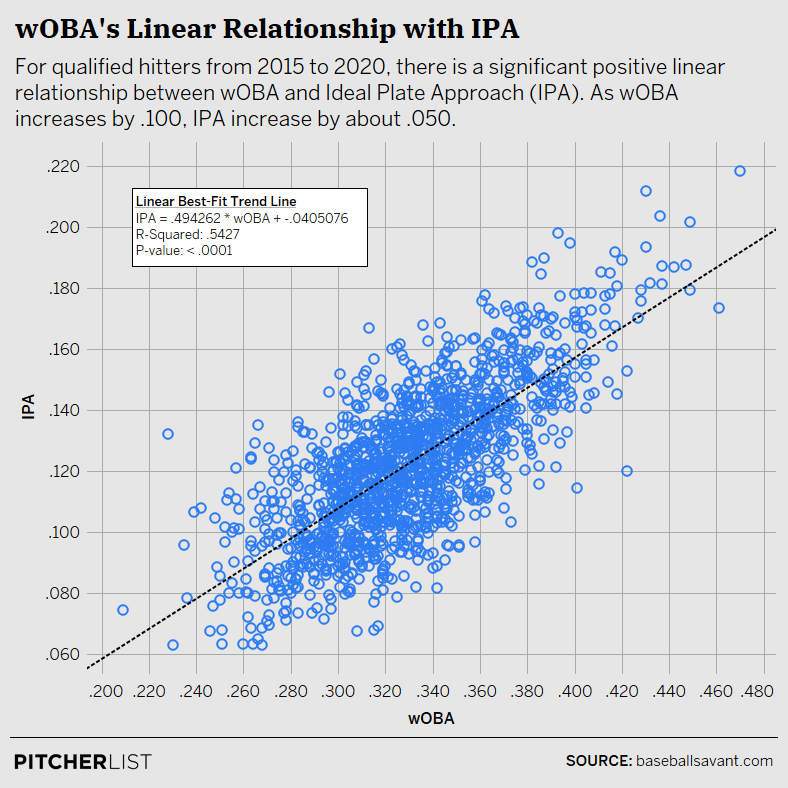
Data Visualization by @Kollauf on Twitter
This was a pretty good sign! An R-squared value of .5427 means IPA explains approximately 54% of the variation in wOBA. This makes sense because it is made up of productive outcomes, which is what wOBA is all about. Of course, IPA is weighted by expected run values, however, so the actual and the expected are understandably different. For instance, not all barrels are created equal – just ask Nick Castellanos.
I assumed, then, that IPA would likely correlate more closely to xwOBA. This also turned out to be the case.
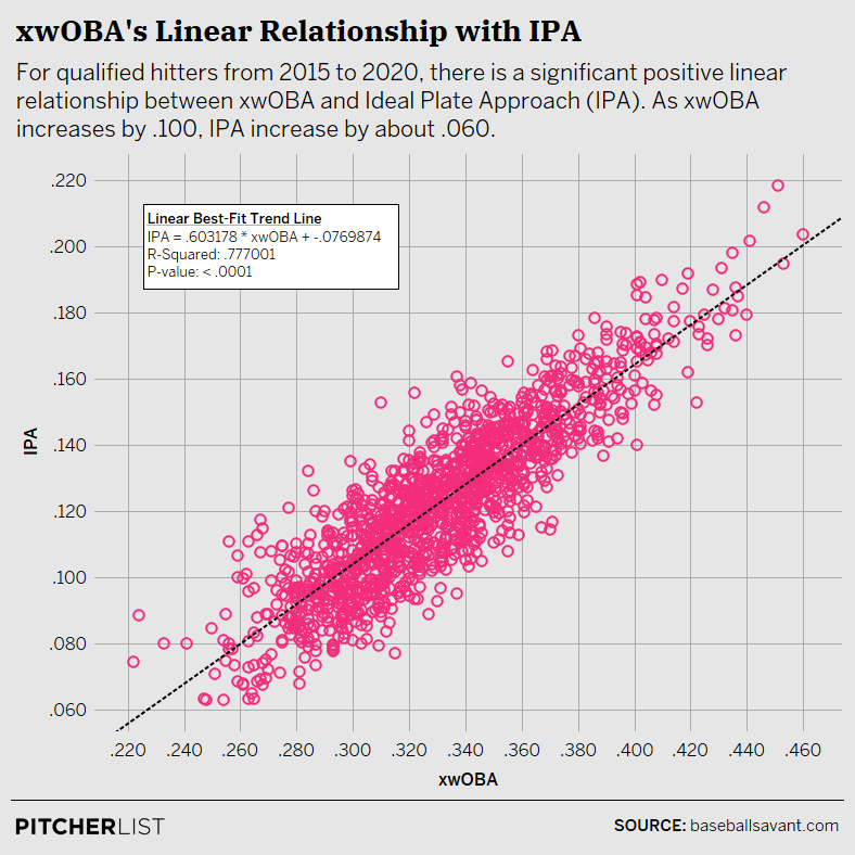
Data Visualization by @Kollauf on Twitter
As you can see, the correlation is much tighter between IPA and xwOBA. Again, this makes sense because IPA is weighted by expected run values.
I ran the correlation on xwOBA and wOBA on the off-chance that IPA was more correlative than xwOBA, but no dice. IPA’s correlation coefficient with wOBA is approximately .74 while xwOBA’s is .84, which was honestly closer than I expected.
I did find, however, that IPA had a strength that xwOBA does not: predictiveness.
| Statistic | Correlation |
|---|---|
| IPA | 0.689 |
| xwOBA | 0.594 |
| wOBA | 0.404 |
From 2015 to 2020, IPA has been significantly more predictive year over year than either wOBA or xwOBA. I would posit that this is because IPA is distinct from those statistics in one meaningful way: it measures skillset rather than results.
Summing It All Up
Alright, so all these numbers have been fun and stuff, but how is all of this applicable?
Basically, I propose that IPA provides two things: a measure of a player’s skillset and an understanding of a player’s floor. If a player has a high IPA, then they likely have a high floor for production – they make good contact and/or they walk a lot. Since it’s more predictive than wOBA and xwOBA, it gives you a good idea of what a player might look like next year as well.
Not every player who has a high IPA will have a high wOBA and vice versa, but almost every player who has a high IPA has a high floor for production. This can help us identify which players were likely a flash in the pan and who might be around to stay. Of course, like all stats, you don’t want to use IPA in a vacuum devoid of context, but I think it can be pretty useful when used in conjunction with other stats. At the very least, it clears some of the noise away from contact outcomes.
Ultimately, is this research incredibly groundbreaking? Probably not. Was it fun to do? Absolutely. Sometimes, the process is just as important as the results. Also, if you’re interested in looking at an IPA leaderboard for all years, here’s my Tableau dashboard!
Final note: thanks to Jonathan Metzelaar, Andrew Krutz, and Jeff Nicholas for the assists on this piece!
Design by J.R. Caines (@JRCainesDesign on Twitter and @caines_design on Instagram)
This was a fantastic read and breakdown, thank you Christian!
Will this be added to the PL Stats Leaderboard?
Thank you very much!
While that would be pretty cool imo, since we run our leaderboards through an external data provider, I’m not sure it can happen. I’m going to try to keep my Tableau leaderboard updated throughout next season, though!
Awesome piece. Jonathan’s piece was awesome too. I love ADP perspective changing articles. Dont we all.
Thank you – that’s the goal! This research definitely opened my eyes to some new players.