


(Photo by Quinn Harris/Icon Sportswire)
1. INTRODUCTION
The goal of this piece is to provide some context for plate discipline metrics (“PD metrics”) from a statistical perspective, as they are applied to hitters. It’s intended to be the reciprocal of Chaz Steinberg’s piece for pitchers, thus I am copying his basic format, so thank you Chaz for all the formatting here. On Fangraphs, you’ll see a number of stats in the plate discipline section, but which are the most predictive? Which ones actually tell us about real plate discipline? What do these stats actually mean for hitters? This piece will try to answer those questions.
OK, so why plate discipline metrics?
- K% and BB% are critical measures of hitters performance, but can be influenced by luck over the short term. Umpires are human, and there’s also the concept of “foul ball luck” which I’ll explain below. Looking at the plate discipline stats should provide some clues as to whether just how much you can really trust those K and BB rates.
- The metrics should stabilize rather quickly. The individual data points are pitches and swings, as opposed to K% or BB% where each data point is a whole plate appearance. Having more data is always a good thing when it comes to statistics because we get better predictions than we do in smaller sample sizes.
There are a few caveats though.
- The main caveat, and it’s a huge one, is that quality of contact is not considered at all. In the PD metrics, contact is just contact…a weak grounder or even a foul ball is counted the same as a home run. Obviously, this is not a true reflection of the values of those different results, whatsoever. So I think it’s important to recognize this upfront. Any analysis relying solely on PD metrics would be woefully incomplete without incorporating quality-of-contact data. Currently, the cutting-edgiest stats dealing with quality-of-contact are derived from Statcast data.
- The other main thing to keep in mind is just that this is a fairly new topic, and a bit complicated. As I mentioned earlier, there are nine different PD metrics on Fangraphs…it’s a lot to digest. Hopefully, this piece should help people make sense of it all. But I should also caution, this stuff is not 100% fully understood yet. If you disagree with anything, please let me know. I’m not an expert with stats either, so if I’m misunderstanding the data or using the wrong formulas, please tell me.
2. RAW DATA
To get things started, I’m going to go through each of the nine PD metrics available on Fangraphs, as well as pitches per plate appearance from baseball-reference. For reference, I’ll provide the definition, and then show in graphs how each one correlates with strikeout and walk rates. All graphs in this section include every qualified hitter season since 2014, with each dot representing a hitter-year. Simple linear regression lines and R-squared values are shown as well. The closer an R-squared value is to 1, the higher the correlation between the two sets of data and the more predictable it is.
We’re comparing everything to strikeout and walk rates because they’re seen as the end results of good and bad plate discipline. Therefore, we want to know what causes them. We’ll look at each metric to determine which are most relevant and trim down the list of nine into something more manageable.
First, the three “Swing” metrics.
1. O-Swing%: How often pitches outside the zone are swung at:
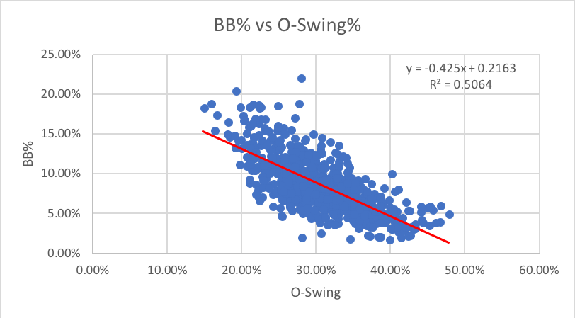
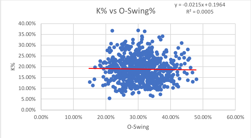
As one could predict, there’s a decently strong correlation between pitches swung at outside the strike zone and walks; as O-Swing drops walks go up. I would have guessed that O-Swing would also correlate with Ks, as one might think chasing pitches leads to strikeouts, but the stat has no predictive power for strikeouts with an R-squared of almost zero.
2. Z-Swing%: How often pitches inside the zone are swung at.
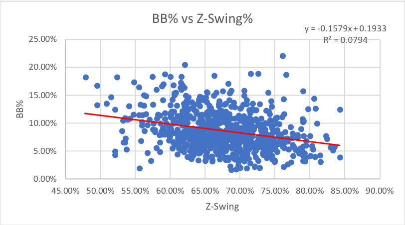
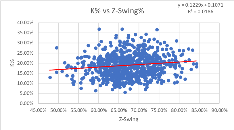
As we might have guessed, the percentage of swings on pitches in the strike zone has no impact on either walks or strikeouts.
3. Swing%: How often pitches are swung at overall.
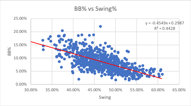
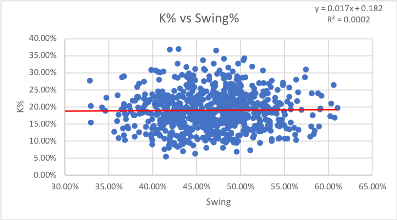
The correlation and lack thereof from O-Swing and Z-Swing, respectively, to walk rate create a modest correlation between Swing% and walk rate. It’s not as predictive as O-Swing, but it helps. As with the last few statistics, Swing% has no predictive power for strikeouts, in fact this is the lowest correlation so far.
Verdict: O-Swing helps identify walks, none are useful for Ks.
Next up, are the three “Contact” metrics. For these, each data point is one swing rather than one pitch.
4. O-Contact%: How often swings at pitches outside the zone make contact.
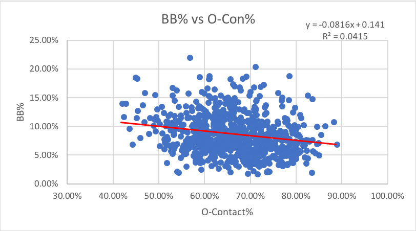
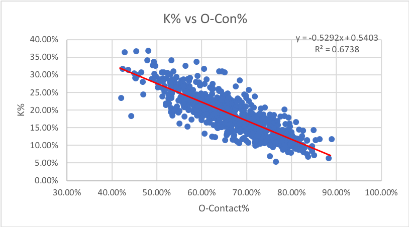
I initially thought that batters who walk a lot would have a high O-Contact rate, as it suggests an ability to foul off difficult pitches, but the two stats are unrelated. However, O-Con% is highly predictive for strikeouts, with an r-squared of over 0.67. IE as the percentage of pitches a batter makes contact with outside of the strike zone decreases, strikeouts increase at a fairly predictive rate.
5. Z-Contact%: How often swings at pitches inside the zone make contact.
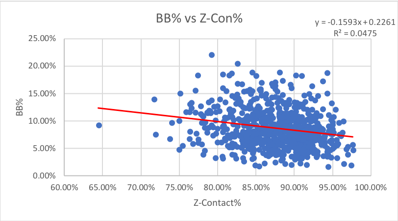
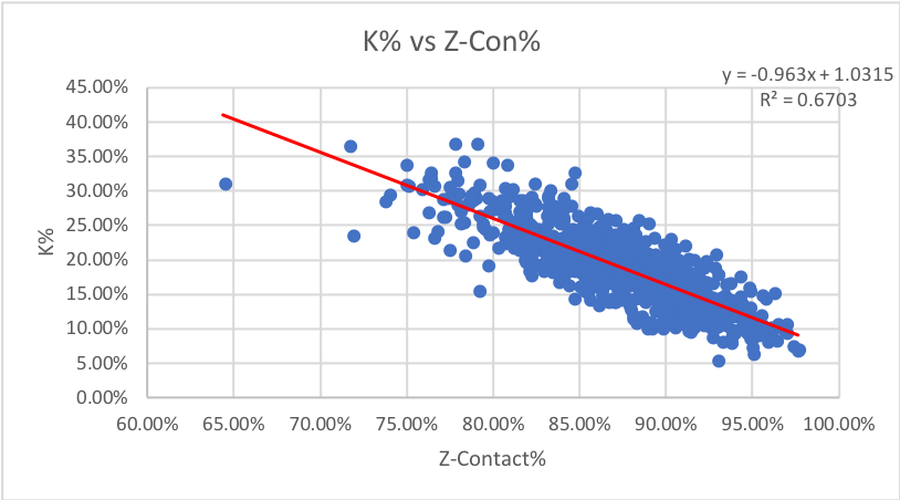
We see almost the same level of correlation here for both walks and strikeouts that we did with O-contact, leading me to a general conclusion that strikeouts are based on full contact and the strike zone is irrelevant. Let’s see if it continues.
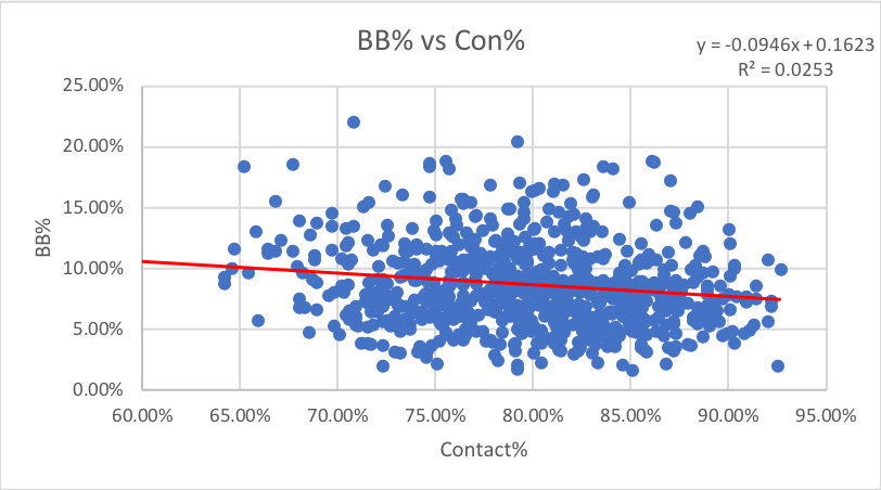
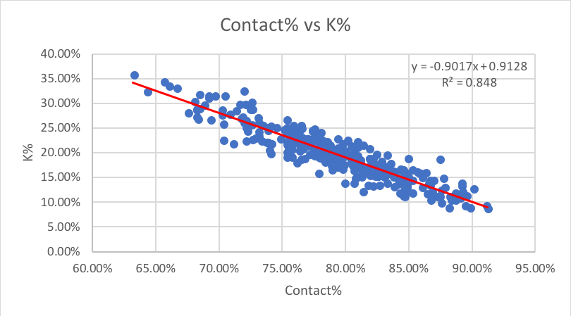
6. Contact%: How often swings make contact overall.
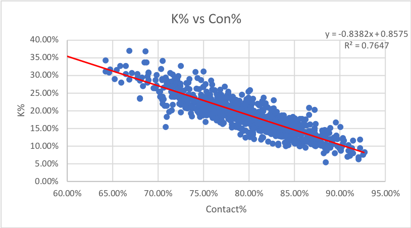
Just like in Chaz’s article, we see that once O-Contact and Z-Contact are combined into one metric, the correlation with strikeouts gets much stronger. This is actually the highest correlation of any stat of all 20 mentioned here. It makes sense that Contact% has the highest correlation, as the absence of contact is a requirement for a strikeout, regardless of location in or out of the strike zone. This is very helpful for analysis purposes though, as we can focus our analysis on this stat as opposed to looking at z and o-contact separately.
Verdict: Keep Contact% for strikeouts, none of the contact stats are helpful for walks.
The last three metrics form the “Miscellaneous” group.
7. Zone%: How often pitches are thrown in the zone (data points = all pitches).
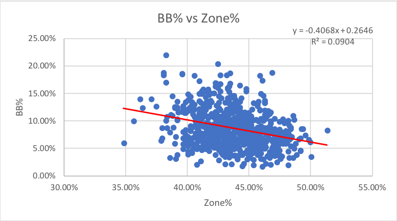
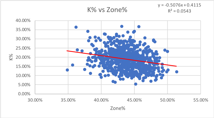
I honestly expected to see much more of a correlation between walks and zone rate. However, it appears that a drop or increase in zone rate has no impact on walks or strikeouts.
8. SwStr%: How often pitches are swung and missed at. This one also uses all pitches as the data points, not all swings.
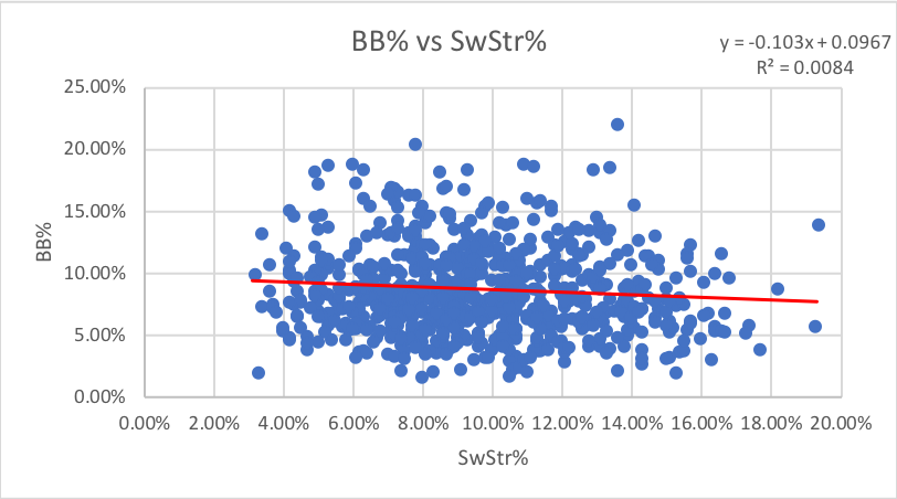
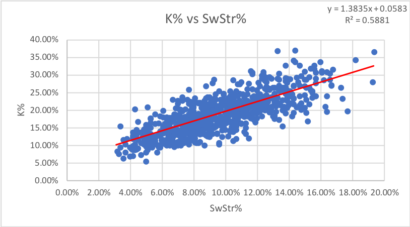
Our first instinct is to think that whiff rate and strikeout rate are synonymous. However, this is not as strong of a correlation as I expected. P have an R-squared of roughly 0.75 for the same points of data, but it does not appear that hitters share the same correlation. Whiff rate is still somewhat predictive for Ks, but like we might have guessed, it is unrelated to walks.
9. F-Strike%: How often the first pitch of a plate appearance is a strike. This one uses plate appearances as data points, the only PD metric to do so.
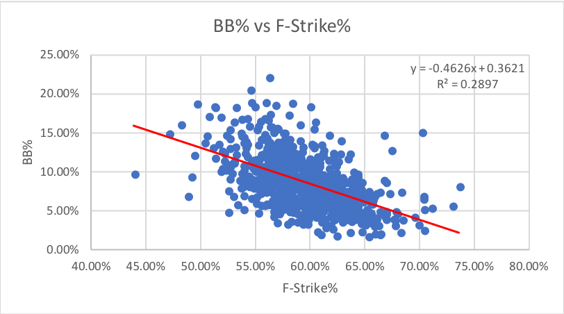
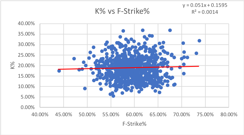
I expected first-pitch strike rate to correlate with both strikeouts and walks by giving the hitter either an advantage or disadvantage for both. However, it appears there is no real correlation with either. Walks do have a much higher R-squared than strikeouts, but the sheer number of outliers from the general group of data points and the spread of data makes it unreliable.
10. Pitches Per Plate Appearance (P/PA): How many pitches a hitter saw per plate appearance, from baseball reference. As it suggests, the data points are plate appearances.
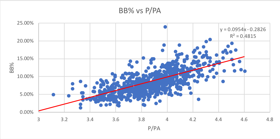
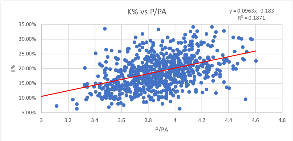
I honestly expected to see a much higher correlation between walks and P/PA, not just because taking a walk means you saw at least four pitches but because I see P/PA as perhaps the best measure of “patience” for a hitter. However, P/PA is still the second best predictive stat behind O-Swing% for walks.
Verdict: Ignore Zone%, but keep the other three (SwStr%, P/PA, then F-Strike% in order of importance)
To sum up, we have whittled ten metrics into four main statistics: SwStr%, Contact%, O-Swing%, and P/PA. And then we’ve got the lesser, F-Strike%. Three of them affect walks, and two affect strikeouts. Now that we’re down to something a bit more manageable, let’s take a deeper dive into each of these, and see if we can really figure out what’s happening:
3. ANALYSIS
1. Swinging Strike% (SwStr%) measures swings and misses in percentage form. It’s helpful to measure because it’s completely independent of what umpires call behind the plate. There is a general variance, as some hitters are able to maintain lower strikeout rates by getting contact when they need it or having a very good eye at the plate, but generally, if one drastically does not conform to the graph and the rule stated below, either their K% or whiff rate is an outlier. Looking at the chart above, we see a few major outliers.

As you can see, Moncada’s strikeout rate thus far in 2018 is over 10% higher than his expected strikeout rate on the regression line. To see just how far off, his strikeout rate is, we’ll create a new stat that I call eKW or expected Ks from whiffs using the equation of the regression line to estimate K% from whiff rate. Using this formula, we get an eKW of 23.2%, strikingly far from his 37.1% K%. But then again, while whiff rate and strikeout rate share a positive correlation with an R-score above .5, the relationship isn’t perfect. There are a wide range of scores and almost none are exactly on the line. Rather, most look to be within about 5-8% of the line. The standard deviation of the line amongst the data plots is 3.6%, which shows that the data is fairly spread out, but it also means Moncada’s K% is nearly four standard deviations away. From this, we can reasonably infer that Moncada’s strikeout rate is unsustainably high based on what we know about whiff rates.
If you ever want to estimate a player’s true strikeout rate based on whiffs, plug in their whiff rate as x into the formula in the chart above. The reason swinging strike rate is our independent variable is there are a lot more data points, giving the stat a bit more stability as opposed to strikeouts.
But is it also possible that certain players can sustain a K% well above or below the regression line? Of course. Some players may be free swingers early in counts and then tighten up to prevent Ks. Others may take too many strike threes on the corner. The charts below show career numbers for all qualified hitters from 2014-18.
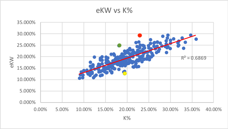
The red dot is Avisail Garcia. [eKW: 29.4% K: 22.8%]. His 6.6 gap is among the 3rd highest in baseball.
The green dot is Adam Jones [eKW: 25.0% K: 18.0%]. One of the only players to best Garcia is Jones’ 7.0 gap.
The yellow dot is Brock Holt [eKW: 12.8% K: 19.3%]. Holt had the largest negative difference with -6.5 eKW-K%.
The standard deviation of ekW-K% for this data set was 3.1%, so each of these are more than two standard deviations from the norm. The former two players were fortunate to have K rates as low as they had, as this metric suggests it should have been much worse.
RULE #1: To estimate K% from SwStr%, multiply by 1.5 and add 5.
I’d recommend using the actual formula, as it will give you more accurate results, but in a pinch or without a calculator, the above will do. If the swinging strike rate is 14 or higher, I suggest adding 6 instead of 5 for a more accurate eKW.
But what about sample size? Typically, stats “normalize” when the r-squared value is .5 or higher. That indicates there is more signal than noise in the data. The K%-SwStr% gets to a .48 R-squared in 14 days, but seems to hover around this number in the short term. I’d be wary of small samples sizes with this statistic, and would wait on this until the sample is at least over 30 days.
2. Contact%. Until Chaz’s pitcher’s article, I never really paid attention to Contact rate. But wow, does it stick out on the charts above with the highest correlation of any two stats. Chaz posted a question that I think is incredibly prevalent: “Isn’t Contact% and SwStr% just measuring the same thing? If you whiff, you didn’t make contact.” Sort of, but contact% also includes foul balls, which starts to address an issue we saw earlier: some players mgith be especially good at defending the strike zone with two strikes. Foul balls are a common outcome; somewhere in the neighborhood of 17% of all pitches. Foul balls are unique in that they are contact, which is good, but also sometimes strikes (depending on the count), and strikes are bad.
If we agree that hitters aren’t ever trying to get a foul ball as the result, it seems uncontroversial to conclude then, that a hitter’s distribution of foul balls with respect to the count is a “luck factor”. If a given hitter is getting more foul balls early in the count, where they are a negative event, compared to later in the count, when they are kind of positive, they are getting unlucky. Over time, the distribution of foul balls should be expected to regress closer to league average. In other words, the data points move closer to the regression line, the more time that goes by.
If a hitter were getting lucky in this way in a small sample size, their data point on the graph would be noticeably lower than the regression line. As an example, let’s take a look at the major outliers from our chart above
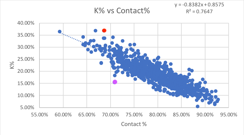
Just like whiffs, we’re going to make a new stat called eKC or expected Ks from contact using the equation of the regression line to estimate K% from contact rate.
The red dot is our old friend, 2018 Yoan Moncada and the purple is 2018 Bryce Harper. They represent the furthest deviations from the regression line in either direction. The first thing I notice, before anything else, is that both of the major deviations are 2018. That brings up the sample size question. The stats have an r-squared of 0.6112 so far in 2018, which suggests that the relationship is still pretty strong, but 70% of the players ranked in the top 20 of the disparity between eKC-K% are in 2018. This suggests that, while we can still use contact rate in the short term to estimate strikeout rate, we must be careful of drastic outliers.
Looking at Harper in depth here. Theoretically, he should be striking out far more often given his mediocre contact rate. The next question is: does this happen to Harper every year? Actually no. Every season in the past, he’s struck out more with a higher contact rate, which makes sense as it plays closer to the regression line. Either Harper will start making more contact without striking out more which would push him to the right and closer to the regression, he’ll maintain his contact rate and strike out more which would push him up towards to the regression line, or he’s broken this stat. I’m betting it’s not the last one. I’m inclined to think that he’ll start making more contact to push up his low average.
Yoan Moncada is somewhat of a different story. He’s now maintained a K% well above his contact rate in both 2017 and 18 so far. However, his moderate drop in contact% should not have resulted in a 5% jump in K%. Therefore, we can still somewhat infer that Moncada should regress somewhat to the mean with either less contact or fewer strikeouts. Fantasy owners have to hope it’s the latter.
How can we tell the difference between what is a normal deviation from eKC and what is abnormal? For that, we’ll use eKC-K% and find the standard deviation of this difference. This tells that a strikeout rate within 2.7% of eKC is normal. Anything outside that is likely to correct back toward eKC.
But it’s worth noting that while individual seasons can vary somewhat, does the same relationship exist over a player’s career? The chart below shows all qualified hitters’ career stats from 2014 through 2018 (ie 4+ seasons):
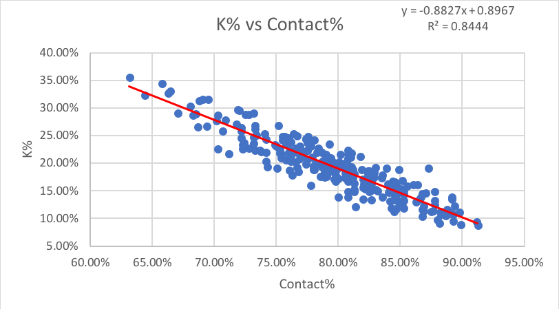
Not only does the relationship exist, but it is actually a much stronger than with individual seasons. From this, we can infer that a player’s career K% will gravitate closer to their eKC over time. Therefore, if a single season is far from the regression line, we can expect it to return to the regression after.
There does appear to be some skill in holding a K% above or below eKC, but it’s marginal. The standard deviation of this data set is only 2.1%, so anything within 2.1% of eKC is normal; anything beyond that is abnormal.
Similar to SwStr%, Contact% has an incredibly strong relationship with K% over time, that it lends itself to creating a quick rule to convert Contact% into K% for on-the-fly comparisons. Again eyeballing the regression line, we can come up with the following:
Rule #2: To estimate K% from Contact%, simply take the inverse percentage and subtract 3%. So if Contact% is 80, you should expect roughly a 17% K rate.
In retrospect, I almost feel this rule could have been predicted even without any data. After all, a hitter is always trying to make contact, and you need lack of contact on strike three to get a strikeout. So logically, it makes perfect sense that the Contact% is a pure measure of strikeout ability, and K% would regress towards overall non-contact% over time. But it’s still nice to see the data match the theory with such accuracy. Seriously, the regression line fits so well.
3. O-Swing% rounds out the “Big Three.” As opposed to the other two, which tell us about strikeout rate, this stat correlates with walk rate. Unfortunately, the relationship is not at the same level as either of the above two, but it’s still helpful. An r-squared of just above 0.5 is stabilized, but not incredibly predictive. I don’t think we can safely create a predictive formula as we did with the prior two stats. But feel free to use the chart above to get a rough estimate of walk rate.
4. F-Strike% is something that game announcers love to mention, but may not be super important in the grand scheme of things.
5. P/PA is an interesting stat and deserves mention for having the highest correlation with walk rate. Unfortunately, the r-squared being below 0.5 means it’s not very helpful.
4. CONCLUSIONS
- Over full seasons of data, strikeout rates correlate closely with SwStr% and Contact%, for reasons that make perfect sense, and some of the variations can be explained by luck factors. This allows us to create two new stats: eKW and eKC expected strikeouts from whiffs and contact) and some easy rules to predict K% from these two metrics, and find the lucky or unlucky hitters in a small sample that are unlikely to hold up for a full season.
- To Estimate K% from SwStr%, multiply by 1.5 and add 5.
- To Estimate K% from Contact%, take the inverse percentage and subtract 3%.
- Some hitters may be able to slightly defeat these rules, but generally, most hitters will conform to within one standard deviation of eKC over the course of their career. Therefore, any minor aberrations from the norm should be treated cautiously.
- For walk rates, none of the metrics show a high enough correlation to make such rules. Walks are unpredictable in nature, thanks to human umpires. O-Swing%, F-Strike%, and P/PA are certainly good, but not really guaranteed to improve walk rates.
Great read and well written!
Thanks Will!
Dave, This is some solid, solid work. Very well done.
Thanks! I’m glad it’s appreciated.
Good to see Moncada mentioned. I have pointed him out many times are one of the strange cases in MLB in regard to Ks. Moncada just has bad approach – I have no idea what he is thinking at the plate. I think he will K less at some point, but he has earned his Ks so far – he just takes lots of strikes in bad counts to be taking strikes. He just doesn’t seem to care what the count is or have any distaste for the K.
It seems to me that the missing pieces here are (as always) context . I see first pitch numbers, but all the other contexts are going to tell you a lot as well – dare I say it would even be exciting to explore flawed approaches. Ks and a bad two strike approach go hand-in-hand obviously. I would also expect some serious issues in one-strike approach to be a major culprit. I would also expect that some players, like Maikel Franco exhibit flaws when they get 3 ball counts. Some guys try to get to favorable counts just to start swinging out of their shoes.You could probably mine these players by looking at contact rates on pitches when players are ahead in the count – Matt Kemp and Javy Baez might be in that group. I don’t think it is the umpires that make BB rates unpredictable – its more like some guys want them and some don’t – players can avoid 100% of them if they want (barring intentional). I think working the count to their favor is all you would really be able to predict. Guys might K for lack of contact/approach ability, but that isn’t necessarily what stops them from walking – for some it would, but the data would be noisy I would expect. It is similar to why sprint speed is a nearly worthless predictor of SBs. When you are measuring something that is simply a matter of want, you are best off using past performance – which has become a highly undervalued tool and it couldn’t be easier to use… although that isn’t satisfying for a lot of people.
Thank you for writing this! This is really good stuff.
All those correlations though! Awesome article Dave :)