


We here at Pitcher List love xStats and use them regularly in articles. The metric has opened a new (alternative?) door of analytics for (at the risk of sounding pretentious) deep-thinking baseball fans (you, too, can learn here). Having the ability to project what a hitter could/should be hitting can tell us a lot about future performance along with the wherewithal to diagnose certain tendencies. It can help fantasy baseball fans looking for hidden value (to sell low/high on a player, waiver pickups, etc) and it’s also suitable for Major League Baseball analytic departments.
The following is a statement on xStats provided by pioneer Andrew Perpetua:
xStats are calculated using Statcast data in an attempt to make more objective observations of the game. Only the vertical and horizontal launch angles, exit velocities, batted ball distances, game time temperature, and ballpark are taken into account. All other factors are ignored. The angle and exit velocity information is fed through an algorithm that lumps together similarly hit balls and finds their average success rates. Game time temperature and ballpark information are used to adjust the exit velocities.
There is a catch to using xStats that provides us with an abstract. Considering the manifestation of traditional shifts, how much can you pull the ball before your performance drops? Can xStats be reliable in these cases, and if so, to what extent?
Since its basis is projecting potential output (or reviewing the past perfect) using contact versus standard defense, the incorporation of shifting seems to be overlooked when using this metric. This is not to say xStats are an inherently flawed measurement, but rather you have to be careful looking at hitters who have a defense catered to their hitting tendencies. Long story short, xStats on pull hitters are to be taken with various levels of salt and we’re going to see how.
First, let’s view table 1, the qualified top-10 hitters with the highest Pull% since 2012 along with their BABIP and batting average (as of 1 May 2018).
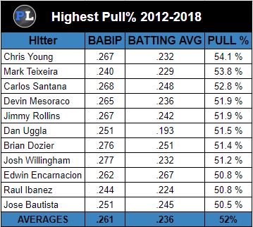
TABLE 1
I did not include the number of plate appearances that involved the shift because all hitters faced a shift right around 50% of PA or more. Just by quick inspection, it would appear that the more you pull the ball, the more your performance at the plate will suffer (not necessarily on a ’sliding scale’). But, is it true of all hitters with a high level of pulled hits? Why isn’t the Pull% leader the worst hitter? Furthermore, at what ratio of pulled contact (into the shift) can we all but discredit expected statistics? Is there a point we can actually use it without caveats?
The first thing I looked into was several years of BABIP, Batting Average, and Pull% data. I amassed 385 qualified hitters from the start of the ’shift revolution’, 2012 through 2017. We need to know what impact pull hitting has on a player’s execution along with the assumption that he could have a harder time being successful than your standard, or spray, hitters.
Of the 385 qualified hitters through the last six seasons, we have a median that lines up with league averages; .259 BA, .302 BABIP, 40.2% Pull ratio. See scatterplot 1 below; a look at the correlation between Pull% and BA.
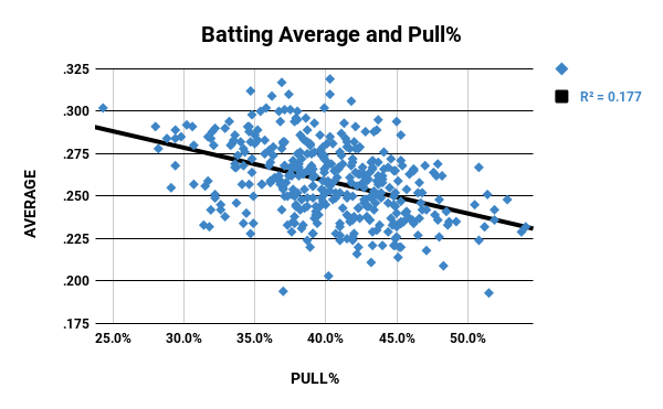
SCATTERPLOT 1
There is a tendency on the chart to indicate the more you pull the ball, the lower your batting average, yet the correlation is very low. We can’t say for certain that if you’re a pull hitter, you’re going to have a lower batting average. It’s likely, but not a foregone conclusion. So we’ll move on to look at scatterplot 2 and see the relationship between BABIP and Pull%.
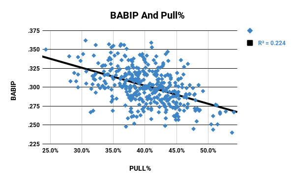
SCATTERPLOT 2
There is a fair relationship, albeit not concrete, between both BA and BABIP to that of Pull%. This indicates pull hitters are generally more susceptible to lowered BABIP and BA, and unsurprisingly so. But, the correlation is quite a bit lower than expected; we need to be more specific. The two tables above are using data across a myriad of hitters with different contact proclivities. How about hitters who could legitimately be considered pull hitters? Is there certainty in their correlation?
The main metric we want to focus on for the following scatterplots is the average Pull % of the group, which is just over 40%. That will be our cutoff when breaking down the association which will involve 181 of the 385 qualified hitters from the main group; precisely 47%. Is there a reasonable relationship between high pull hitters and distorted BABIP/BA numbers? Scatterplot 3 again shows BA and Pull%, this time with our focus group.
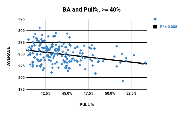
SCATTERPLOT 3
We have an even lower relationship and that’s OK because of hitters with higher pull ratios hit around the same batting average (see Table 1). What we learn from this is that once you hit the mean of 40.2% (or more), your BA isn’t likely to lower at a significant rate. So what about their BABIP?
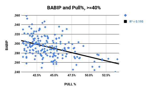
SCATTERPLOT 4
The relationship here is slightly stronger; almost as much as scatterplot 2, and a bit more cognate than scatterplot 1. Keeping your pull ratio between 40-45% holds you within reasonable BABIP expectations (for the most part), but allowing it to become more of a staple of your hitting is where you’re going to have bigger troubles.
Before we conclude the pull study aspect we’ll take a gander at table 2, the metrics for the hitters with at least 1000 PA facing a traditional shift. With this group, as with Table 1, presents no proof of a connection; some with higher averages pull the ball less and vice versa.
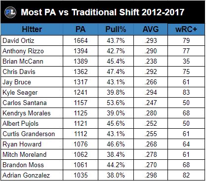
TABLE 2
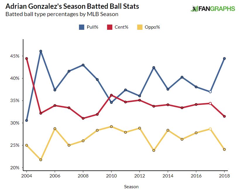
Looking at table 2, we have a ‘test subject’ in New York Mets first baseman Adrian Gonzalez. While he has the fewest appearances against the shift of the eligible examples, he has the lowest pull%, the highest average, and second-most wRC+. Whats more is Gonzalez also makes for a prime example of how xStats can be deceiving when using them to analyze a hitter with elevated tendencies to pull the ball.
Gonzalez is off to one of the worst starts of his career posting a slash line of .232/.321/.391. He’s also pulling the ball a lot more (44.6%) than he has since his second year of baseball (46.1%). His batted ball history hasn’t been skewed as badly as it is this year and, despite pulling less during the second half of his career, his productivity still declined.
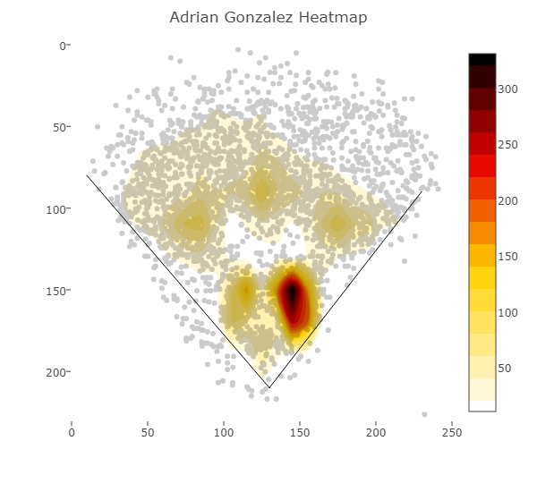
To further elaborate, the two charts below show both his career batted ball heatmap ((top) and his current heatmap spray chart(bottom).
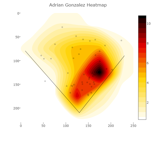
What makes him a good example is what xStats is telling us about him. His differential for batting average (BA-xBA) is -.059, slugging is -.163, and for Gonzalez’s wOBA is -.094. While these aren’t ludicrous disparities, it is also a little deceiving. Looking at what Gonzalez is doing in his (nearly) age 36 season, it’s hard to figure he should be hitting near .300 as he’s pulling so heavily through the first month of the season.
Here’s the interesting thing. Despite Gonzalez pulling nearly half of his batted balls, less than half of his plate appearances are facing a shift; 38 out of 81 plate appearances. So his xStats are relevant? Not exactly. What we don’t know is the on-base situation(s) that Gonzalez came to bat with. Runners on base cause defenses to all but abandon the shift on pull-hitters for a more strategical setup; you don’t want only one fielder to the right of second base with runners on as the likelihood of a successful steal to third is all but guaranteed.
xStats rely on an average defense; no shifts, no weighing defensive prowess at any particular position to make successful hits to that location less likely. You have to take care before you can project a hitter to be underperforming without first looking into the hitters batted ball data. Players with higher pull rates (40%+) are the exception to the ‘rule’ of xStats.
The simple plots you show of Avg and babip against pull% indicate quite a strong relationship. The R^2 of .22 indicates that in this data, 22% of the variance in babip is directly attributable to pull% (in the simple linear regression). That’s HUGE given that babip has a lot of intrinsic variability and other factors like hard hit% likely matter as well. The R^2 for Avg is also not small at all given the number of factors that likely relate to Avg. Looking at your plot, extreme pull hitters should expect to hit like 30 pts worse than average and 50+ pts worse than someone on the low end of pull percentage. I think you undersell the amount of impact there.
Also, when you subset the data, you have some issues with high leverage points in your regression. If your curious to look for changes in the relationship over different regions, a nonlinear regression like a local weighted smoother would be more informative.